Labour of love
Communicate chronicles British graphic design since the 1960s. Oliver Bennett asks the stars of the show how their trade has changed over the years
Communicate, which opens tomorrow at the Barbican in London, articulates the magical process by which graphic design characterises its era, from the late 1960s and Oz magazine, to the early 1980s and The Face: all the better to show how visual communication influences popular culture.
What the exhibition doesn’t offer, however, is a contrast between designers’ early, reputation-making work, and their latest projects. So we invited a handful of the show’s big names to select one of each, and reflect on how graphic design has changed in the intervening years.
Richard Hollis
Then: Pluto Press book covers
Now: Hackney Empire facia
Back in the 1960s and 1970s, much of Hollis’s work was political, such as his book sleeves for Pluto Press, and graphics for the African National Congress. But he also did a mass of work for the Whitechapel Art Gallery, worked as art editor of New Society and became a lecturer at London College of Communication, formerly the London College of Printing.
‘It was always about doing things economically. You always did so much by hand, with the radio playing,’ recalls Hollis. ‘My generation never used a keyboard and we didn’t type. The first thing to change was camera-ready artwork and the photomechanical transfer machine.’ The computer, he says, has inevitably led to different ways of working. ‘You can go on finessing something for hours. Previously, it’d cost you a fortune to get a printer to change it, so you had to think about it for longer.’
But the biggest change, thinks Hollis, has been in the emphasis of graphic design. ‘My generation saw design as a social service, rather than being at the service of marketing,’ says Hollis. ‘Art galleries didn’t talk about branding, or employ brand consultants at great expense. Related was the notion that graphic design should not be “authored”. In the 1950s and 1960s we never put our name to it. [Paul] Rand used to sign things, but we were dead against it.’
Hollis has maintained an interest in the public realm, as evident in his giant letterforms for the refurbished Hackney Empire, working with Tim Ronalds Architects. ‘They’re cast terracotta, weighing 28 tonnes in total, and are stuck on to steel rods,’ he explains. The letters, the final touches to the Hackney Empire, were put in place last week. It opens officially this week.
Katy Hepburn
Then: Monty Python books
Now: U2 book
Katy Hepburn’s past work covers subjects as diverse as Monty Python and musician Jean Michel-Jarre, but like Richard Hollis, she also took on radical jobs for Pluto Press and the feminist journal Spare Rib. The latter ‘represented the political and anarchic spirit of the time’, Hepburn recalls. ‘The editors were involved with the look of the page, as it was a collective. The ethos was very radical and simple – sometimes the artwork would just be a Xerox.’
Hepburn also designed the Python books. ‘The second – called The Papperbok – had authentic pastiches, ranging from a bad encyclopaedia ad to a Penguin book,’ she says. ‘The accuracy of the type styles imitated all the faults of cheap design in a display of all the “don’ts” of typography. Just as the TV series imbued everyday situations with a subversive twist, the book-layouts were trying to doing the same.’
Her most recent project is a book about U2. ‘The design is restrained, as I wanted it to have a non-rock ‘n’ roll look,’ she says. ‘The band has enough of its own iconography from albums and tours. The book is about non-design in a way, and lets the photographs and words do the work. I believe a lot of good design is invisible: it’s the message and content of the brief that determines what you do. That’s the role and responsibility of the designer. We shouldn’t just be helping to wallpaper the capitalist world.’
U2 Show by Diana Scrimgeour is published by Orion on 14 October, priced £25
Storm Thorgerson / Hipgnosis
Then: Elegy by The Nice
Now: Televators by The Mars Volta
Storm Thorgerson, the photographer and designer, was part of graphics group Hipgnosis and is the man behind many iconic album sleeves for bands such as Pink Floyd, Led Zeppelin and Black Sabbath.
He has a strong theme running through both artworks pictured, despite the fact that one (left) was created in 1971 and the other in 2003.
‘The Nice album cover was the first time we’d been given free rein. I thought of it in that reverie before sleeping. We took the red footballs to the Sahara desert, lined them up, brushed away the footprints and took the photograph before the sun went down,’ he says.
The Televators single sleeve, for US rock group The Mars Volta, also came about as a result of a ‘semi dream-state’. ‘It came to me like a hallucination,’ says Thorgerson. ‘But this time I modelled it on the computer.’
Televators and other work by Thorgerson can be seen at the forthcoming show, Taken by Storm, at the John Martin Gallery, 6 Burnsall Street SW3, from 21 September to 9 October
John McConnell, Pentagram
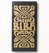
Then: Biba logo
Now: Unicorn Theatre identity
John McConnell prefigured the growth of the consultancy industry by running his own group between 1963 and 1974. During this time he also undertook his iconic work for the 1960s boutique, Biba.
‘There have been big changes in graphics,’ says McConnell. ‘In the 1960s it was a very small and low-status industry. Bank managers didn’t even know what it was, bar being some kind of commercial activity, unrelated to aesthetics. It was amateurish.’
McConnell, now a Pentagram partner, has seen it grow. ‘The industry has changed out of all recognition,’ he says. ‘It’s more corporate and perhaps design has become a more formulaic process. But there’s always an imaginative leap in every job. That hasn’t changed.’
Like others of his generation, McConnell never expected Biba’s identity to become classic. ‘Current popular imagery is a symbol of the time. You don’t expect it to have longevity,’ he says. ‘Barbara Hulanicki [Biba’s founder] was a friend, which was how I came to do the job. It was the first boutique of its kind, and the first interest in “nostalgia revisited”, if you like. The marque was originally developed
for a cologne and I thought it was very bad work at the time. But looking back, the mail order catalogues broke new ground. They were black and white and moody. We worked out that girls bought a look, not a seam or a button. That was a major milestone – the idea of feeding a desire.’
The industry has gone from small, committed groups to being part of the corporate vision, he believes. ‘There’s much more at stake now,’ says McConnell. ‘I’ve learned the need to understand the political complexities of companies, and how to make your ideas stick. All the post management school MA people have rushed into design. It’s seen as sexy power.’ So it’s a pleasure for him to return to smaller scale jobs, such as the identity for the Unicorn theatre (DW 8 January), a simple type form.
Pearce Marchbank
Then: Time Out magazine
Now: John Lewis kitchenware publicity
Pearce Marchbank started on Architectural Design magazine, moved to the rock and underground press, designing for Frendz and Oz, before moving on to Tony Elliott’s new listings magazine. Back then, Time Out was full of the influence of Twen magazine and launch zeal. ‘It started out fortnightly, then we made it bigger and a weekly,’ Marchbank recalls. ‘It was full colour, and when I did covers like the green jealousy one [far right], they were annoyed I hadn’t used a photograph. But it sold out.’
The famous logo was hand drawn, based on the Franklin Gothic Bold typeface. ‘It was supposed to look transparent; like a window,’ he says. ‘That has gone, but otherwise it has lasted for 30 years – not bad for a logo that was supposed to be temporary.’
Time Out was also significant in that it had one of the first design departments to bring production technology into the editorial office. ‘I worked directly with people operating the scanners,’ he says. ‘We bought as much as possible in-house, which was great as we could keep the artwork for a day longer. Now, of course, designers do everything, right up to plate-making. We have total control.’
Marchbank’s kitchenware publicity for John Lewis, art directed by John McConnell, is conspicuously of our time, but maintains the same design discipline. ‘The brief was to make the pots and pans masculine, with these crops that focus on the hi-tech aspect of the kitchenware,’ he says. ‘It’s the same process as Time Out – it’s about representing the direction and the editorial idea.’ John Lewis’s hard anodised cookware range is due out later this year.
Communicate: Independent British Graphic Design since the Sixties, runs from 16 September to 23 January 2005 at the Barbican Art Gallery, Silk Street, London EC2
-
Post a comment


