
Mixcloud rebrand aims to “amplify communities online and offline”
The new identity has been launched to mark the platform’s tenth anniversary, as well as support its mission to get more fans directly supporting music creators.
Creator-led audio platform Mixcloud has launched a new identity as it celebrates its tenth anniversary and looks to the future.
The project, which was led by London-based design consultancy Output Studio, aims to support the service in its renewed mission to get music fans directly supporting music creators. Moving forward, the service says this will be done through a more fan-funded, Patreon-style model, rather than through traditional “algorithm-heavy” streaming.

“The connector”
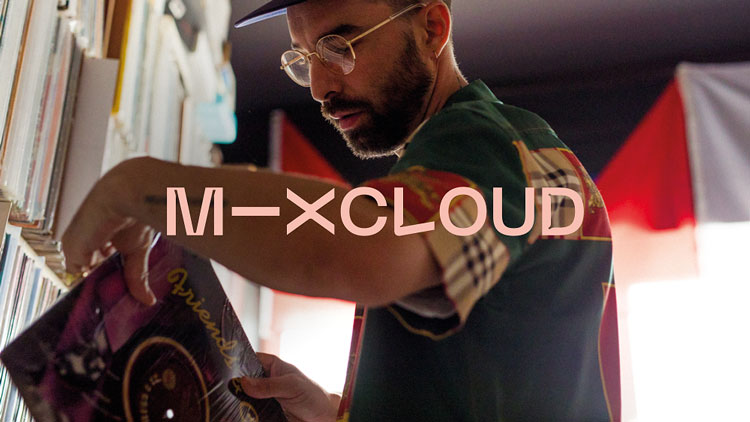
At the core of the new look is something Rob Coke, co-founder and client director at Studio Output, calls “the connector”. This fluid graphic line motif forms the base of the brand’s new bespoke typeface, which was developed by Canadian foundry Pangram Pangram.
Since Mixcloud deals with a huge amount of user-generated imagery – pictures from gigs, album or promotional art or music video stills, for example – this graphic-typographic approach looks to unify communications across all musical genres.
“[This approach] gives Mixcloud a responsive brand language across all of its platforms,” says Coke. “It makes it less reliant on high-quality photography – it brings raw image content together with high-quality shots in a system which is unmistakably Mixcloud.”
“Moving away from pictograms of clouds”
Additionally, a new colour scheme has been implanted, which sees Mixcloud depart from its previous blue and white identity. This, often deliberately clashing, use of colour aims to “throw up unexpected pairings” and provide a playful visual element.
Elsewhere, Coke says redesigning the platform’s app icon was a particular challenge. Wanting to distinguish the platform as offering something different to traditional streamers, the team “moved away from pictograms of clouds”.
“[We wanted to] emphasise the ‘Mix’ part of the name as a differentiator,” Coke says. “This actually led us to our solution: the shorthand ‘M—X’ logo, [which introduces] the connector device to the logo and plays on the idea of remixing.”

“Everyone is welcome”
All of this serves, Coke says, to underpin Mixcloud’s core value of being “emotionally connected with sound”.
“Visually, it’s all about showing the emotional connection between the creators on the platform and their audience.”
Creating this identity to work across all of Mixcloud’s outputs, including its more than 50 million online radio shows, podcasts and DJ mixes, was crucial according to Coke.
“We want Mixcloud’s creators to feel like they’re represented by the brand and proud to be part of it,” he says. “And we want the audience to realise that this is a genuine community and that they all have a place in it.
“In this sense, the brand really represents the dance floor that Mixcloud was born out of, where nobody is judged, and everyone is welcome.”


Honestly the new design makes my eyes go funny, and the app logo makes it look like its not even a real app. This really doesn’t increase the appeal of mixcloud to new users surely… it makes it look like a rubbish old 90s website on geocities ffs. The original design was clean and nicely styled, this new one looks childish tbh..
Its an awful piece of design, really jarring, doesnt work well digitally and doesnt look good next to other icons. Actually makes me want to delete the app.
I have to say this is one of the worst logos I think I have ever seen. The typeface does nothing to communicate any of the ideas proposed by Mr Coke. I understand the need for rebranding but in this case I believe an awful decision has been made and it looks really disappointing, just from a design perspective – it’s trying to be too clever. I am certain simplicity is the key here, take a look around all the best logos communicate flawlessly and with simple design.