Uber rebrand looks to reflect how the taxi app is “changing”
The start-up has a new visual identity designed by Wolff Olins, one year after being embroiled in a host of scandals, and two years after its last brand was launched – we look at how the company could be trying to change its image with a new look focused on “accessibility” and “safety”.

This month, taxi app Uber revealed a drastic rebrand, ditching its former circle-within-a-square icon for a simpler wordmark.
Founded in 2010, the start-up looked to revolutionise the taxi and ride-sharing industry, by allowing passengers to book a cab at the click of a button, while being able to track their own route and log their driver’s details for safety and convenience purposes.
Then in 2014, the company expanded into food delivery, launching its Uber Eats service, again allowing eaters to order a takeaway at ease without needing to pick up the phone.

The start-up has now been rebranded drastically twice in its eight-year history. Its last brand, launched in 2016, was, admittedly, rather tangential and vague. The main app icon features a circle sat within a square with curved edges, and within this circle sat another small square with a line coming out of it, dissecting the circle.
The abstract logo was developed by Uber’s in-house design team in 2016, and aimed to represent the bit (binary digit), the smallest unit of data in a computer. Binary code is generally conceived in the form of combinations of 0s and 1s, or a series of black and white dots.
The rebrand, at the time, received a fair amount of criticism, with outraged people taking to social media to lambast the identity. Following the release of the new logo, Uber’s head of design Andrew Crow announced he was stepping down from the role via a Medium blog post. He now works as vice president of design at running app, Strava.
Branding blunders aside, the start-up company has been embroiled in far more controversial happenings, from sexual harassment scandals to mistreating employees.
In February last year, allegations were made about sexual harassment and discrimination at the company, and now, it has been confirmed that the company will pay £1.5 million in damages to current and former workers who claim they were victims of sexual harassment, according to the BBC.
In May last year, Uber also admitted to underpaying its drivers based in New York City by taking a larger cut of fares than it should have done, and ended up paying them millions of dollars in compensation, according to The Guardian. Following a string of contentious allegations surrounding the company, CEO Travis Kalanick stepped down last year.
Following the appointment of new CEO Dara Khosrowshahi in August last year, Uber was then hit by more allegations in September, and faced a potential ban in London after Transport for London (TfL) deemed it not a “fit and proper” private car-hire operator, centred around how it reported criminal offences and how it carried out background checks on drivers, according to The Guardian.
Now, a year after this list of controversies and two years after the last rebrand, Uber has a new look – a chance for the company to change its image, both in terms of branding and perceptions, and start afresh.
To do this, Uber hired global design consultancy Wolff Olins’ San Francisco studio to give the start-up a new look – this time, more typographical. The studio worked with Uber’s in-house design team on the project, which took 10 months to complete.
Molly Watson, director of verbal identity at Wolff Olins San Francisco, says that the new brand has been implemented to represent the start-up’s growth, rather than change the company’s image entirely.
“Uber has grown from a tech start-up to a global company,” she says. “It needed a simple brand system that worked globally. This system can be localised with specific content, making it both more relevant to local audiences and more recognisable around the world.”

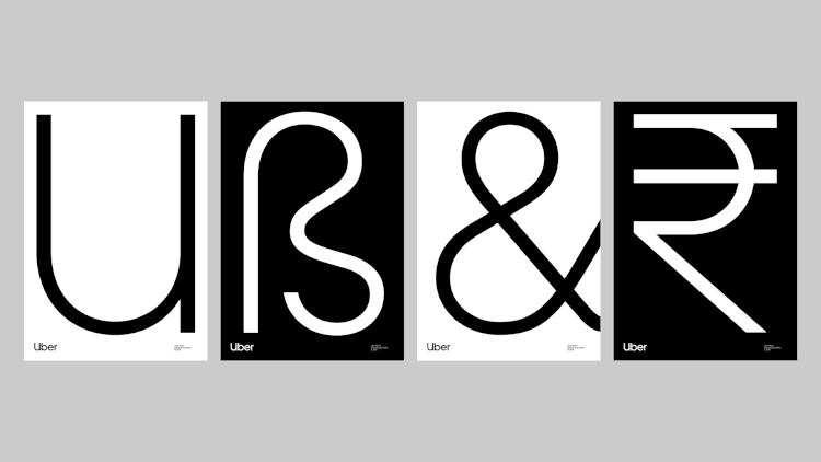
The new logo features the name “Uber” set in a new, bespoke, sans-serif typeface called Uber Move, developed by the Wolff Olins team. This is set in white against a black background.
Black and white is the core colour palette, but blue is also used sparingly as well as highlights of other colours, including green, purple, orange, yellow and brown.
The Uber team says there were three main principles behind the new branding: embrace black, invest in a wordmark rather than a symbol and “bring back the ‘U’”.
There’s no denying that the new logo does what it says on the tin – it is far more distinctively Uber than the last. While the logo seems simple, more thought has been put into the rest of the brand system.

The way pages, images and text are composed is based on the “U” symbol taken from the logo – a U-shaped structure has been designed, which is used to hold imagery and text. This is used across touchpoints such as print and digital advertising. The use of the “U” harps back to a former Uber branding, which featured a logo that centred around a “U” symbol.
Watson says the U-based composition system is “elegant in its sheer simplicity of use”.
“You just drop an image into the grid,” she says. “The system is flexible and super easy to apply. It also creates a subtle “U” wherever it appears – over time, we imagine this composition could appear without a logo and sill be recognisably Uber.”
The core typeface Uber Move has also been inspired by the typography used on transportation networks across the world, according to Uber – from London’s National Rail and Underground systems to airports, the same, soft, simple sans-serif style applies, which is “easy to read”.

A new suite of icons has been developed, which also take inspiration from transportation iconography. This includes line-drawn, flat graphics, including arrows, bells, shopping bags and shields, which can appear either hollow or filled out – all used to represent different functions within the app, such as journey, safety features, Uber Eats takeaway delivery and Uber support.
The mainly monochrome palette aims to aid legibility for users by providing a high contrast, says Uber, while Wolff Olins has developed a bespoke shade of blue for the rebrand called “Safety Blue”, which is used to call out “important interactions” to Uber passengers. This could be where a vehicle is picking them up from, how far away their driver is or anything relating to support or submitting a complaint or issue.
Animation and motion has been added to the branding assets, used across broadcast and digital advertising, which utilises the “U-shaped” composition, allowing video and text to expand and shrink out of it.

A new suite of flat-graphic illustrations using geometric shapes, mostly in monochrome with other highlight colours, has also been incorporated, with “simple shapes, clean lines and limited colour, and a heightened sense of reality” to help them feel on-brand and be easy to understand, says Uber.
A new range of photography also aims to represent people “young and old” from across the world, to represent Uber’s global market. Finally, a refreshed tone of voice has been employed, which looks to be more “straightforward and easy to understand” for the brand’s users, the company adds.
Will the new brand be a fresh start for Uber, and allow it to shake connotations of some of the severe controversies that have surrounded it? The rebrand comes a year after Dara Khosrowshahi was appointed CEO of the company, and could signal a period of change for the start-up. Watson says the rebrand aims to push home the point that Uber focuses on “[passenger] safety and ease of use”.
“Uber is changing the way people move around the world – and the company itself has been changing,” says Watson. “Uber’s new leadership wanted to ensure that the brand reflected this. Our ambition was to create a brand that recognised the value of what Uber offers, and help the business better serve people around the world – through accessibility, safety and ease of use.”
The Uber rebrand is currently rolling out across print and digital marketing and advertising materials, the website and app, social media, merchandise, staff uniforms and cars, and more.
Read this next


New brand, new look, but do they have a new policy for how they treat customers AND drivers?
I like the idea of the U shaped. 🙂
I’m really growing tired of brands re-vamping by just picking a generic font, what ever happened to making things own-able? I much preferred their previous logo, at least it had some uniqueness to it…