Words on display
Graphic designers are rarely asked to design more than the captions at an exhibition, but what should their role be?
Exhibitions are as much to to do with the feet as the eye. They are stories told in space. But the storytelling is as much about placement and architectural devices – the modulation of light, structures of various sizes, materials, textures – as it is the traditional use of words and pictures. Graphics become just one of the surfaces we respond to as we move around. A well-lit painting, or a glimpse of animatronic movement can propel you forward more eagerly than any pointing finger sign.
Exhibitions are almost never mass-produced, as most graphic design is usually tailor-made for a particular space. (The collapsible touring show that can be dismantled and re-erected to fit into any space is a poor cousin and it is associated with that unmitigated horror, the trade show.) Yet it is still all too rare for graphic designers to be the primary designer. The moment the budget grows beyond a certain size the architect takes over. Or an architect masquerading as an ‘exhibition designer’.
There doesn’t seem like any good reason for this. Some basic organisational principle, some arrangement of content, must influence an exhibition. Time, personality, movement, theme – all these ideas, and their effects upon content, are as much the preserve of graphic designers as anyone else. In fact, you could argue graphic designers know more about organising content than architects. After all, we work with a far greater range of content than any architect.
There was a heyday when graphic designers proved that they can lead a team: Josef Müller-Brockmann and his Swiss colleagues were in cool command of exhibitions throughout the 1950s and 1960s for pharmaceutical companies, the Swiss government and tourist board. Now graphic designers are usually commissioned to work on what you might call ’boutique’ exhibitions, of small and niche interest, like Steven Doyle and Tibor Kalman handling design shows at New York’s modest Cooper-Hewitt design museum. Probably still the best exception is American superconsultancy Chermayeff & Geismar’s remarkable work at Ellis Island a decade ago. Somehow the group was given the major role, and what seems like a fairly free hand. It filled New York’s old immigration centre with a remarkable armoury of storytelling methods: huge 3D charts showing how the population of America has evolved, sound recordings, restored dormitories, and abandoned luggage. The graphics are part of the story, occasionally dominating (in ways that an architect would not think of), often very subtle.
The best hope is to be part of a good team. One notable collaboration is Nick Bell, formerly of Una London, working in tandem with Dinah Casson and Roger Mann. They have just delivered an exploration of Winston Churchill’s life, using the latest interactive technology, a follow-up to their examination of nuclear power in raking illuminated typography.
All too often the graphic designer is called in at the last moment, when the architect realises the lettering might be a bit more complicated than he thought, or the client remembers that someone helped with the captions last time. And that is what much of exhibition graphics amounts to: captions, and a smattering of display type and a banner or two. But even this seemingly modest task can be done – like any graphic design – with great empathy for both the subject matter and the space into which it is being unfurled. For instance, Australian group Emeryfrost worked in conjunction with Spowers Architects to decorate the Australian Racing Museum in Melbourne. Emery Frost etched racing heraldry and famous riders on to glass, using the odd blast of type to give contrast, and – the brief was to make racing appeal to the young – make racing seem chic. Perhaps this is the best way to consider exhibition graphics: to be an indistinguishable fragment of a startling whole.
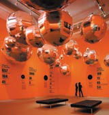
Bruce Mau seems to be going the other way: not content with just designing a few elements of the exhibition, he wants to determine the content. Take his recent exhibition at Vancouver Art Gallery, based on his book, Massive Change: the Future of Global Design. The content was supplied by a collection of future-gazers: scientists, economists, engineers, sociologists, who each predicted the future of their field. Under Mau’s editing and art direction, this is spun out into a thrilling, upbeat stream of positive possibilities. More than any designer, Mau applies Herbert Bayer’s ‘field-of-vision’ theory, surrounding the viewer with an almost 360º gamut of images. But despite the usual Mau tricks of excess – helium-filled silver balloons, a forest of white banners and a room plastered with hundreds of pictures on the walls, floor and ceiling – one reviewer called the presentation lacklustre, and complained of ‘flashbacks of class trips to the science centre’. Maybe the content couldn’t quite live up to the display.
Another designer who has muscled his way out of typesetting captions is J Abbott Miller, now a partner at Pentagram. Along with his wife Ellen Lupton, Miller chose and researched subjects, then painstakingly designed the catalogue and the exhibition, controlling and deciding every aspect of the show. The subject matter varied, but one of the most obscure exhibition topics was a study of plumbing: The Bathroom and the Kitchen and the Aesthetics of Waste – a Process of Elimination.
Another route is to be the architect’s partner, such as the partnership of architect Lorenzo Apicella and graphic designer Fernando Gutiérrez, both at Pentagram. Their recent Lost Worlds exhibition in Qatar showed the fragility of the natural world, but also looks to have more than its fair share of beautifully lit dinosaur skeletons.
Objects with explanations is a pretty good definition of any exhibition. Admittedly, there has been a sea change in recent years in how we encounter objects and how the explanations take place; infinitely more drama, sparkling light, magical technology and sophisticated physical form. But the real power of any exhibition is the aura of the objects at its centre. And when the original object is the only one in the world – the actual hats of Stanley and Livingston at the Royal Geographical Society, or Marengo, Napoleon’s tiny horse at Chelsea’s National Army Museum – its aura can be strong enough to make the surrounding air crackle.
No amount of design can compete with exhibits like that. Perhaps the best way to consider exhibition graphics is as an indistinguishable fragment of a larger whole.
Read this next

-
Post a comment


