Designed to win votes: Conservative
An examination of branding for the Conservative party

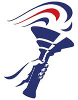
Visual identity: The Conservatives’ flaming torch identity, which stands for ‘freedom’ according to a party spokesman, has survived three General Elections intact and is on course for its fourth.
It was designed in 1989 by the then Michael Peters Group.
It underwent minor tweaks for the October party conference by current advertising agency, Yellow M.
Roadshows and events: Again, created by Yellow M and the in-house design team.
Printed campaign material: Created by Yellow M, from the manifesto to policy documents to posters.
Merchandise: ‘Gimmicky’ products such as mugs with a photograph of Tony Blair and the word Smug, T-shirts, balloons, mouse mats, flags and posters form the basis of the Conservatives’ merchandise – ‘anything you can put “Conservatives” on’, says a spokesman.
The Keep the Pound logo, a Union Flag-coloured pound sign, also features on merchandise, designed in-house around two years ago.
Party Political Broadcast: Designed, shot and scripted by Yellow M in conjunction with the party’s central-office team.
Websites: The site www.conservatives.com was created by Italian digital design consultancy Uovo, together with Yellow M, and features both blue and yellow branding, because ‘yellow writing stands out well on blue’, according to the spokesman.
The website is maintained by an in-house team and will be updated daily.
-
Post a comment


