Belly up to the bar chart
Will on-pack nutrition information improve McDonald’s corporate responsibility credentials? Scott Billings reveals its new strategy
McDonald’s has unveiled its latest strategy in an ongoing campaign to convince consumers that it endorses and promotes healthy eating. Under its Balanced, Active Lifestyles initiative, the corporation is introducing an on-pack graphic system of nutrition information that will be rolled out globally next year.
The system has been designed by Birmingham consultancy Boxer, the lead group for McDonald’s global pack design and art direction, as part of a wider pack design overhaul. Boxer parent company The Marketing Store worked with McDonald’s to develop the initiative, which is aimed at providing the fast food company’s customers with easily understood nutrition data for its products.
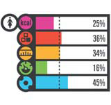
Boxer drew up the design system over approximately 12 months, using consumer research to gauge reactions to a range of formats. Bar charts – found to be the most intuitive format – have been adopted for the global roll-out, with each pack displaying a reading for calories, protein, fat, carbohydrates and sodium (pictured). In Europe, this chart will also show the percentage of the Guideline Daily Amount for each nutrient and a dotted line will mark off a third of the daily recommendation, intended to help customers plan for three balanced meals.
According to Boxer managing director David Poole, the system ‘provides a snapshot of a product’s nutritional value and how it relates to daily nutrient recommendations’. The graphic device is non-language specific, with only a few minor changes required in different territories. ‘The simple graphic solution makes the information more palatable to consumers and McDonald’s is able to roll this out around the world with ease,’ says Poole.
Boxer worked with nutrition specialists to distil information provided from a food analysis laboratory into a system of five graphic icons.
Rather than making claims to serve inherently healthy food, McDonald’s is instead presenting the on-pack information so customers can make an informed choice about the composition of their diets. Previously, nutrition information has only been available, in table form, on the reverse of tray liners in McDonald’s restaurants and via the company’s website, www.mcdonalds.com. The new packaging runs in tandem with an awareness campaign on energy balance, marketed as ‘It’s what I eat and what I do’. This campaign will promote physical activity alongside balanced food consumption.
As much as informing consumers, the initiatives are arguably part of a battle to improve McDonald’s probity. An obesity backlash in the West has kicked up a flurry of activity in nutrition labelling, and Morgan Spurlock’s documentary Super Size Me was something of a broadside against the fast food industry.
To combat this, McDonald’s has set itself three priorities/ to broaden its menu, promoting freshly-prepared foods; to promote physical fitness and activity (it is a primary sponsor of the 2006 Olympic Winter Games in Torino, Italy, where the new packs will debut) and to provide ‘relevant and accessible’ nutrition information to customers.
Boxer has designed a suite of in-store materials that will explain the nutrition initiative to customers. The consultancy also worked with digital design group DS Emotion to create an interactive kiosk, currently under European trial in Falkirk and Madrid. This kiosk provides personalised GDA information based on the user’s age, weight, sex and activity level and compares this with the selected McDonald’s meal.
With the introduction of the new packs, McDonald’s is hoping to steal a march on competitors and pre-empt the introduction of mandatory on-pack information in many of its markets.

Itsu, the sushi fast food chain owned by Pret A Manger duo Clive Schlee and Julian Metcalfe, introduced on-pack nutrition information on its packaging in February. Afroditi Krassa, lead designer for the brand, says she developed a graphic system that took cues from cereal packs, shunning the McDonald’s approach of showing detailed nutrition data in favour of logo devices that convey the product’s health benefits. A heart logo indicates low fat and a small fish signifies a high omega-3 oil content, for example. Itsu is in the throes of an aggressive growth strategy – plans are afoot to open hundreds of new sites in the UK – and Krassa hopes the packaging will be a means of building loyalty and trust among consumers.
‘The symbols communicate very quickly and give the consumer less of a feeling of being on a diet; it is a playful, lifestyle thing. The average customer does not need to know every single gram in food,’ claims Krassa.
McDonald’s will roll out its new packs from the first half of next year to around 20 000 of its restaurants across North America, Europe, Asia and Latin America.
NUTRITION INFORMATION PACK DESIGNS
July 2003 – European Commission clamped down on vague or misleading nutrition claims on product packaging
February 2005 – Nestlé begins overhaul of UK product packs to offer clearer nutrition information
May 2005 – Tesco introduces ‘signposts’ system design by Rocket Design Consultants
February 2006 – McDonald’s will roll out graphic system designed by Boxer
-
Post a comment


