Identity: the book on how Chermayeff & Geismar & Haviv changed American design
Publishing house Standards Manual’s latest release is a monograph to celebrate the 60th anniversary of the US consultancy, which features work such as Harvard University Press’ rectangle-based logo and the torch symbol now synonymous with New York University.

Update 19 June 2018: Identity is set to be released this month. To order the book, head here.
For the past six decades, New York-based brand consultancy Chermayeff & Geismar & Haviv (CGH) has created instantly recognisable identities for some of America’s biggest companies and institutions, ranging from the NBC peacock to Chase Bank’s octagon symbol.
To mark CGH’s 60th anniversary, independent publisher Standards Manual – whose previous books have included both NASA and the US Environmental Protection Agency’s (EPA) graphic standards systems – is releasing a monograph about the consultancy.
The book looks to highlight the impact that founders Tom Geismar and Ivan Chermayeff, and partner Sagi Haviv have had on American design, and in turn American culture, says Standards Manual.
“People know the work, but they may not know the creators. Now it’s their time to receive recognition from the masses, not only the profession,” the publisher adds.
The book has been announced shortly after co-founder Chermayeff’s death, who passed away aged 85 this month, and who personally worked on the design of the monograph up until this.
Here, Standards Manual founders Jesse Reed and Hamish Smyth pick out some of the most significant designs from the consultancy’s 60 years’ worth of work.
Mobil

A few identities from CGH’s portfolio will be displayed in a more extended manner—one of those is the consultancy’s work for oil company Mobil. This case study is significant not only because of its ubiquity in American society (you used to be able to find the logo every 30km on most highway exits across the country), but also the more unknown posters that were created by Ivan Chermayeff for the company’s many activities. Chermayeff created hundreds of posters – each an original piece of artwork – over the span of the consultancy’s relationship with Mobil. A selection of these posters are featured in the book.
NYU
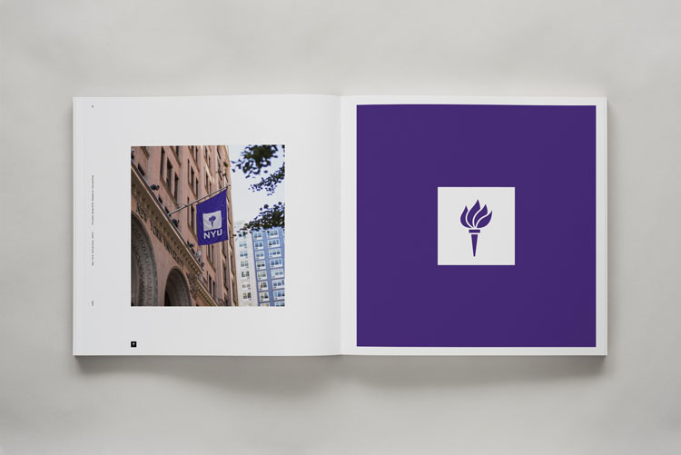
Even if you don’t live in New York City, chances are that you’re familiar with the “torch in a square” – the symbol for New York University (NYU). The torch is a notable symbol of higher academia, but what makes this mark unique to NYU is why the square is there at all. The shape is not arbitrary, it’s very intentional. It’s not just any square but a manifestation of Washington Square, located on NYU’s Manhattan campus. This shows the firm’s relentless attention to conceptual thinking, unlike most arbitrary decisions made by designers today. Instagram’s format is square, so put the logo in a square? Geismar and Chermayeff would never have come to such conclusions!
Pan Am

An identity that was almost lost due to the collapse of airline Pan American World Airways (shortened to Pan Am by Ivan) in 1991, this is a symbol that still survives in American culture to this day. In similar fashion to Mobil, it’s not the identity that is the most interesting design element. Instead, the firm’s series of posters is where this body of work really comes to life. The series has been exhibited across the world, and lives on in the Museum of Modern Art’s (MoMA) permanent collection. A selection of this poster series is also included in the book.
Harvard University Press
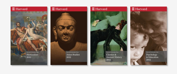
Publishing house Harvard University Press’ logo is what we’d call a classic “home run”, with three ideas in one logo. Six rectangles are arranged in a grid, with the negative space forming an “H” for Harvard. As a bonus, the rectangles are arranged in a way that mirrors the classical style of windows seen in the buildings of Harvard. These three ideas come together beautifully to create a simple, clear mark – an important factor to consider when it is stamped on the spines of books.
Beehouse

This is a beautifully simple mark that takes a cue from the name of the South Korea-based fashion and lifestyle brand. A lowercase “b” is drawn in the shape of a hexagon, which is reminiscent of a beehive’s hexagonal structure. Sometimes designers go overboard with conceptual thinking, when the answer is actually staring you right in the face. It can also be hard to convince clients to take such bold, simple approaches. That CGH has done this so many times over the years is a testament to their effectiveness, not only in terms of having great ideas but also getting them approved.
Identity: Chermayeff, Geismar, and Haviv costs $98 (£74) and is available to pre-order from Standards Manual.

-
Post a comment


