Imperial War Museum of the North, Trafford, Manchester
Sign and identity design: Agenda Design Associates
Sign and identity design: Agenda Design Associates
Sign manufacturer: Pearce Signs
Architect: Daniel Libeskind
Simplicity has been key to Agenda Design Associates’ graphics strategy for the Imperial War Museum’s £28.5m northern outpost, designed by acclaimed architect Daniel Libeskind and due to open this summer.
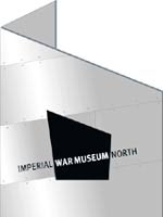
The building comprises three ‘shards’ representing the conflict and impact of war, and such a strong architectural statement required an equally robust identity. Following its appointment 18 months ago, Agenda devised a brand positioning and identity signified by a sharply angled quadrangle inspired by the jutting form of the museum. This bold graphic language forms the basis for the sign system within and outside the new building.
‘Signs should enhance visitor experience, reinforcing [visual] style and answering questions before they are asked. They need to be loud enough to be heard, but not deaden everything else,’ says Agenda director Paul Davis. The consultancy was fortunate in being able to work on the project from an early stage and in close contact with the architect, thus avoiding the common problem of signs being an undervalued extra, bolted on towards the end of the project. ‘We approach signs from a number of levels, but the most basic is for a mum with three kids who needs to know where the café and loos are,’ he says.
The museum is expecting 300 000 visitors per year. Their first encounter with Agenda’s signs will be five steel ‘monoliths’ planted outside, but not touching, the building in the car park and the pathway to the entrance and faced in the same material – rivetted aluminium – as the shards. Standing 5m high, these 3D sculptures are conceived as shard-shaped pieces embellished with the brand identity in a Meta typeface.
Once inside, signs become crucial, says Davis, as a result of the unconventional architecture. ‘Because everything is at an angle, you have to guide people in a particular way,’ he explains.
The positioning of the signs was decided by Agenda and the rest of the project team, with decisions on 30 per cent of the 50 signs left until it was possible to tour the galleries to understand how the space would work.
Visitors arrive within the Air Shard and move into the Land Shaft directed by an arrow applied directly on to the raw concrete in the same way that military signs would have been applied. Here, a large plasma screen gives scope for updating directional information while the floor plans are screen-printed on stainless steel wall panels to further help orientation.
The core information signs within the galleries run vertically upwards to a height of 160cm or, if appropriate, horizontally. They are constructed from MDF letters applied to the wall and painted.
‘[The signs] are quite sculptural in scale. We have tried to make them look as if they’re growing out of the building,’ says Davis.
Directional signs for the toilets and fire escapes are functional, stencilled directly on to the concrete walls in grey on white for maximum contrast.
The budget for the signs was approximately £50 000. Visitors will be able to judge their success as they move around this unusual building when it opens this summer.
-
Post a comment


