Typeface: Openworld
Designer: Miles Newlyn
Designer: Miles Newlyn
Typeface: Openworld
Design consultancy: Wolff Olins
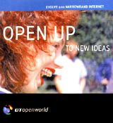
Client: BT
Central St Martins College of Art and Design alumnus Miles Newlyn is a freelance, but spends three or four days a week at Wolff Olins, where he works on an unusual mix of type design and ‘strategic creative writing’. He started work on the Openworld typeface in 1997, when the BT/ MCI merger was announced. The concept behind it was to create a typeface which ‘set new standards in on-screen legibility’, to eventually be rolled out across BT’s entire on-line presence.
‘At the time the only faces designed for PCs were Arial and Verdana. Tahoma came out a bit later,’ explains Newlyn. ‘The idea was to create a custom look for everything BT and MCI did on-screen. In the end they liked it so much that it was used for print and a slightly redrawn version [was used] for the BT Openworld logo.’
Openworld is an elegant, slightly angular sans serif, defining characteristics which Newlyn ascribes to the way it was constructed. ‘We kind of worked backwards on it, designing the pixels first,’ he says. ‘That’s why it appears angular and squared off. It works well at small sizes and looks bold and refreshing on screen.’
More precisely, Openworld’s optimal size is 8pt or 9pt, where each character has just a pixel of space between them. For Newlyn, the issue of letter-spacing is critical to on-screen legibility. ‘It’s fundamental,’ he says. ‘Arial works fine as a typeface, but the spacing issue hasn’t been properly addressed.’ Openworld is also a discreetly condensed face, which allows more text to appear within the limited confines of the typical PC screen.
In this context, commissioning a custom typeface was not so much about creating a point of difference – although this consideration did play a part in the design process – as ensuring uniformity across a range of different arenas. It was envisaged that on-line users could be provided with a CD-ROM and would be able to install the Openworld typeface on their hard drives, selecting it as their default browser typeface. ‘It’s a ubiquitous branding exercise,’ says Newlyn.
-
Post a comment


