Think outside the penalty box
The World Cup is a priceless branding opportunity, but have commercial pressures diluted the strength of the designs? Clare Goff finds out.
For football fans it’s the ultimate tournament; for brands it’s the ultimate platform. The World Cup rodeo kicks off in Germany next month. Sports pundits are already dissecting the effect of Wayne Rooney’s broken metatarsal, but what will get the design community shouting from the sidelines?
The World Cup logo for Germany 2006 – unveiled in 2002 – has already divided opinion. With echoes of the Olympic Rings, the logo incorporates three happy faces and represents the ‘incomparable emotions that can only be evoked by football’, says Andreas Abold, of Abold, a German consultancy that worked with London group Whitestone on the design.
But German designers were seething, says Tim Fendley, creative director of Applied Information Group, who says, ‘It’s incredibly hammy. It’s the kind of stuff I’d have done at A-level and shows what happens when design is produced by committees run by chief executives.’
But such is the importance of the World Cup brand that the creation of its logo had to meet exhaustive criteria.
Chris Lightfoot, founder of Whitestone, has been involved in the development of the World Cup brand since 1998 and says that its branding has to appeal not only to fans but also to the commercial partners who fund the tournament. ‘It’s not just a case of coming up with a pretty logo,’ he says. ‘It’s a highly involved process.’
The result of more than a year’s work, numerous committees and dozens of ideas, this year’s logo is a key departure from previous World Cup logos, he says.
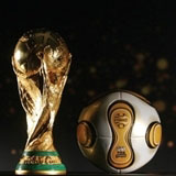
‘Historically, the logo focused on football or flags. Far too many designers fall into cliché, but this is unique and unusual.’ There are three official World Cup properties: the trophy, the Fifa World Cup standard marque and the event emblem. Each marque is strictly protected by Fifa, which ensures that only its official sponsors have access under specific terms.
Burger King recently learned the lengths that Fifa will go to ensure its marques are protected when the fast food chain was stamped with an injunction after using images of the World Cup trophy on its Israeli website.
The 15 official partners – which include Adidas, Budweiser, Coca-Cola, McDonald’s and Yahoo! – have collectively forked out an estimated €420m (£286m), a significant chunk of the £1bn revenue needed to stage the games, and will be hoping to make a significant return from their association.
Alongside official partners are technical sponsors that provide kit for the teams and player sponsors.
The big sporting brands will be fighting it out on the pitches for precedence. Nine of the 32 teams will be wearing Nike strips and the brand will use the occasion to show off its new Sphere Dry fabric, which draws sweat away from the skin. Umbro has the England kit deal sewn up until 2014, while Puma has secured contracts with 12 teams, and is hoping to gain an edge over its rivals by sponsoring less-popular teams such as Ghana and Iran.
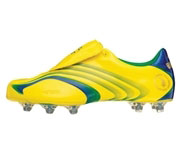
Each manufacturer has designed new ranges of footwear among its sponsored teams and players. Adidas has rolled out a different boot for each nation, incorporating its +F50 Tunit design. The lightweight version features Climacool technology and its lace cover provides a ‘cleaner kicking surface, to reduce missed shots and passes’, according to its literature.
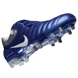
Nike’s Portland, Oregon-designed World Cup boot, the Air Zoom Total 90 Supremacy, with a ‘side-lacing system that provides a cleaner strike’ has already been sported by Rooney, days before his injury.
Adidas has provided the balls for the tournament since 1970 and this year has created a ball it calls +Teamgeist (team spirit), described as a ‘radically new 14-panel configuration’. The match ball will be black and white, the traditional colours of the German team, while the ball used in the final will be gold.
Dave Annetts, creative director at Design Bridge, worked with Adidas on the design of the balls for the 1994 and 1998 tournaments.
‘Today, the focus of the design of the ball is on a technological look, but previously the ball would take a particular theme,’ he says.
For the US tournament in 1994 Design Bridge developed a space theme, after rejecting emblems such as an eagle due to its imperialistic connotations.
‘Sport is a highly political thing and with the amount of commercial activity around the World Cup there is so much at stake,’ he adds.
In 1998 England went to the World Cup with the wrong badge on their shirts, mixing up the Football Association badge – three light blue lions – with the England badge and its three dark blue lions.
Such wardrobe malfunctions are unlikely to occur now, however, since the World Cup has emerged as one of the most sophisticated branding machines in the world.
‘Things will happen during the World Cup that will influence the next year in design,’ says Annetts. ‘Everything you see on or around the pitches – none of it happens accidentally.’
World Cup 2010:
• South Africa
• 2010 identity to be unveiled shortly after the end of this year’s tournament
• Fifa is understood to be working with Whitestone on the design of the visual identity and may appoint local consultancies to implement brand work
-
Post a comment


