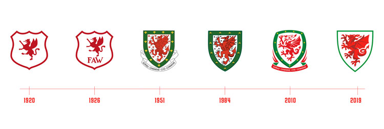
FA Wales rebrands to reflect a “modern nation with an ancient heart”
The new identity is built around the notion of “Welsh spirit” and features an updated dragon design inspired by “chiselled rock and slate”.

The Football Association of Wales (FAW) has been given a new visual identity by London-based design consultancy Bulletproof, positioned around the concept “Built on Welsh Spirit.”
Jamie Gandee, associate creative director at Bulletproof, says that an aim of the rebrand was for the FAW to “stand up alongside the likes of Nike, Adidas and other lifestyle brands”.

It seeks to create a “modern, iconic brand” while also incorporating “centuries of pride, resilience and determination,” according to Bulletproof.
The rebrand also had to “support every level of football in the country”; the FAW covers the National Association, the national team as well as leagues and cup competition.

Bulletproof has updated the Welsh Dragon icon, with a design that is “inspired by chiselled rock and slate carving”, in an attempt to reflect “centuries of Welsh craft and industry.”
Gandee says that this dual perspective was key: “Wales’ great industrial past allowed us to create a brand built on graft and craft, while still giving it real depth and a sense of place.”
The logo was also kept “simple” in the hope that it would “look and feel at home in today’s modern global sporting arenas”.

Bulletproof says that the new branding uses a modular system which is built on horizontal rows “to create something that represents growth and support from the ground up”.
The colours are all “grounded in the Welsh landscape”, according to the studio.
The palette was inspired by everything from “the rolling hills of Glamorgan, to the valleys of the Rhondda and the peaks of Snowdonia.”
Gandee says that “Welsh dragon red” was used throughout with in an attempt to “celebrate the hero and the whole of the country”.

A bespoke font, Welsh Spirit, was also created. It features “chiselled, firm foundations” in an effort to celebrate the “traditional art of Welsh slate carving.”
In the font too, an effort has been made to look to the future, as it combines elements of “modern condensed sans serif typefaces used in sport”.
The new identity started rolling out in August.


C’mon Ireland.
[Bulletproof says that the new branding uses a modular system which is built on horizontal rows “to create something that represents growth and support from the ground up”.] Why post-rationalise everything. Doesn’t need it.