Clover rebrands to take on more “natural” look
The margarine brand has been given a new look by BrandOpus, with the aim of tackling “falling sales” in the butter and spreads category.

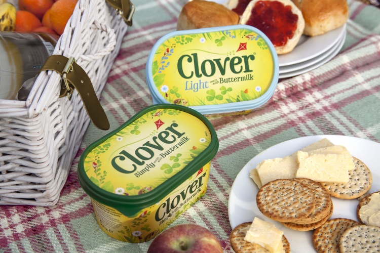
Consultancy BrandOpus has designed new branding and packaging for margarine brand Clover to help it compete in a category of “falling sales”.
The new visual look keeps the spread brand’s yellow and green colour palette, but uses richer, brighter shades. A yellow, green and light blue colour palette has been used for Clover Light. The packaging incorporates more illustrations of imagery such as robins, hedgehogs, kites and greenery.

The logotype has been updated, with thinner lettering that has softer, curved edges and is flatter with no shadow effect.
The clover symbol has also been removed from the main logo lock-up and instead incorporated throughout the packaging design instead.
Kate Jones, design director at BrandOpus, says the redesign aims to evoke nature and the “origins of dairy” by “bringing it to life through a meadow full of quirks, character and inhabitants”.
The consultancy decided to focus on naturalness because it is now a “priority” for many consumers, BrandOpus says.
The butter and spreads market is currently in decline, having decreased 5.1% in market value in 2016 and losing £70 million in value, according to research by The Grocer.
BrandOpus says the rebrand aimed to build “brand engagement” for Clover and help tackle cheap prices and decreased consumer interest in a category of “falling sales”.
The new branding and packaging is currently rolling out in the UK across point-of-sale products, print and marketing collateral and online. Clover is produced by the Dairy Crest Group.

Read this next


Very old fashioned… Birds with musical notes, kites, hedgehogs, ladybirds? I think I can even see the kitchen sink in there. More of a retrobrand rather than a rebrand. Missed opportunity here.
Agreed. I much prefer the previous design. Sorry.