Eric Gill – the past, present and future of type design
As it updates two of Eric Gill’s best-known typefaces, Monotype is delving into the type designer’s archive. We take a look at some of his key sketches, workings and correspondence.
Monotype is updating two of Eric Gill’s most famous typefaces – Gill Sans and Joanna – to create the new Eric Gill Series of fonts.
The new Eric Gill series features more than 75 fonts in three families.
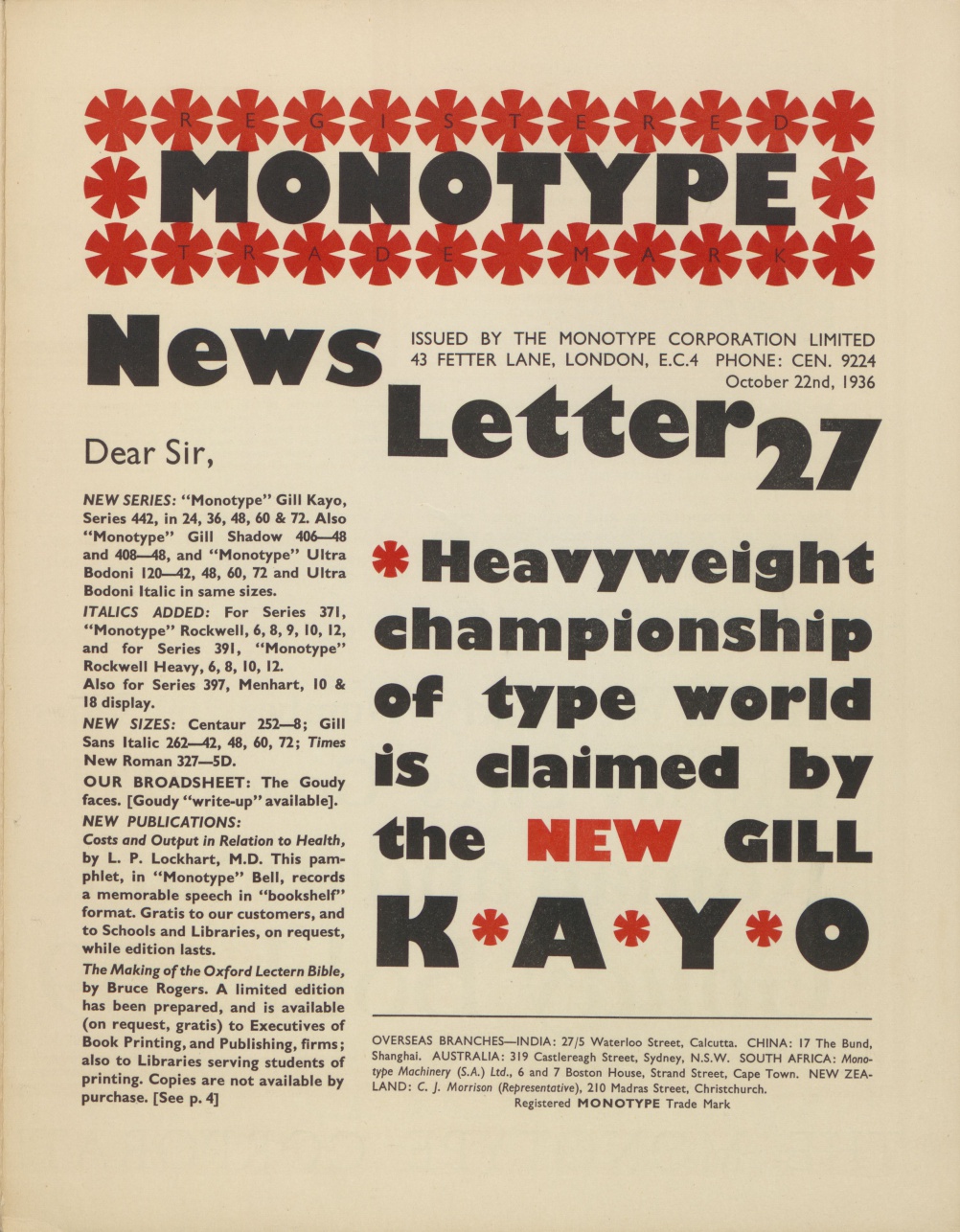
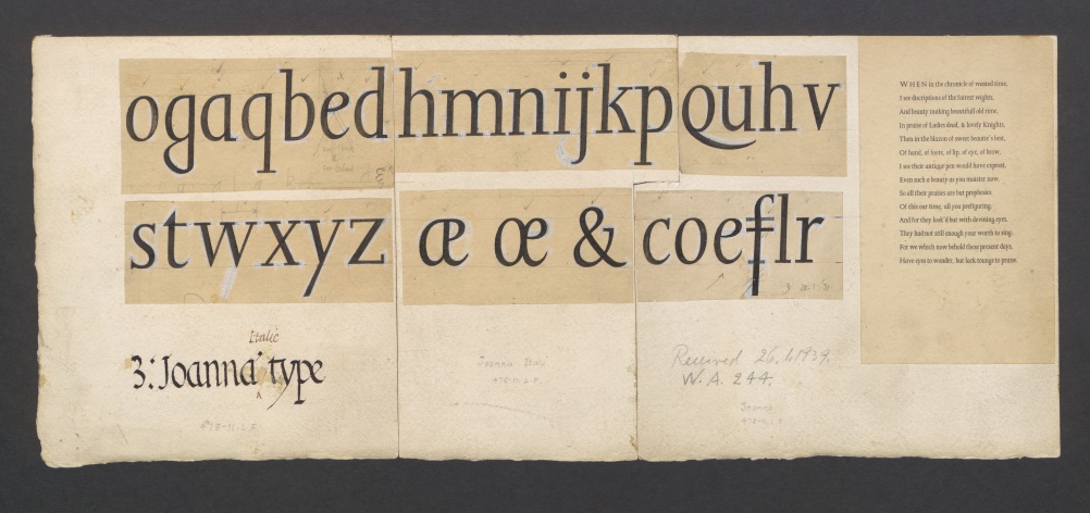
Gill Sans was first released by Monotype in 1928 and became the foundry’s fifth best-selling typeface of the 20th century, while Joanna was released in 1931 and was named after one of Gills’ daughters.
To mark the release of the typefaces, Monotype is set to hold an exhibition at London’s Truman Brewery showcasing archive material relating to the typefaces’ development.
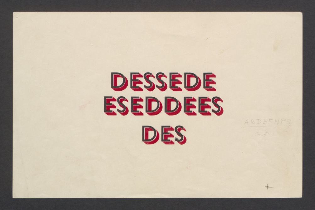
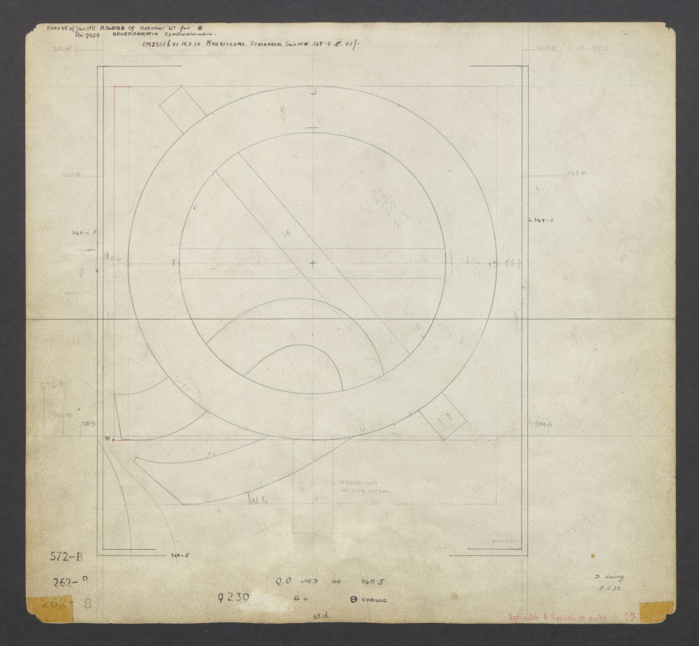
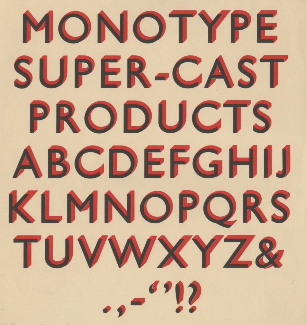
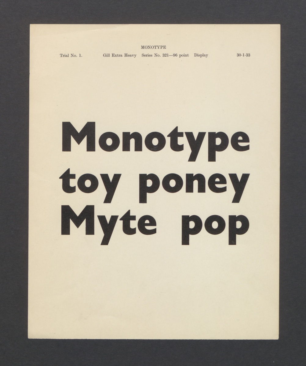
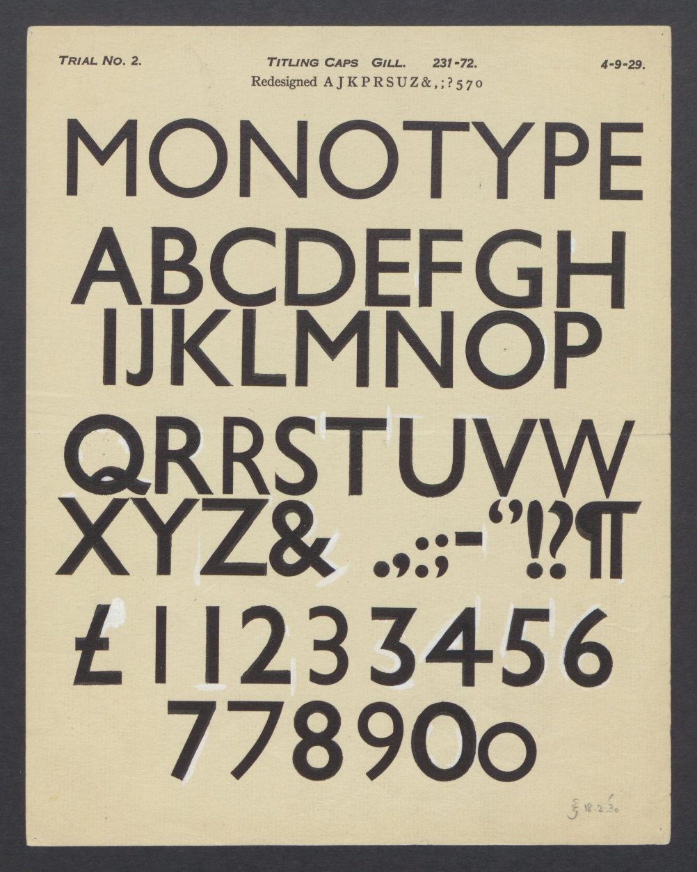
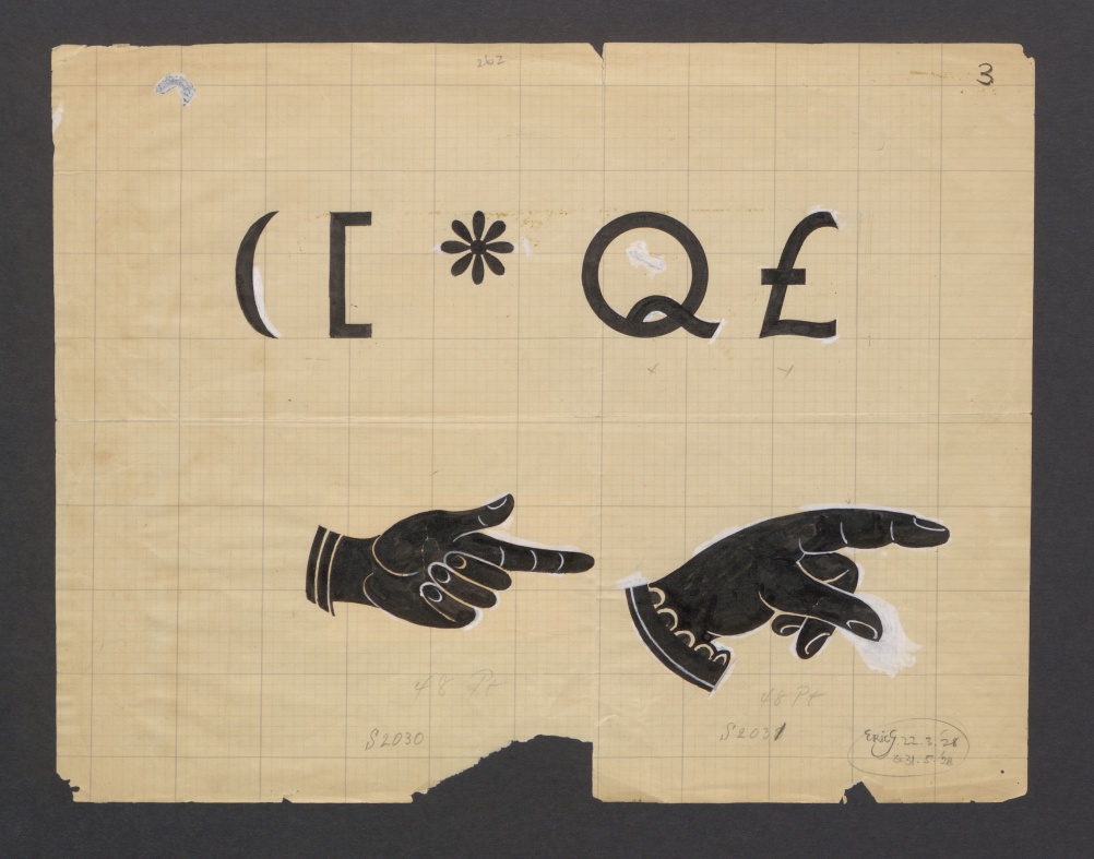
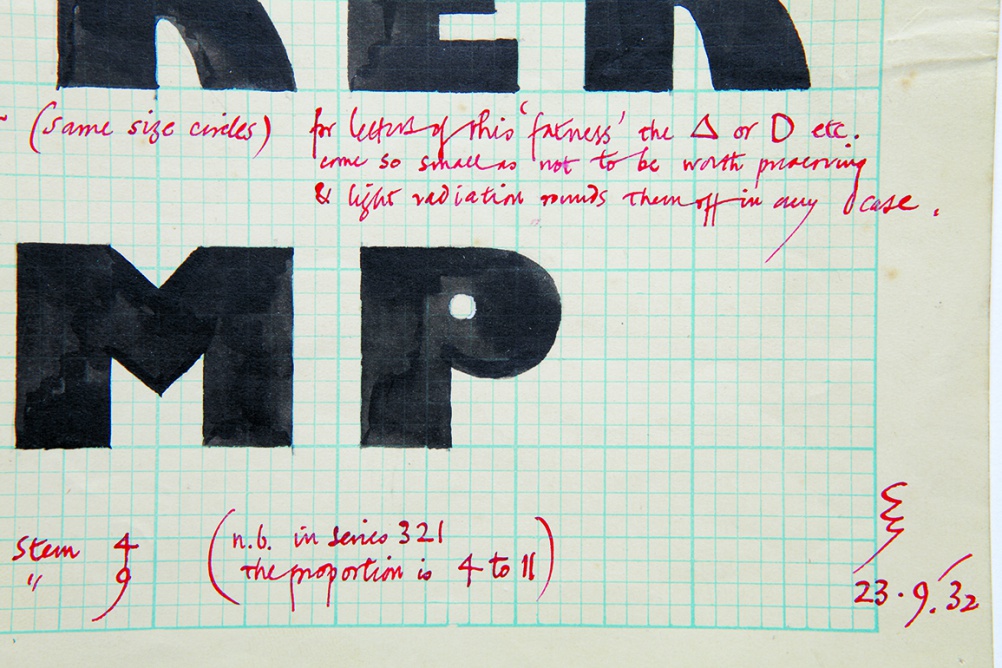
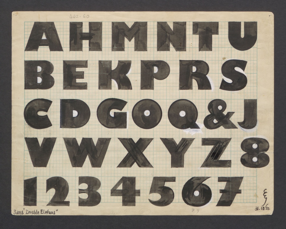
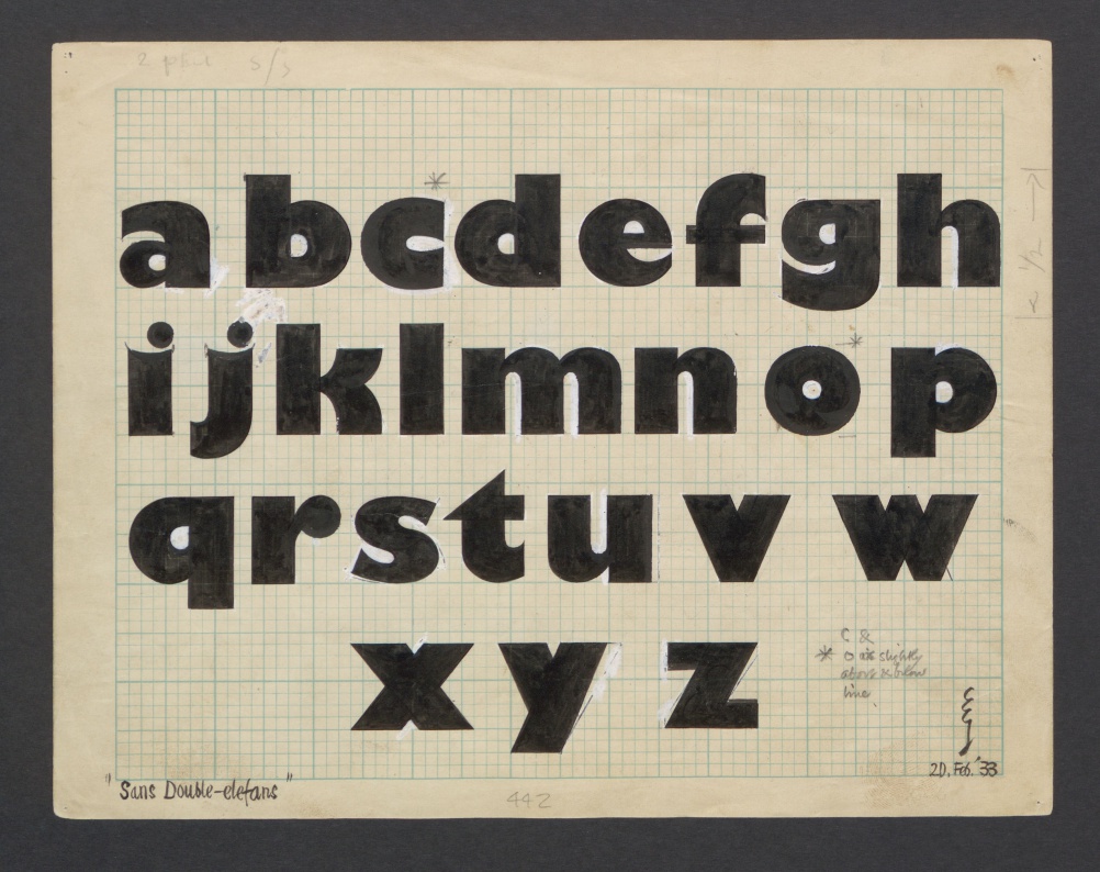
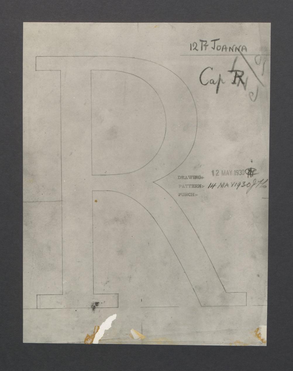
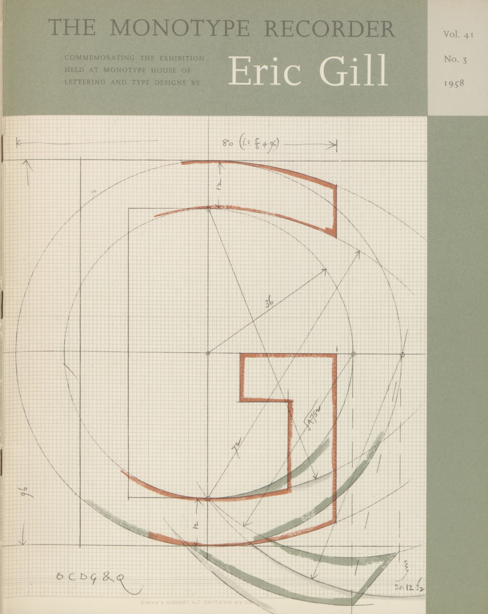
The show will feature test prints for display weights that were never digitised, correspondence and hand-drawings from Gill and copper-plates from the letterpress production of the typefaces.
Visitors will be able to “set” super-sized glyphs of Gill typefaces on a magnetic wall, and consultancy Field has created a digital installation that will aim to “show type as an emotive and adaptive means of communication”.
You can examine some of the archive Gill material in our picture gallery below.
The Eric Gill Series exhibition runs from 4-10 November at the Old Truman Brewery, 91 Brick Lane, London E1. For more information visit www.eventbrite.com.
Gill Sans

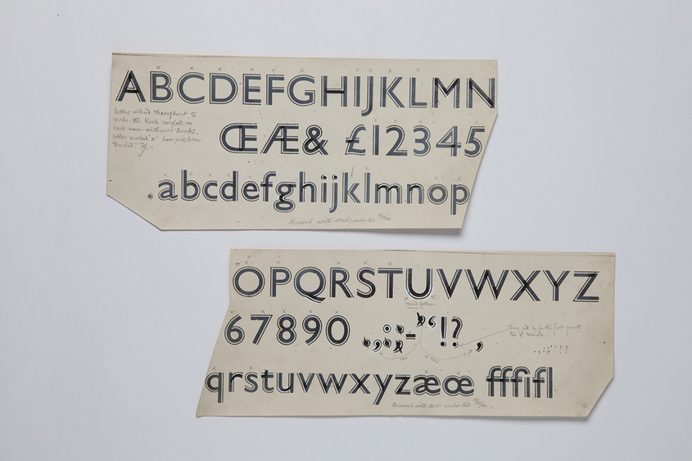
Joanna
Field’s installations
Read this next

-
Post a comment


