New online workspace hire service HeadBox reveals branding
Consultancy Karoshi has designed the branding for HeadBox, a new website that provides bookings for workspaces, and has gone for a cross between a “floor plan and a speech bubble”.
Consultancy Karoshi has created the visual identity for a new website allowing people to hire out spaces and venues called HeadBox.
HeadBox is an online marketplace allowing people to book “creative” and “off-site meeting” spaces, for events such as workshops, brainstorms, training, production and company meetings.
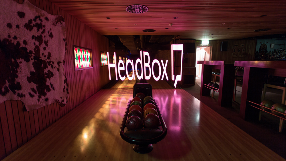
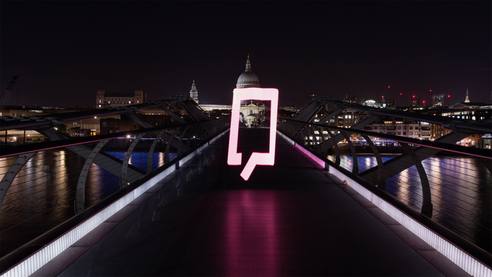
The new logo is a two-dimensional, red, open square, with the brand name next to it.
The consultancy says the marque is “a fusion of a floor plan and a speech bubble”, representing the physical spaces that the company provides.
Ben Vincent, creative partner at Karoshi, says: “The concept of a floorplan literally references the venue or host. The speech bubble contained within the negative space is a nod to the guest’s conversations and the sharing of ideas within these inspirational spaces.
“The square box format becomes a visual mnemonic for the brand name, and the open door represents the unlocked venues.”
Karoshi has also helped to develop the brand positioning with the tagline “Sharing Inspiring Spaces”. It also designed HeadBox’s membership packs, and exhibition and launch event graphics.
The consultancy was appointed to the project in May this year, after being approached by HeadBox’s founding partner Andrew Needham.
The HeadBox website, which uses the logo’s red colour scheme, was designed by consultancy Brilliant Basics.
Headbox currently has more than 1,000 spaces available to book across London, and will be expanding nationally and internationally.

-
Post a comment


