Shelf raising
Own-brand ranges are the success story of supermarkets and because of packaging design they are becoming credible standalone brands, says Liz Farrelly
Supermarkets are, undoubtedly, the biggest players in the UK’s retail arena. What they don’t know about selling isn’t worth buying. Traditionally, though, when it came to aesthetics and innovation, their own-brand packaging was considered to be an industry joke. But not anymore.
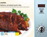
These days supermarket packaging is the place to look for aesthetic and technical innovation; Somerfield’s ready-meals might come in a cheeky faux microwave box, complete with the cooking time displayed as an LED; or, over at Sainsbury’s, its ActiveNaturals Brown Sugar Scrub (you rub it all over) is presented in a sturdy, glass, preserving jar complete with still-life photography of the luscious ingredients. From ideas-based solutions to sophisticated minimalism, the breadth and depth of supermarket packaging solutions is leading the field.
Why? Super-high stakes is one reason. Competition among the multiples (that’s industry jargon for supermarkets) is fierce, Tesco being the leader of the pack. Takeovers and acquisitions are making headlines, the crucial question being, which rival will buy Safeway to instantly increase their number of stores? With all this moving and shaking going on what better time to look at the major players’ packaging strategies, and the end-products?
Whereas in the past supermarkets spent money on advertising and slashing prices (so as to entice shoppers away from local grocers, bakers and butchers), now that our foraging habits have been forever altered and most of the developed world visits one or two supermarkets pretty regularly, the battle is on to turn the weekly-food-shop into a more exciting (and profitable) adventure.
Witness, for instance, Sainsbury’s selling scented ironing water (something you’d expect to only find in specialist retailers such as L’Occitane), and extremely popular it’s proving too. Or how about the Safeway launch of an American range that offers everything you need for a TexMex-themed chow-down (so you can conveniently ‘cocoon’ yourself and treat your taste-buds without grappling those cook-books).
With shopping rated as the UK’s number one leisure activity, why would the multiples be satisfied with just collecting your grocery spend? And, as we align ourselves to favoured brands for everything from trainers to deodorant, the supermarket is cashing in on its biggest asset – its household name.
Lawrence Barnett of Smith & Milton which, along with Parker Williams, looks after much of Sainsbury’s packaging, recognises this as a major spur to packaging innovation. ‘It’s down to the multiples’ growing confidence in themselves as brands. They don’t think of themselves as selling ‘own-label’ products anymore. Consumers see them as trust-worthy brands, so now the multiples can launch various sub-brands which will also be trusted,’ he says.
If supermarkets know everything about selling it’s because they’re doing their homework. Research is what’s pushing product development – identifying consumer trends, analysing the demographic make-up of their huge and varied customer base, and improving the quality of their offering. And with innovative new products, come new challenges for packaging designers.
On the quest to develop new products, there are a couple of different strategies at work; make it fun, impulsive and exciting, or make it a cross-category lifestyle choice and create complete product ranges at various price points.
As Alex Bane of Taxi Studio, which works for Somerfield, explains, ‘The Economy range has to consistently say, “This is good value”. The Premium range has a template too, usually using gold or silver (witness Taste the Difference from Sainsbury’s, Tesco’s Finest and Waitrose’s So Good). It’s in the mid-range that you have to design to brand segmentation, meaning, if it’s a shampoo it has to look like a shampoo. The product has to sell itself in relation to other products of its type. It’s all about having an idea, but also promoting continuity.’
The fastest-growing sector, according to Mintel – and reinforced by Jacqui Sinnatt at Butcher & Gundersen, which has worked with Safeway for 15 years – are ready-meals and cook-in-sauces. ‘People are cooking less and not sitting down to family meals. But the quality of ready-meals has improved so much that they’re now a viable option. They’re real food.’
Sinnatt points to Safeway’s Innovation Team as one reason for the leap in quality. ‘On the Indian range, it developed relationships with Indian suppliers, and then went through the store adding other items to the range. It’s all about introducing a bit of excitement for the customer; Safeway has gone the route of “adventure”,’ she says.
On the design side instead of the corporate personality taking over, which, Sinnatt declares, ‘can become very bland’, Butcher & Gundersen differentiated the Indian range by adopting a palette of rich colours and contemporary typefaces set against a sari-pattern background. ‘Plus, we keep the customer interested by adding secondary cultural information, about spices and recipes,’ says Sinnatt.
Over at Somerfield, Bristol-based Taxi Studio treats each pack as a problem-solving exercise. Taxi Studio’s Bane explains, ‘We look at how people use these products. They chuck the ready-meal box in the bin and then have to fish it out for the instructions.’ So Taxi Studio simulated the stainless-steel microwave facia on the box, complete with cooking instructions.
When it came to fresh salad packs, it again put the information to the fore after realising that customers don’t know what these exotic leaves taste like. ‘We brought the fine-print descriptions to the pack front and displayed it on old-fashioned plant markers,’ says Bane. ‘It’s fun and functional and fits with Somerfield’s mission statement, “good food made easy”.’
Sainsbury’s pioneered the sub-brand approach when introducing its comprehensive Organic and Be Good To Yourself ranges, presenting customers with detailed nutritional information. ‘Sainsbury’s researched the marketplace, identified trends, built a specific proposition endorsed by the Sainsbury’s brand and sold it across the store,’ says S&M’s Barnett.
Taking that logic a step further, Sainsbury’s introduced Perform and Protect and ActiveNaturals, grouping diverse products into ranges closely tailored to niche audiences.
The first combines function and emotion into a ‘family standard’, while ActiveNaturals does ‘exactly what it says on the box’ – in the style of Ronseal. As an alternative to chemical-based products, for personal or environmental hygiene, Sainsbury’s developed natural ingredients with active properties into innovative products, for example, tea-tree oil antibacterial washing-up liquid.
The packaging reflects this back-to-basics approach by using aluminium screw-tops, glass jars and a simple spray-bottle for the infamous ironing water. There’s a yummy, pampering edge to it too, with foodie ingredients almost good enough to eat. You may pop in for that washing-up liquid, but, thanks to packs that stand out a mile on-shelf, you could end up with an Exfoliating Face Cream, smelling of peach and strawberries, in your basket.
Sainsbury’s latest store concept, called Sainsbury’s Market – housed in the Conran-owned former Bluebird shop on King’s Road in London – travels further along that route of the more sophisticated the offering, the simpler the wrapper.
Woodward & Company, although not traditional packaging designers, developed a wrapping system to fit with its signage and retail environment. Lucy Woodward describes the offer as, ‘really foodie, more Borough Market than Harvey Nichols. You’re literally eating the best food standing in the gutter, but you’re prepared to pay for it; it’s just not cool to be posh’.
Inspired by the farmer’s market ethic, seasonal foods are sold at Sainsbury’s Market from stalls, staffed by expert butchers, bakers and fishmongers. Providence and great quality are guaranteed, while the aesthetic aims to be ‘simple and uncorporate’.
‘We used wax-wrap, brown paper, twine and personalised stickers for each stall, and a rustier orange/tamarind colour for the logo,’ explains Woodward.
‘The printer kept calling us up saying, “It’s all a bit rough”, and we would have to tell it, “Yes, that’s what we want”.’ The ecological aspect of this approach, Woodward describes as ‘subliminal, we just thought, the less packaging the better’.
Will Sainsbury’s Markets be rolled-out nationwide? Are we in for a foodie revival that will challenge the supremacy of the ready-meal? Either way, packaging designers will be adding that special ingredient.
-
Post a comment


