Top billing
Richard Clayton finds only a few inspirational posters that actually entice him into the cinema
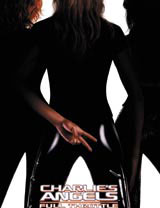
Whatever happened to film poster design? There was a time when it dazzled with infinite variety: Richard Amsel’s painterly illustrations; those angular Saul Bass montages; Bill Gold’s in-your-face punchiness; Sam Shaw’s cinéma vérité-style photography; Bob Peak’s brooding artwork on Rollerball and Apocalypse Now.
Like so much in the Hollywood story, the 1970s proved a turning point. These days, the discipline is subject to a global machine that churns out publicity with all the wit of an automaton. Celebrities set the parameters for typography and layout – Leonardo DiCaprio’s head in nth proportion to the title – and imagination is ruled by genre.
A fair assessment, or nostalgic hyperbole? The classics are certainly part of a thriving memorabilia industry, witness the success of www.reelposter.com. Contemporary versions rarely catch the eye. Johnson Banks principal Michael Johnson – evangelical about Alan Aldridge’s 1969 Chelsea Girls poster as curator of British Design & Art Direction exhibition Rewind – bemoans the decline in standards.
‘They’ve been appalling for some time,’ he says. ‘It’s this key-scenes-from-the-film approach, or else the dominance of the stars.’ His group tried a couple of projects with a distributor, but soon aborted the attempt.
‘We devised daggers in the snow for an awful remake of Sleeping Beauty. But it was much too symbolic for the producers. “Where’s [the film’s star] Sigourney Weaver?” they asked.’
Andy Nicholaou, an art director at The Creative Partnership, is a veteran of around 20 poster commissions a year. Normally, artwork is imported from the US and adapted for local conditions. Where a designer has more latitude, the results are still impressive.
‘With [British sci-fi horror flick] 28 Days Later, director Danny Boyle was really involved and we had a licence to do anything we wanted,’ he says. ‘It was almost like an album cover, but those projects are few and far between. [Even] with Johnny English, the spoof James Bond comedy, every shot was retouched. Rowan Atkinson tried to look as good as Natalie Imbruglia. But not many can do that.’
The Creative Partnership is handy with a teaser campaign though. The build-up to the ‘reveal’ of 28 Days Later involved a comic-book tale, told via escalator panels at Tube stations. Nicholaou is planning a similar effort for the ‘character-based’ superhero yarn League of Extraordinary Gentlemen released 15 August.
‘There’s a trap here to think that it was all much better in the good old days when you had artists drawing posters,’ says Film Distributors Association chief executive Mark Batey. ‘What [distributors] are trying to achieve through graphic material is to get at the essence of a movie to motivate an audience to see it. Around 350 films come out in the UK every year. Posters need to show a flavour of the genre and stars – something compelling that can appear [within a year] on the DVD pack.’
Promoting ‘another popcorn movie’ is completely differently from publicising a Palme D’Or winner. However, as Intro creative director Adrian Shaughnessy points out, most designs are anything but compelling.
‘Film posters should be vibrant bits of street theatre that convey a truthful impression of a film. Instead, they are usually dull, formulaic things that all look the same, and appear to have been designed by focus groups held at gunpoint. Which is just like most Hollywood films, I suppose.’
Differentiation amounts to little more than labelling a tin of beans, and the advertising does depend on the product. But while directors like Spike Jonze, Steven Soderburgh and Alexander Payne are developing a kind of commercial auteur theory on screen, it isn’t translated to their graphics.
‘That one with Nicolas Cage’s head as a flowerpot [Adaptation], I actually stopped and looked at it,’ Johnson reflects. ‘But you could see it’s been “Photoshopped”. They should’ve used a real model.’
Shaughnessy says the poster he and Intro designer Julian House created for Morvern Callar came about because Lynne Ramsay ‘approached [it] in the way the best music packaging is approached’. But it’s rare for directors to have such clout.
For the purists, working in today’s movie business might be a case of ‘how I learned to stop worrying and love The Matrix publicity’, unless a few more maverick producers can say ‘the designer stays in the picture’.
-
Post a comment


