Chocolate packs by Pearlfisher
Pearlfisher has redesigned packaging for Green & Black’s, which goes on shelf from this week, as the chocolate brand seeks to evolve a mainstream and premium positioning away from its original niche, organic appeal.
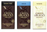
Pearlfisher has redesigned packaging for Green & Black’s, which goes on shelf from this week, as the chocolate brand seeks to evolve a mainstream and premium positioning away from its original niche, organic appeal.
The revamp is the first major change to the brand’s image since its launch a decade ago, says Pearlfisher deputy creative director Sarah Butler.
The consultancy established the brand’s previous look in 1994 and has been brought in now to help it compete on-shelf against the likes of Lindt and Galaxy.
Butler says, ‘The previous design stood out in the organic category but lost impact in the mass market.
‘The redesign simplifies the pack and introduces a rich, dark brown as the primary background colour across the whole range. There’s still colour-coding on the top of the pack but there’s now something continuous about the entire look.’
As a company, Green & Black’s is known for giving its commodity suppliers a ‘fair-trade’ deal. The ethical messages behind the brand have been retained but with less prominence on pack, says Butler, as these values are increasingly ‘generic’.
The overall aim is to create a more luxury, quality and sophisticated appeal, she adds.
Pearlfisher won a pitch against Duffy in March to work on the project for an undisclosed fee.
Read this next

-
Post a comment


