
A folklore-inspired rum brand with “hidden” design details
The Duppy Share Spiced identity is inspired by Caribbean folklore and has subtle details, like UV illustrations which aim to appeal to a younger crowd.
A new range of rum has been branded by London-based design consultancy B&B Studio.
The Duppy Share Spiced is the first new line from The Duppy Share, a rum brand that was established in 2015.
The latest variant is infused with new flavours — pineapple, kola nut and Caribbean spices — and is intended to be used for cocktails and in mixed drinks.
According to the drink’s founder, George Frost, the latest addition needed to “feel accessible and relevant to partygoers and social drinkers”.
With this in mind, B&B studio, who also designed the drink’s original branding, focused on the element of “mischief”.
Depicting a duppy

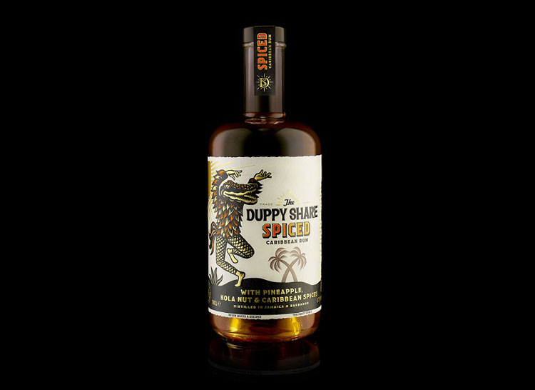
The packaging features prominently the figure of a duppy. In Caribbean folklore, the duppy is a beast who emerges at night and steals the best rum from the barrels as it ages.
Despite lending its name to the branding, the original drink’s design does not depict the duppy. Shaun Bowen, creative partner at B&B, says that the decision to feature the duppy was to show “more closely the character-driven convention of the spiced rum category, seen in The Kraken, Captain Morgan and Sailor Jerry”.
The duppy, however, has no “definitive or universally recognisable” form, so how to depict it became the studio’s “key design challenge”.
The solution was to “envisage the duppy as a shapeshifter, continually taking on a multitude of forms,” Bowen says. B&B’s duppy — which has been captured in a “moment of transition between different creatures” — has a crocodile head, a feathered torso and human hands. The studio hopes that the illustration will make the bottle an “instant shelf stand-out”.
In the illustration, the duppy is dancing on a beach which B&B says “speaks to a more youthful consumer”.
The bottle for this range is also different. It features a longer, thinner neck which “suggests a pouring spirit”, according to Bowen. On a more practical level, it also means that bartenders are more easily able to work with the drink at a busy bar.
Hidden design details
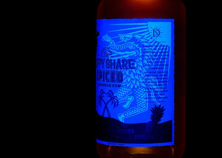
In keeping with the mysterious inspiration, there are a number of “hidden” details in the new branding. There is a UV illustration, which shows a picture of the duppy in the dark in a way that mirrors the creature’s night-time activities.
In the copy there is a nod to this UV element in the phrase: “moonlight is for mischief”. “Never waste a second” is the founder’s motto for life, which is inspired by his father.
Beyond the duppy, the landscape shown — with its palm trees, textured patterns and orange, black and gold colour way — ties into the wider brand design. And while the new bottle is different, its “distinctive shouldered” shape is another “visual parallel” between the new drink and the original.


-
Post a comment


