
“Time is money”: Designing a daily visual reminder of the gender pay gap
Aiming to “empower conversations”, the Lost Time Project has created a calendar that calls attention to the gender pay gap and the days that women “work for free”.
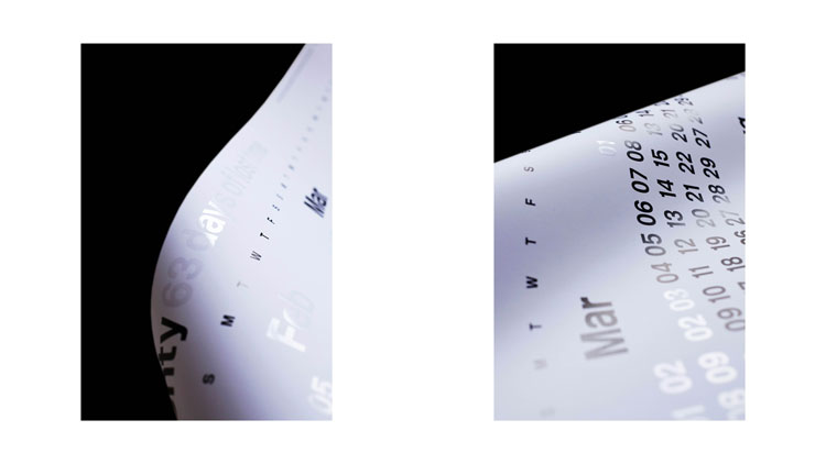
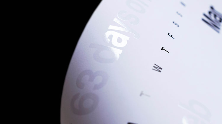
In 2020, the UK’s gender pay gap stands at 17.3%. While this is slowly closing – this year’s figure is down from 17.8% in 2019 – it still means that for the first 63 days of the year, women effectively work for free.
These statistics were the driving force behind a new graphic design initiative called the Lost Time Project. Led by associate Pentagram partner Alice Murray and Redwood creative director Lauren Priestley, the project has produced a wall calendar which aims to “catch someone’s eye, start a debate, change the way people think” around the gender pay gap.

“An eye-catching reminder”
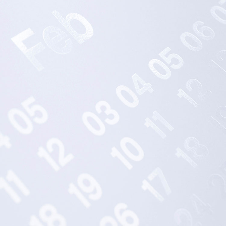
The print itself is B1 format and features the days of the year from 4 March in black type. From 1 January to 3 March however, the numbers have been printed in “invisible” Spot UV gloss to represent the “lost” time.
For the typography of the calendar, the Murray and Priestley opted for New Rail Alphabet, a revival of the original British Rail typeface designed by Margaret Calvert in the 1960s by London-based foundry A2-Type.
This large size and bold design, according to Murray and Priestley, has two purposes: “It’s eye-catching, but it also serves as a daily visual reminder”.
Additionally, having a physical wall calendar, rather than something digital, “removes it from the content overload media we are attached to daily”, they say.
“A wall calendar is innocuous, a universal representation of time, so we wanted to play into that,” Murray and Priestley tell Design Week.
“It feels like now people are ready to listen”
According to the pair, representing the gender pay gap in terms of time rather than money helps to “bring [the issue] to life”.
“Ultimately, raising the conversation, boosting confidence and sparking action are all aims of the project,” they say, adding that creating the calendar in 2020 felt right because “it feels like now people are ready to listen”.
By empowering people to have these conversations and equipping them with the relevant information, Murray and Priestly hope the project can resonate with everyone, not just women: “This is a project for everyone; men, women, non-binary – it affects all of us to have a gender pay gap and it should be all of us that want to change it.”
Indeed, as part of the initiative, they suggest those who can buy two copies of the calendar, so that one can be sent by the Lost Time Project to the buyer’s CEO. All profits from the sale of the calendars goes to Ladies, Wine & Design, Creative Equals, and Designers Speak (Up).
“A simple message, a simple fact”
This year’s calendar is the first offering from Murray and Priestley’s Lost Time Project, but the team plan on making future editions to further highlight the issue.
“Something we want to explore is the different pay gaps throughout the world – New Zealand is very different to the US and the UK, for example,” they say. Another idea the pair say they’re considering is launching different calendars for different industries.
Ultimately, the aim is to keep the message and the design easy to digest: “It’s a simple message, a simple fact – so the design [needs] to be simple, too.
“It’s through creativity and design that issues like this can come to light in an eye-catching way. And, graphic design has the power to turn something that’s so everyday – there’s nothing more mundane than a wall planner – come to life, be beautiful and have meaning.”
The Lost Time Project calendar can be bought from www.losttimeproject.com.
Read this next

-
Post a comment


