
Pantone unveils 315 new colours in digital expansion
The colour company, which famously picks a colour of the year, also announced “supporting digital solutions” for its design system.
Pantone has introduced 315 new colours, and a new organising system to “streamline” the choice.
The American colour company, known for choosing a colour of the year, is adding new shades across its palette.

Leatrice Eiseman, executive director of the Pantone Color Institute says: “The colours that are influencing design today have evolved to reflect shifting societal views, new technological innovations, and a truly global outlook.
With the ability to interpret the influence of colour on overall consumer psychology, we have enhanced the utility of our Pantone Fashion, Home + Interiors Colour System with this new collection of engaging hues, enabling the design community on the cutting edge of colour selection.”
The updates are based on trend forecasting, and client and consumer research, according to Pantone.
What are the new colours?
As “traditional understanding of reds continues to broaden”, updated shades include Fire Whirl, Adrenalin Rush and Watermelon which represent the colour’s connotation from “protest to statement to individuality”.
Pink which has “embraced new meanings and relevance beyond its traditional gender and child-like status” has been added to with paler tones with Slightly Pink, First Blush and Tender Touch, as well as more “evocative” shades such as Sangria Sunset and Viva Magenta.

The “endless” interpretation of blue has also been expanded with the “ethereal” Engless Sky and Ebb and Flow as well as a more fashion-inspired take with denim colours such as Soft Chambray and Rain Washed.
There are additions to the entire colour palette, including purple, orange, yellow, brown, neutrals and taupes, greens, whites, greys and black.
“Colour innovations”

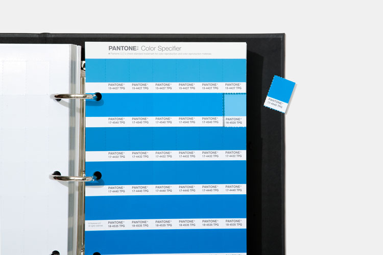
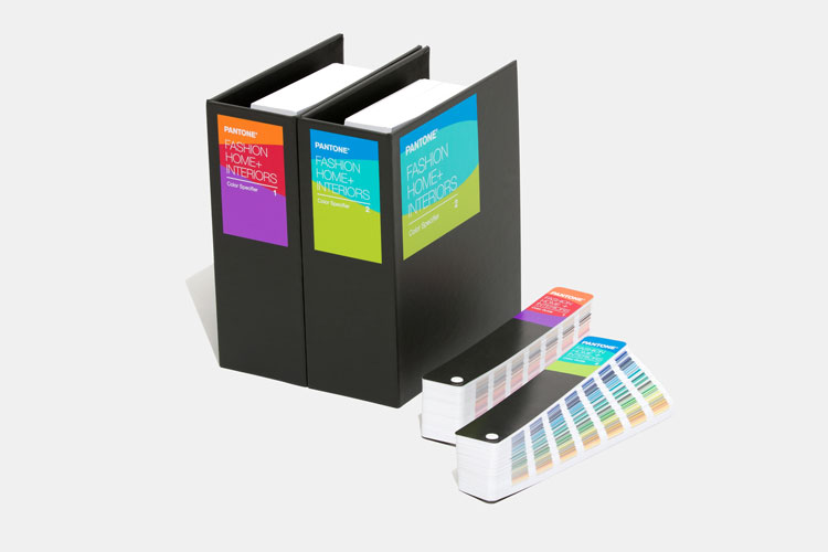
The Pantone Fashion, Home Interiors Colour system is targeted at those who work in apparel, textiles or soft goods. The colours work across mediums, from cotton to plastics, pigments and coatings. The service enables design professionals to find and choose colours for projects with precision, according to Pantone.
It says: “When a designer in one country communicates and specifies in Pantone, they know without question their colour intent will be immediately understood by their production partners across the world, making colour management easier and more reliable.”
The suite has been updated in the attempt to help creatives “use the colour language to select, communicate and control colour throughout the design process”.
Updates include a layout system that has been “restyled” for designers. The formats have been “refreshed” so that designers can find the right colour and shade “faster than ever” out of a choice of 2,625 shades. Pantone hopes that this “enables designers to more quickly turn inspiration into a product reality”.
The technology also “enables new colour innovations”. Using “spectral data” – data that has been broken up into oscillations of length or scale – it is hoped that designers will be able to “streamline digital and physical workflows”.
Pantone Colour of the Year 2020

Pantone is perhaps best known for picking a colour of a year. 2020’s choice was Classic Blue, chosen for its “constancy and confidence” in a time a time “that requires trust and faith”, according to Eiseman.
The colour of the year process has been running since 2000, as a way to highlight trends in the colour and wider design industry. Classic Blue was also a nod, for example, as “genderless in outlook and seasonless”.
It was also the first “multi-sensory” colour of the year, with Pantone collaborating with creatives from the fields of music, food, fashion, beauty and technology to imagine Classic Blue as “a sound, a smell, a taste, and a feeling”.
Little is known about how the colour of the year is chosen, though designers spoke to Design Week about the process with mixed views. While some called the selection “narrowing”, others said it was an “interesting exercise in terms of trends and forecasting”.
Read this next


Hello, i’m interesting to get the Pantone colours. I’m Graphic Designer and the name of my company is Art-Layou. How can I get the and the price…Thank you!!!
Art-Layout (sorry for the mistake)….and how can i get them…