
Pentagram redesigns The New Republic to match its “forward-thinking content”
Eddie Opara and his team have created a typographic identity for the New York-based liberal journal and its accompanying website.
Pentagram partner Eddie Opara has designed a new identity for The New Republic (TNR) magazine which aims to “reflect its robust brand of liberal inquiry”, the studio says.
The work includes a new brand identity, editorial work for the print magazine as well as a new look for the magazine’s digital platform and its sub brands.
Founded in 1914, The New Republic is a New York-based journal of liberal opinion which addresses wide-ranging societal issues, touching on politics, culture and art.
Throughout its history, it has attracted notable figures from the world of literature and politics, including writers like George Orwell and Virginia Woolf.
A “modern media organisation”

Since the magazine’s beginnings, Pentagram says that the title has “evolved” into a “modern media organisation with the mission to respond to the current political movement as changing conditions demand”.
Among these is a response to issues like “racial and gender equity and climate change”, Pentagram adds. The new design hopes to “connect with these potential readers”.

The new look “reinvigorates” the magazine with a look that hopes to match its “forward-thinking content”, the studio says. It also hopes to engage new audiences, as it expands further into the digital sector (with a podcast series, for example) and also live events.
The magazine’s editor Win McCormack says: “We have tried to design a contemporary TNR suitable for the unparalleled and fraught period of political history in which we find ourselves now.”
“Sharp, refined and open”
After researching the magazine’s “singular place” within political and cultural opinion, Opara and his team created a graphic language that is “sharp, refined and open”, which frequently uses typography to create a balance with the pared-back visual content.
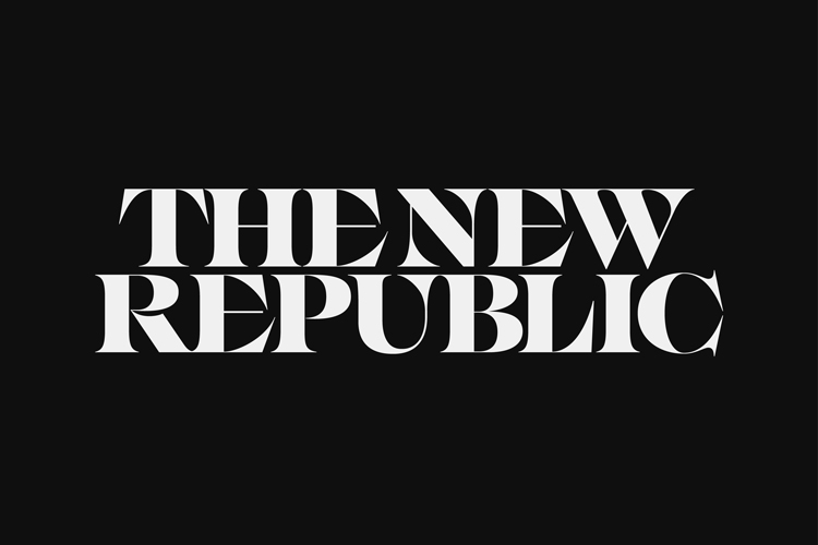
The wordmark is set in an “experimental serif font” IKANSEEYOUALL, designed by Swiss Typefaces which was chosen for its “flared serifs, strong contrast, and great craftmanship”, Pentagram says.
It has been “modified slightly” for the magazine, the studio explains. There are “custom connection points to help uniformity in the lockup” which can be seen below.

The magazine’s original logo – a colonial ship which displayed a rendering of the TNR – has been replaced. The ship was inspired by a passage from American poet Walt Whitman’s work Leaves of Grass, but it was “no longer clear” or “inclusive”, Pentagram says.
Elsewhere, an increased weight in the thinner strokes aims to “enhance legibility at smaller sizes”.
“Maximum graphic effect”

On the cover, the “powerful” masthead is paired with “cover art direction that uses type and image for maximum graphic impact,” the studio says. One recent cover shows an illustrated version of the Lincoln Memorial with the statue’s face in its hands.
Inside, the magazine has a new 12-column grid system that “improves readability and offers greater flexibility to utilize illustration and photography”, according to Pentagram. Four core typefaces are in use: Eksell Display, Stadt, Fakt and Tiempos Text.
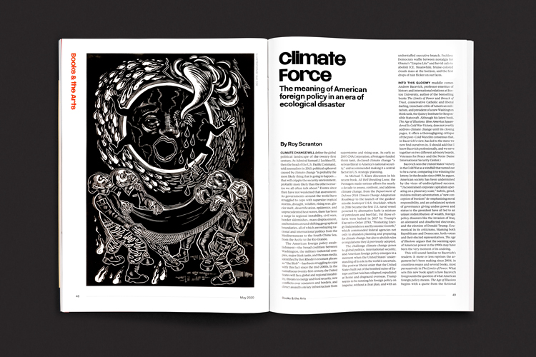
These are used to denote different sections of the magazine. For example, the “exuberant” Eksell Display is used for headers, which run vertically on the first pages of the magazine (entitled “Signs & Wonders”).
A further ten typefaces have been added for the features which have been chosen for the “voices and viewpoints” they “lend to individual stories”, Pentagram says. These include Coign, Reckless Neue, Brenner Slab and Wayfinder. Long-form pieces are set in Tiempos Text.
An “imaginary typographic matric”

Pentagram adds that the team has created an “imaginary typographic matrix” that the TNR design team can use to help them chosen one of these fonts.
The matrix has two axes – from “Serious to Light” and from “Past to Present/Future” – against which the articles’ subject matter can be plotted. From there, the designer can select the most “appropriate” typeface for the piece, the studio says.
The digital platforms

An expanded colour palette has been created for the magazine’s wider brand world, which includes a live series of salons and readings. A new identity has also been created for TNR’s first podcast outing, “The Politics of Everything”.
TNR’s website has been relaunched, which hopes to “translate” the print redesign while also establishing the site as a “dynamic platform in its own right”. The website is “playful, appealing and direct”, Pentagram says.
An increased published schedule seeks to “bring reads back daily for new content”, in the face of rivals such as The Atlantic (which had its own redesign last year).
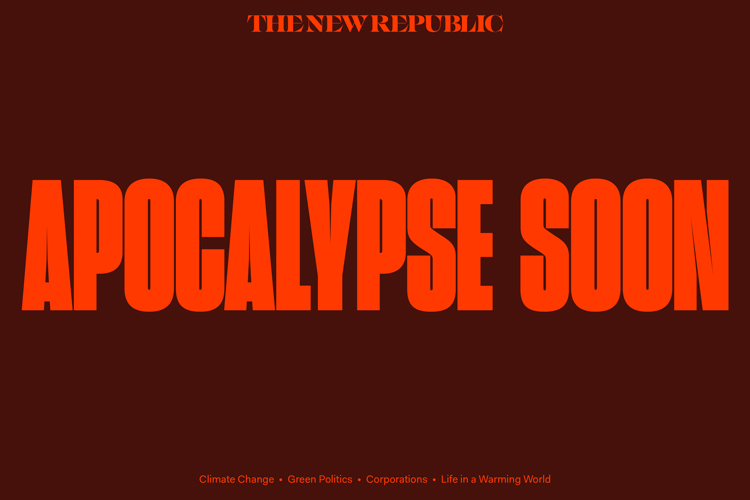
Four new editorial verticals have also been designed: The Soapbox (about politics), Apocalypse Soon (on climate change), Critical Mass (on culture) and Sold Short (on inequality”.
Once more, different type has been used to “differentiate” the verticals (each has its own colour scheme too). The four sections also all have has its own logo, taken from the magazine’s fonts.
This seeks to gives each section “its own character and voice as a channel in the TNR universe”, Pentagram says.


-
Post a comment


