
Rebrand brings smile to Royal National Institute for Deaf People
The charity has reverted to its previous name after more than a decade as Action on Hearing Loss, with new branding led by design studio Someone.
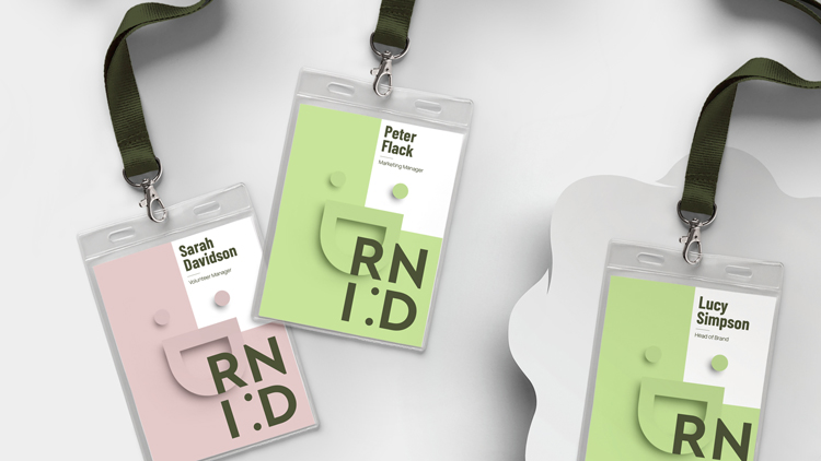
The Royal National Institute for Deaf People (RNID) has rebranded with a new visual identity from London-based design studio Someone, which incorporates a smile device.
The studio worked with the charity’s in-house design team and brand consultant Dan Dufour on the project which comprises a new logo, wordmark, bespoke illustrations and photography.

The charity was established in 1911 in London by deaf banker Leo Bonn. It aims to create a more inclusive society for those who are deaf or have hearing loss, as well as testing out new treatments for people with these conditions.
According to the charity, 1 in 5 adults in the UK have a form of hearing loss while 1 in 8 have tinnitus.
Returning to a “much-loved” and “better recognised” name
The new visual identity accompanies a name change for the charity. This renaming process was underway when the studio joined the project, Someone founder Simon Manchipp tells Design Week.
In 2011, the charity changed its name to Action on Hearing Loss in a rebrand led by design studio Hat-Trick in collaboration with copywriter Nick Asbury.
The charity announced that it would be changing back to its previous name as research showed that it was “much-loved, preferred and better recognised”.
RNID head of brand Cheryl Hughes says that the new identity “is focused on positivity” with details that “celebrate diversity”. “We might be over a century old, but it doesn’t mean we’re stuffy and formal,” she adds.
Making life “fully inclusive for deaf people”

Manchipp says that the studio carried out research with 6,000 people to find a new strategy. The result of this was a redefined purpose: “Together, we will make life fully inclusive for deaf people and those with hearing loss or tinnitus”.
The designer says that the charity is involved with “many kinds of experience” and the brand needed to be “clearly open to all of them”.
One of the most prominent parts of the identity is a new logo which takes the form of a smiley face (made up of a colon and capital D from the RNID wordmark).
This “radically reconsidered” design “brings charm to the category with a smile at its heart”, the studio says.
“Progressive and unusual”

The “modern sans serif” typeface Barlow, designed by Jeremy Tribby, has been chosen for its “kinder, warmer, more inclusive feel”, Manchipp says.
The “flexible” family of fonts has 54 styles with three widths and nine weights, making it “suitable for large and small digital and print use”, he adds.

A “progressive and unusual” colour scheme comprising green and pink tones has been chosen which “avoids the hard punches of primary palettes”, the design studio says.
A “unique illustrative style” has also been adopted which helps to “differentiate and aid storytelling”, according to Someone. These include speech bubble icons that are used throughout physical and digital material.
“Culture and language is constantly evolving”

According to the studio, RNID is going to publish its new tone of voice guidelines online as a way to “encourage deaf people to help shape the language the charity uses”. The refreshed tone aims to be more “conversational” and “less formal”.
RNID digital director Michael Wilkinson says: “Culture and language is constantly evolving and we want to make sure we reflect that in the way we speak as a brand.
“That’s why we’re going to be publishing our tone of voice publicly and inviting people to help shape its future direction.”
The identity launched this week and will be rolled out fully throughout the upcoming year.
What do you think of the rebrand? Let us know in the comments below.

-
Post a comment


