Latest signing
Wayfinding is not the only concern for designers of sports stadium signage, argues Katy Greaves

As the next winter sports season gets ready to kick off, some stadiums are undergoing renovation. Sports, and football in particular, continue to draw the crowds, necessitating bigger and better stadiums. And with the ever-spiralling price of sponsorship deals, clubs now have the wherewithal to build them.
However, what generally happens with stadiums, certainly in the past, is that grounds are developed piecemeal as the club accumulates a big enough crowd or sufficient money. This means that the signage in many stadiums is a confusion of old and new.
Pentagram, for instance, is working on the signage at the multi-events centre, Wiener Stadthalle in Austria, which is being extended to include more retail outlets and hospitality wings. ‘There are a couple of generations of signs on top of each other,’ says Pentagram partner Justus Oehler. ‘The main problem being that the original architect in the late 1950s used signage with different colours for different entry spots in the hall. However, more signs were put up at a later stage in the 1970s that use colour coding, but not the same colours as the original. The results are understandably confusing.’
When you have tens of thousands of people converging on a stadium for an event, clear wayfinding is paramount, otherwise chaos will ensue. In this regard, ‘It is important to provide all the information in digestible chunks: the right information in the right amount at the right time, to avoid overloading the consumer with too much too soon,’ says Springetts chief executive Pete Green, who has worked on Twickenham, Old Trafford and most recently, the signage for West Ham at Upton Park.
Justus Oehler compares the hierarchy of information to an onion: the outer layer is the information on the ticket and subsequent layers correspond to the train station, or car park, followed by the stadium itself, narrowing down to the stand and individual seat numbers.
Green adds, ‘It should be designed to give the consumer enough information to simply get to the next level.’
Wayfinding, health and safety, and crowd management are important functions of signage. But Eigg director Daniel Lister, who designed the identity for Liverpool’s Anfield stadium, has other concerns. ‘You need to look at implementing subtle aspects of team colours and part of the logo to build up the excitement for the supporter,’ he says. This is easy for, say, a football ground that is used exclusively by one team, such as West Ham at Upton Park, but more complicated when a stadium plays host to a number of different events.
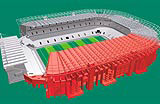
For instance, Twickenham is used for everything, from Jehovah’s Witness conventions to sales conferences and banquets. It is the home of the England rugby team, which may be playing host to overseas teams who don’t speak English. It is also the site for cup finals, which may be played between two teams from the north of Britain. For this reason, it would be inappropriate to brand the signage with the England rugby team. ‘Therefore, the signage system is mainly preoccupied with delivering information that gets people from A to B,’ Green explains. Computer-generated wire-frame illustrations on the Twickenham signage allow visitors to easily orient themselves within the stadium.
Upton Park, on the other hand, ‘Will only ever be used for West Ham,’ says Green, ‘Tina Turner’s never going to play there and with the best will in the world, they’re not going to Europe in the near future. It meant we were able to deliver more of an emotional message.’ The new signage at West Ham will feature huge claret and blue signs, showing photos of the club’s football heroes, from old legends like Bobby Moore that appeal to grandad, to his grandson’s contemporary idols like Zinedine Zidane. ‘Every piece of information acts as a visual reinforcement of the brand, even a sign that says “toilet” should be more exciting because it’s obviously an Upton Park toilet,’ says Green.
Balancing wayfinding with branding is an art, and Oehler cautions that in certain situations too much colour can, ‘cheapen the architecture and make it look like Lego’.
Lister agrees, ‘You have to ensure the sign doesn’t become over-complicated, particularly with directional signage that has to have some authority. Signage relating to food and beverage can afford to be richer.’
Branding signage becomes even more complex when the brand represented is not the club itself, but the club’s sponsor. Signage can play an important role in reinforcing the link between a sponsor and stadium, for instance the Reebok and McAlpine stadiums have never been respectively known as Bolton Wanderers’ stadium or the Huddersfield Town Ground.
However, there’s a fine line between pushing the brand message and alienating the club’s fans. ‘Sometimes the brand of the sponsor can take over the brand of the club,’ says Lister. Some of the newer branded stadiums concentrate signs displaying the stadium’s name around the press boxes so that they are in no doubt as to the correct name to use in copy.
Sport is becoming more and more commercial. It is not just sponsorship; merchandising and retail are big money-spinners and signage can also help. ‘We try to use colour and branding throughout the stadium to excite people into spending money,’ says Lister. Signs, it seems, are never as simple as they seem.
-
Post a comment


