Disparate signs
London is a more walkable city than many imagine, but the current, unpredictable plethora of wayfinding systems doesn’t make it easy for pedestrians. Inspired by the Central London Partnership’s Legible London study, Tim Fendley considers what can be done to improve signage in the capital
London is easy to get around. We have a Tube map – a simple diagram based on an electrical circuit, designed in 1933. Its diagrammatic principle is ideal for showing connections and the relationships between stations. But, while it’s great for travelling on the Tube, when it comes to walking the street, it’s rubbish – yet we at Applied Information Group found in the Legible London survey for Central London Partnership that 44 per cent of people do exactly that.
Other maps are also unsuitable for walking. The A to Z and Multimap, for example, are good for driving, but they do not show the width of roads, line of sight and other details that are crucial for the pedestrian. Add in the wonderfully idiosyncratic positioning of street names – high, low or just missing – and a short walk can be a challenge. The strength of the Tube map, combined with the weakness of pedestrian mapping, produces a distorted sense of distance and direction. We have 27 million visitors every year who know very little of the city, and the inevitable result is confusion.

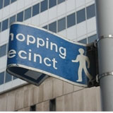
There’s no shortage of information, except when it’s needed. In the Congestion Charge zone alone, we counted 32 different sign systems before we gave up. They appear in different places, some at junctions, some on routes, some have maps, many just ‘finger posts’. They come in all shapes and sizes, and they indicate distances in kilometres, metres, miles and even minutes.
These diverse sign schemes create unpredictability. We do not know what to expect, where to look, and whether, if we follow one sign, there will be another further down the road to help us reach our destination. There are some good sign systems, but they suddenly end halfway through your journey when you reach a borough boundary or a different jurisdiction.
Of the people we asked, only 3.7 per cent used any of the sign systems. Confusion reigns and little confidence exists. Any sign system that tackles a city as complex as London must address how we build our geographical understanding. How do we recognise where we are? Primarily, we use landmarks and names. It depends on context – the London Eye, the Pagoda in Kew, a local church, a patch of grass – whatever is distinctive. London is saturated with these places – key elements that need enhancing to make the city more legible.
People draw mental maps of areas they know, especially when walking. In London these pockets of knowledge are often separate from each other – a result of the city’s size and the scattering of Tube stations and bus stops (the places where we usually start a journey on foot). Indeed, once we draw a roughly 12-15-minute walking diameter around the key hubs in central London, we begin to see how closely these pockets are to each other and how walkable London really is.
How can we connect these pockets? In the modern city, walking is increasingly seen as a transport mode, like cycling. Transport information at Tube stations and bus stops needs to take this into account. Enhancing these modes for the future is something the London Mayor and Transport for London are increasingly aware of, as we have seen with improved information for cyclists. Legible London shows that this is now moving forward in relation to walking as well.
A system for London must be predictable, easy to understand and use progressive disclosure – the right information at the right time. Many of these principles are to be found in the 1963 road signs system, which is still substantially unchanged.
Another key issue is what is needed where. What routes do we need to support, and how do we make the system predictable? We want as few signs in the ground as possible, but as many as necessary to give people the information they need. The grain is different in central and outer London, but the methodology of the system needs to be the same. The information for pedestrians should be integrated across all media, from maps and planners to on-line journey-planning and signs in the ground.
It is a big challenge to get London’s information to connect together, but people want it to happen. The 2012 London Olympics present a fantastic opportunity – it provides a focus that can help people agree the detail necessary to create a system that will stand the test of time.
The Legible London study and exhibition were commissioned by Central London Partnership and funded by Transport of London. The Legible London exhibition is on at New London Architecture, Store Street, off Tottenham Court Road, London WC1 until March 2007
Tim Fendley is creative director of Applied Information Group, which carried out the study
-
Post a comment


