
Rebranding a cryptocurrency marketplace for “humans”
Design studio Alphabet has created the branding, strategy – including logo and graphic interface – for cryptocurrency service, Coindirect.
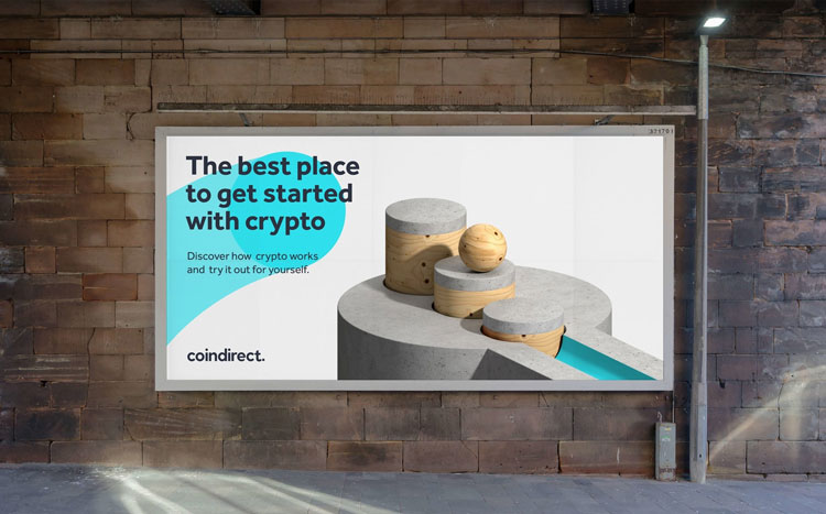
Alphabet has rebranded cryptocurrency platform Coindirect.
The Manchester-based design studio has created the brand identity, strategy, digital interface and messaging for the digital currency service.
Cryptocurrency is a digital asset, that works as a currency by using cryptography to ensure the security of financial transactions. It is distinct to traditional financial systems as it uses decentralised systems, as opposed to a central banking system.
Coindirect is a cryptocurrency trading platform where users are able to trade over 40 currencies including Bitcoin, which is considered the first cryptocurrency.
Making cryptocurrency accessible
Sam Lane, co-founder of Alphabet, tells Design Week that the “core aim was to evolve Coindirect into a contemporary brand with a friendly personality that is straightforward, open and honest”. He adds: “Our client had a clear vision to make the idea of cryptocurrency more accessible to everyday people.”
This led to the creation of a new strapline for Coindirect: ‘Cryptocurrency for humans.’ This in turn influenced the tone of voice for the updated identity, which aims to be “relatable” and “conversational” and to “cut through the jargon often used in this saturated market,” according to Lane.
A graphic system which reflects the “growth of funds”

Alphabet designed a graphic system where a circle represents “the sum of currency” and the gradient trail represents “the movement and growth”, Lane says. The C-shaped “graphic device” can be overlaid on imagery and typography to create branded content.
This circular movement of the shape “naturally” created the form of a C. “This was the most logical and effective solution for the logomarque,” the designer adds.

The stylings of the graphic system and logomarque can also be seen in a bespoke icon pack that’s been created for Coindirect, which aims to clarify the brand’s key features.
Sub-brands have also been created to highlight the work of Coindirect’s three “core” services: Wallet, Exchange and Marketplace.
Animations that appeal to entry-level investors

While it is often talked about, cryptocurrency remains an unknown territory for many. In an attempt to clarify some of this murkiness, Alphabet has created 3D animations that represent “the movement of money in a fun, playful and engaging way”.
“We wanted to create a brand that could cater to everyone and the 3D animations were designed to help entry-level investors in particular understand the intricacies simply and visually,” Lane says.
These animations can also be seen in a poster series.
Avoiding an “off-the-shelf interface”

The studio provided guidance on how the data could be “visualised in the app”, which will be many people’s entry-point to the service. The design details all aimed to clarify any complication.
A “clear” red and blue colour scheme was used, as well as “inspiration” from the logomarque and graphic device to make the user interface (UI) experience “feel seamless with the rest of the brand”, Lane says.
“We wanted the experience to feel bespoke for the Coindirect brand as opposed to just another off-the-shelf interface,” Lane says, “which is why we advised our client to refine and customise the visuals where possible.”


Looks like Alphabet might have (inadvertently or otherwise) borrowed a bit from Pentagram’s design system for TrueCar: https://www.pentagram.com/work/truecar