
Johnson Banks reveals branding for lockdown teaching resource
The studio has designed a complete brand identity including logo and website for online teaching resource, Oak National Academy, in a week.
Johnson Banks has created the branding for Oak National Academy, an online teaching resource.
The London-based design studio has designed the brand identity and website for the platform, as well as creating templates for teaching. It’s been an unusually fast turnaround too; the project was completed in just a week.
Coronavirus has resulted in the closure of nearly all UK schools, and when they might reopen is a contentious subject; a letter created by an NHS nurse urging government to keep schools closed because of the potential health risks has been signed by more than 7,000 people.
Oak National Academy, supported by the department for education, has been created by a group of 40 teachers from state schools across the UK in an attempt to meet the needs of the UK’s schoolchildren. They’ve compiled a pool of video lessons and worksheets, tailored to the national curriculum.
Teachers can use the resources to complement their own lessons until schools reopen. The lessons are free for teachers and pupils.
Finding a “compelling idea in a weekend”

The studio’s founder, Michael Johnson tells Design Week: “We had to find a compelling idea in a weekend – then find a way to be able to film it, animate, code it and illustrate it across multiple channels.”
The academy had already created all the content, and wanted a fast roll-out as the lockdown continued to result in school closures.
Johnson Banks gathered a design team for the project; Peter Grundy for illustration, Matt Ingram for animation, filmmaker Ian Anderson, Nick Asbury for additional copywriting. Design studio Typematic was involved for templating.
Looking for a ‘penny drops’ moment

Oak National Academy provided a challenge for branding, thanks to the popularity of the imagery. “We were initially taken back by the sheer volume of oak tree, oak leaf and acorn symbols already in existence,” Johnson says.
In an attempt to give it a more unique spin, the studio came up with an idea to capture the moment when an acorn lands. “It’s at this point that the transfer of knowledge, ideas, inspiration takes place,” the designer says. To illustrate this, a “vital” shadow becomes part of the logo, which shows that it’s about to land.
“It also becomes a useful way to ring together the iconographic language,” Johnson says. The shadow runs through the bespoke icons, which denote different classes, from Maths to English and Art to History. Icons have also been created for general use, such as social media as well as control buttons for videos.

The way the acorn falls, which Johnson likens to the moment the penny drops or when the apple fell on Isaac Newton’s head, can “flex” in animation.
Montserrat has been used as the font. In keeping with the natural theme, green is the dominant colour in the palette. Yellow has been used in some of the icons, as well as shades of blue for the class templates.
The templates are an important part of the project, as the academy is planning over 180 lessons for each week that the lockdown continues. The system of G-suite templates allows teachers to build their lessons.
Getting the story out
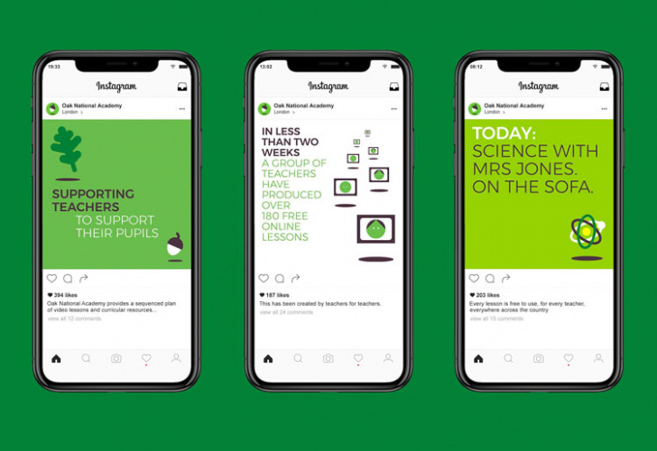
Social media graphics and templates were also created to publicise the teaching resources. these have been effective, apparently. According to Johnson Banks, the website received over 200,000 unique visitors the day of its launch on April 20. 23,000 lessons were started on the first day.
Read this next

-
Post a comment


