Jack Renwick Studio helps architects Monument build-up brand
Full service architecture, design and build company Monument receives new identity based on “building blocks of architectural design”.

Jack Renwick Studio has created a new brand identity for architectural, interiors and building company Monument, aiming to encompass all that the firm does.
Faced with the challenge of creating something which fully reflects the range of services the Newcastle-based group provides, the consultancy chose the brand positioning: “Beautiful spaces from start to finish”.
Jack Renwick, who took inspiration from architectural drawings, says: “Monument needed a new identity that represented its entire offer as a company. They do it all, from planning, to finishes to surveying the ground.”
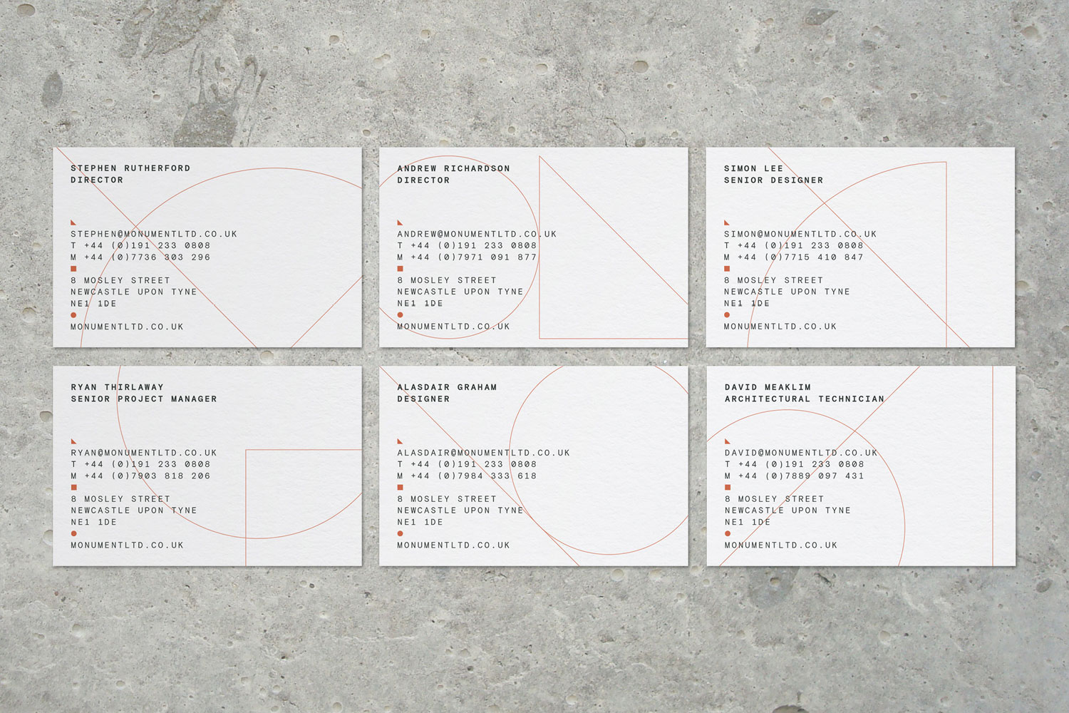
Renwick says the design incorporates the “the building blocks of architectural design – the square, circle and triangle” to create a graphic system that can “highlight information and draw attention to images”.
The logo, which is made up of clean, copper-coloured lines, uses all of these shapes.
A neutral palette was chosen, with colours including copper and off-white, which were all based on “quality” building materials such as marble, slate and copper.
A Basis Grotesque Mono typeface was used elsewhere across the brand. “We chose that because it is a mono font so all the characters sit perfectly in line with each other, which adds to a sense of quality planning and finishes,” Renwick adds.
The previous branding was more literal, with the word Monument made from long pillars.
The new brand identity will feature across the company’s website, business cards on hoardings and more.


-
Post a comment


