
The United States Space Force rebrands less than a year after launch
While the latest branch of the American military revealed a logo earlier this year, it already has an update (and new motto).
The United States Space Force (USSF) has revealed a new logo, only a few months after the organisation’s first logo was unveiled by president Donald Trump.

The USSF was created in December 2019 after Trump signed legislation to rename the United States Air Force Space Command and form a distinct military entity for space.
Its responsibilities cover “developing military space professionals, and acquiring space systems, maturing the military doctrine for space power, and organizing space forces to present to our Combatant Commands”.
The details of the USSF’s latest logo
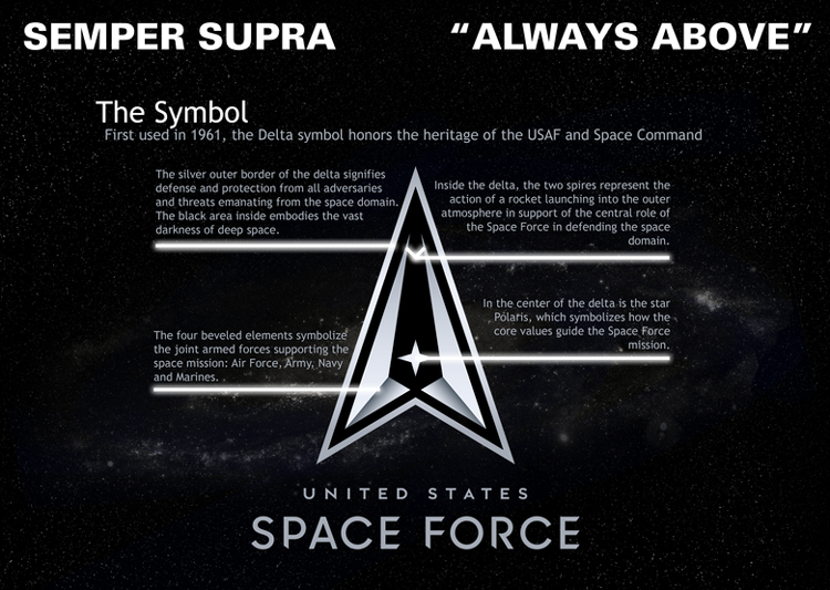
The latest design is a black and silver symbol, which takes inspiration from the 1960s. It is also accompanied by a new motto, Semper Supra, which is Latin for Always Above.
The arrow-like shape is the delta symbol which “honours the heritage of the USAF (United States Air Force) and Space Command”, according to the USSF. At the centre of the delta is the Polaris star – more commonly known as the North Star or Pole Star – which “symbolizes how the core values guide the Space Force mission”.
From the Polaris star, four bevelled shapes represent the four branches of the armed forces: the air force, army, navy and marines. The three-dimensional aspect goes against a trend towards flat logos that have been present in designs from the past year, including Nissan, VW, BMW and most recently, Toyota.
When you look at the logo you notice a black area inside of it. The black area embodies the vast darkness of deep space. Some feel fear and dread but we prefer to be inspired and stand up to the challenge. #sempersupra pic.twitter.com/g8l6NmNXsX
— United States Space Force (@SpaceForceDoD) July 22, 2020
The black space within the logo “embodies the vast darkness of deep space” while the contrasting silver border “signifies defence and protection from all adversaries and threats emanating from the space domain”. On Twitter, the USSF said that while “some feel fear and dread” at the through of deep space, it prefers to “be inspired and stand up to the challenge”.
Towards the top of the logo, two spires “represent the action of a rocket launching into the outer atmosphere”. According to the USSF, this is a way to support “the central role of the Space Force in defending the space domain”. More widely, there seems to be a revival in the American space sector. The first private rocket was launched from American soil this year, and in honour of this landmark, NASA revived its much-loved worm logo.
It is not clear whether the design has been created in-house or by an external agency. Design Week has reached out to the USSF for confirmation. The branding has already rolled out across social media and been used for the announcement of its internship programme.
“Boldly going nowhere meaningful at all”
After consultation with our Great Military Leaders, designers, and others, I am pleased to present the new logo for the United States Space Force, the Sixth Branch of our Magnificent Military! pic.twitter.com/TC8pT4yHFT
— Donald J. Trump (@realDonaldTrump) January 24, 2020
The new design is the latest entry into what has been a colourful design process for the US’s latest military department. When Trump first unveiled the logo in January – the result of “consultation with our Great Military Leaders, designers, and others” – designers’ responses were mixed.
Above+Beyond creative director Tom Munckton told Design Week that it was unintentionally funny, “boldly going nowhere meaningful at all”. Accept & Proceed strategy director Lily Fletcher was more diplomatic, saying that “as with anything Trump-related, there’s a knee-jerk reaction to jump on the hater bandwagon” but that the mark was not “as bad as it could be”.
There is nothing sacred any more. pic.twitter.com/ubyy4OIZrp
— George Takei (@GeorgeTakei) January 24, 2020
Most talked-about was the logo’s similarities with the seal of the USS Enterprise, the fictional spacecraft from television Star Trek. George Takei, an actor from the sci-fi show, tweeted the two logos side by side with the caption: “There is nothing sacred any more.”
Last month saw yet another development in the story, as it was reported that streaming network Netflix had secured the global trademark rights for the Space Force logo for its new comedy series, Space Force.


A parody surely? Looks like it’s come straight out of Paul Verhoeven’s classic Starship Troopers. Their tagline was “A new kind of enemy. A new kind of war.”
Awful logo. Out of tune with current and future, difficulties obvious at small scale, almost impossible to interpret as it’s a poor representation of the elements meant to be conveyed. Gradients fail even at larger sizes, to help the design in any way. Proportions and general execution are strictly 1st-year art school level.