Bellman places Retna book in Frame
West Sussex design consultancy Bellman has given UK-based photolibrary Retna Pictures a new look for its lifestyle photography catalogue. It is the first redesign for the Retna book, which has been renamed Frame by Bellman. The consultancy was appointed last March with a brief to relaunch the company’s image and refocus the catalogue’s market position.
The design rethink sought to promote the company’s new photographers over a wider variety of subject matter and to feature the Royal Photographic Society as a complete section within the catalogue for the first time.
Bellman production manager Emma Nicol says the consultancy presented three contrasting ideas at the outset, before developing the chosen idea through various creative stages.
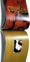
The print process uses a metallic pantone colour underneath the standard four process colours to give the impression of additional shades. A metallic silver was used at a percentage tint.
‘This process was first achieved by experimenting with different sequences of layering the metallic and CMYK inks. On the section introduction pages this created the feel that the bold four colour swatch had a metallic edge,’ says Nicol.
‘By adopting a clean and simple design incorporating strong and confident colour, the photography has been allowed to speak for itself. It was a lengthy ongoing process as shoots were generated by the progression of the design itself,’ she adds.
The catalogue will be distributed worldwide through Retna’s agent network and will be launched at the end of the month.
Client: Retna Pictures
Design: Bellman
Designers: Wayne Blades, Susan Noyce
Production manager: Emma Nicol
Printer: Hong Kong Graphic
-
Post a comment


