Bobbett revamps Club 18-30 logo
Bobbett Design has redesigned the identity for youth travel operator Club 18-30, which is unveiled on 22 December.
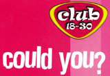
The identity will appear first on the holiday operator’s summer 2002 brochure, entitled ‘could youwould youshould you?’.
The existing marque has been simplified and features a cleaner, sans serif font and an abstract ‘c’ in the background to give it more ‘punch’ and greater visibility in an increasingly competitive market, according to Bobbett senior designer Jason Davis.
The magenta-and-yellow colourways remain unchanged ‘to provide continuity and maintain high levels of recognition’, as does the badge-shape, says Davis.
The design is ‘corporate with a twist’ to mirror the fact Club 18-30 is a well-established brand with a fun character, David adds.
The logo is the latest phase of Club 18-30’s rebranding programme, which began earlier this year with ‘deliberately risqué’ brochures (DW 5 July). A third brochure will launch next year.
The marque will be applied to all key marketing material after the brochures are released, including corporate stationery, uniforms and promotional items.
Bobbett has also created brand guidelines for Club 18-30’s other creative partners as well as holiday reps, to ensure it is used consistently, which will roll out next year, says Bobbett sales and marketing manager, Kerry Richards.
Bobbett won the work two years ago and has been Club 18-30’s incumbent consultancy since, says Richards. The client usually reviews its design groups annually, she adds.
Read this next

-
Post a comment


