Lightsource
Lighting designer Janet Turner tells Sara Manuelli how to make magic with colour in lighting
From Philippe Starck-designed hotels to Alsop Architect’s Peckham library in south London, we have increasingly grown used to a riotous use of colour in lighting design. Now galleries, leisure, retail spaces and even city areas are jumping on the bandwagon, with varying degrees of success.
Lighting designer Janet Turner believes that to understand colour in lighting design you need to consider some basic qualities such as the effect it can have in space, on surfaces, textures and forms as well as on our perception. ‘You need to consider the subtleties of colour, including white,’ says Turner, ‘and the best way to do it is by looking at natural daylight. Natural light changes variation and intensity according to seasons, from day to night and by geographical location. The UK is particularly lucky to have very long twilights and dawns.’
Lighting also effects ambience. Turner mentions big-scale projects such as the iconic Postmodern La Defence development in Paris, which during daytime basks in the patrician qualities of daylight against the bluish, white light of metal halide at night time.
On a more intimate scale, colour in lighting design has been used extensively in restaurants. Isometrix’s lighting for the Starck-designed Sanderson Hotel’s Spoon bar and restaurant exudes a greenish, glowing light against the daylight effect through the skylights of Quaglino, created by Conran & Partners with lighting sourced by Concord Marlin. Both are concealed, fluorescent lamps.
‘For more traditional restaurants you can achieve warmth using GLS tungsten lamps, which are similar to candlelight, while if you’re aiming for a more minimalist look, tungsten halogen gives you that cooler, sharper, whiter light,’ says Turner. ‘And remember, there are very different types of white lamps including the recent energy efficient lamps.
Increasingly, retail spaces and offices are also becoming conscious of colour rendition. Even supermarkets such as Sainsbury’s and Tesco have been aware of this in lighting design. ‘You can use coolish colours on cabbages and warm ones on strawberries. It’s not only the smell of freshly baked bread that supermarkets pipe through, they are now appealing to our eyes as much as to our sense of smell and place warm light on loaves. And sometimes you can add colour for colour’s sake – just for the fun of it,’ says Turner.
However, you should be wary of overimposing or attempting to improve on nature. ‘For example, a purple light might not work on daffodils, but then it can work wonders on white statuary or a snowscape,’ she says. Lighting should be specific to the object or the tasks that need illuminating. ‘Sometimes the correct light to use is a white one, since it allows the object stand out from its background. For example, the even and high intensity of light on New York’s Rockefeller Center is most effective, surrounded as it is by multicoloured buildings.’
Different materials also require different lighting since light can reveal the inherent qualities of what it is illuminating, or adversely exaggerate or even obscure it.
The technology of lighting, as well as the choice of types of lamps, is key in creating different atmospheres. ‘Fluorescent lights, for example, don’t reveal the sparkle, sheen or texture, and are more appropriate for large, flat, geometric surfaces and spaces, while a point source like tungsten halogen does,’ says Turner. Technology has moved so fast that effects which used to be achieved by using coloured gels behind fluorescent tubes can now be rendered with just one type of lamp and light fitting, she says.
Colour saturation is often found in spaces such as hotels, restaurants and bars to create intrigue, or a sense of theatre. Yet, Turner suggests the avoidance of a blanket approach. ‘When you put saturated colour in an interior, you tend to lose the sparkle and variety of surface and texture,’ she says. Instead, a white light against red pigment, for example, can allow you to achieve richness while still perceiving the objects and textures. ‘You can play with an orange light on a red surface for amazing intensity.’
Colour in lighting can also control our perception of space. ‘The human eye adjusts so efficiently in an environment or when we look at photographs. Only when we have a comparison we realise how distorted [that perception] is,’ says Turner, mentioning yellow sodium street lighting as a typical example. ‘You are able to light the way someone wishes an object or an environment to be perceived, and the great thing is that you can change it with the touch of a switch – that’s the magic of lighting.’
In retail, colour plays an important role. It sets the mood and can divide sections of shops or highlight specific merchandise. ‘What’s happening now in retail is that it is increasingly being lit as a museum experience, and vice versa. Of course, fashion [for a certain type of lighting] plays a big part. It’s about lighting objects as objects of desire and creating an atmosphere. But lighting is also part of the marketing, styling and branding process,’ says Turner.
For example, in the Marni stores in London, Milan and Paris, created by architect Future Systems, CDMT lamps in downlighters provided good colour rendition in the spaces, since both the client and the designer wanted a high level of brightness. The same lighting was replicated in all the stores, but with different colours: turquoise in London, terracotta in Milan and white in Paris.
But there can also be a negative side to the use of colour in lighting design. Turner mentions the fashion among city councils to illuminate monuments or buildings. While in some cases they are part of a successful regeneration plan, more often buildings are washed indiscriminately in coloured light, irrespective of the building’s form, textures or context. Often these schemes are inappropriate and are of detriment to the appearance of the building and can add to the serious problem of light pollution.
Yet it can also work wonders as in the case of the revitalisation of a run down area in Rotterdam, a walkway with multicoloured fluorescent lamps that switch through a colour change unit. Lighting can change a space from undesirable to desirable and transform it into the centre of a community’s social life, as in the case of Stirling Prize-winning Peckham library, created by Alsop Architects and lit by Turner.
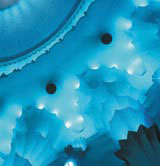
London’s Apollo theatre is another sublime example of colour in light design. Hoare Lea Lighting was commissioned by architect Jaques Muir & Partners to design the auditorium feature lighting in this Grade II-listed cinema/ theatre. The original 1929 auditorium design incorporated 3500 GLS lamps in two colours, aquamarine and amber, on two circuits that could be faded to give the illusion of an underwater palace. This lighting layout had become unusable due to high maintenance. Dominic Meyrick, lighting principal at Hoare Lea Lighting, replaced the lamps and fittings with a system that allowed for colour changes and devised a control method that fully exploited that facility. The solution was an imaginative use of LEDs that creates a stunning lighting effect, where a wide range of colours can be used to light the auditorium’s exquisite architectural detail.
The multicoloured lighting design of the theatre even cohabits and complements the lighting design of the current production, Bombay Dreams. Following the school of thought that believes the stage experience should be taken outside of ‘the black box’, it is used for specific moments of the play such as a firework scene. An ‘oversensory’ experience that perhaps might find some of the audience wishing for that calming, fade to black moment.
But as Turner points out, coloured lighting doesn’t have to be fixed. ‘You can change it or just turn it off.’
Any colour you like: The art and science of colour in architecture is at the Building Centre, 26 Store Street, London WC1 until 5 April. For information about seminars call 020 7692 6209
Read this next

-
Post a comment


