Turner Duckworth icing on packs for Mr Kipling
Turner Duckworth has overhauled the brand identity of the Mr Kipling cake range, with reworked packaging designs rolling out to stores this week.
The consultancy was appointed to the six-figure job in September 2004 on the back of its previous work for Mr Kipling parent company Manor Bakeries. The pack refresh forms part of an £8m relaunch campaign to promote the new-style Mr Kipling products by Manor Bakeries.
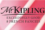
The work represents a move back to the brand’s 1960s heritage strapline of ‘Exceedingly good cakes’, focusing on the products themselves, rather than a Mr Kipling character, explains Turner Duckworth creative director Bruce Duckworth. He says the updated packaging designs reflect this move by featuring close-up photography that aims to capture the ‘characteristics’ of each cake.
The refreshed Mr Kipling typography is designed to ‘hark back to a day of homemade baking’, more subtly implying the presence of the Mr Kipling character in the background, says Duckworth.
‘The previous packs were bright red and had more of a corporate style. As the market has changed, this style is at odds with the homemade look,’ he says. ‘We have taken the corporate feel away and made it more premium, so it can compete with own-brand ranges that are slightly cheaper.’
The Mr Kipling range contains some 40 products and six additional ‘whole cake’ products are being introduced this month, featuring the redesigned branding.
Turner Duckworth has been retained to design a seasonal range for the brand owner that will be released later in the year.
Read this next

-
Post a comment


