Gentle shine
Special print processes such as foil-blocking can be in-your-face techniques, adding little more than a glossy touch to a project. But there’s much more to the art of enhancing, argue Nosmot Gbadamosi and Emily Pacey – subtle and understated effects can also be achieved with the richest of methods
In the age of the limited edition, even company brochures are starting to resemble works of art. Designers are using special print processes like foil-blocking and embossing to create texturally and visually fascinating surfaces for anything from art posters and album covers to annual reviews.
Recently freed from its workhorse yoke by web-based communications, the ancient medium of paper is finally receiving royal treatment, and designers are having fun with it like never before. ’Print runs are getting shorter – maybe 500 instead of 20 000, which is fantastic as it means you can increase the quality of the paper and use die-stamping and foiling and so on, and it won’t blow the budget,’ says Bryan Edmondson of Sea Design.
Sea is creating new box packaging for paper company GF Smith. Perhaps more than any other job Sea has done for its long-term partner, this is ’all about production values, all about paper and print’, says Edmondson. He goes so far as to assert that, ’special processes are replacing photography and illustration. Instead, typography, foiling, varnishing, embossing and graphic design are creating the brand identity and imagery for a piece of work.’
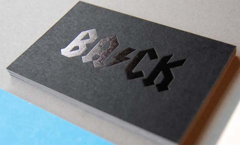
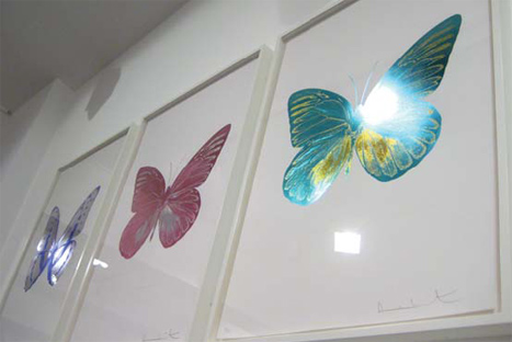
Foil-blocking – where paper is laid over with shiny or matt foil, often to create letterforms – is hugely fashionable at the moment. Ten years ago, mention foil-blocking and images of tacky, shiny foil applied too liberally to Christmas cards would have sprung to mind. But today, foil-blocking has refined itself to suit ever subtler forms of design, illustration and art. Damien Hirst’s three-layer foil-blocked butterflies for his 2010 work The Souls left many marvelling at how far the technology has developed.
’Foiling has the greatest opacity and the most reflection,’ says Canadian designer Marian Bantjes, who gold-foiled the edges of her 2010 book I Wonder so that it would resemble an ingot. ’It can be used on surfaces that can’t be printed on – in my case, a satin cover. It also gives a level of richness unattainable through conventional printing.’
Coralie Bickford-Smith, senior cover designer at Penguin, has worked with foiling since 2005. The latest books to demonstrate her passion for the technique are special-edition bronze, silver and gold covers for six works by novelist F Scott Fitzgerald.
’When I started using foils we had problems maintaining detail on matt foils, but nowadays the machine and plates are getting better at dealing with detail,’ says Bickford-Smith. She believes that – almost like magic – foiling can make a design look special and create texture, when really ’it’s just Colorplan and metallic foil’.
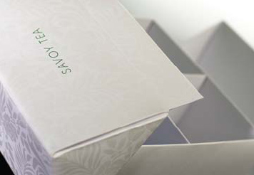
Likewise, Pentagram worked with Leicester-based packaging printer Keenpac to use black and green foiling on the Savoy hotel’s new tea packaging. Flocking was initially considered for Savoy’s tea packages, but was ruled out as old-fashioned. Similarly, Penguin’s Fitzgerald covers were initially to be printed with metallic ink, but the result is ’horrible’, says Bickford-Smith.
Keenpac account manager Lisa Roberts believes that the technique’s growing popularity is due to the vast range of foils now on offer. ’Developments have seen matt and clear foiling and a whole range of different applications, so there is a broader finish. It’s not just restricted to logos. People are being quite clever with it.’
For designers with unfettered imaginations, the challenge is to find experts capable of undertaking their extravagant visions. ’It can be very difficult. Last year we had to travel to the Scottish Highlands to get someone that could end-block [colour foil the page-edges] of a book’, says Edmonson.
To keep costs down, illustrator James Graham sourced a decommissioned machine and did his own foiling. The prints were for a solo show of works originally commissioned by Esquire magazine. He suggests that its growing popularity harks back to craft in a digital age, but adds that it still needs to become affordable and that more printers should offer the service.
One such printer is K2 Screen, which is responsible for crafting the cover of Massive Attack’s 12-inch limited-edition EP Atlas Air. Featuring imagery by band member Robert del Naja, the screen-printed cover has a fluorescent yellow colour base and hand-applied glitter. ’Allout stuff is produced by hand because our projects are all short-run. Using a litho printer you can only get a certain amount of grammage through the machines, but we can work on surfaces like rubber glass and wood, not just paper,’ says Mark Jenkins, director of K2 Screen.
K2 is not a typical printer, but Edmondson believes that, ’If you are a printer only concentrating on one thing, you are behind the game. The ones that do the whole package are really busy. Pureprint is right at the top of the digital leaders, and is great to work with, as are Fulmar Colour and The Colourhouse.’
There are still applications in which special processes don’t work. If over-indulged, or the colour-palette is ill-judged, foiling in particular can look tacky. Varnishing and foiling can be hard to recycle, too. But as paper continues to premiumise, designers will continue pushing the envelope of special processes, giving their clients maximum impact.


Read this next

-
Post a comment


