Martin Cox, Blast
Karel Martens
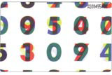
‘I toyed with nominating my business partner for a bit of blatant self-promotion, but in the end came back to a designer whose work I had literally picked up on my first visit to The Netherlands – a set of phone cards for that drawer of “nice things” we all have in the studio.
I’ve always loved Dutch design as it seems to strike the perfect balance between the rigour and consideration of the Swiss school and the flair and quirkiness of English design. The people and the country are inherently cool.
Karel Martens is one of a long list of Dutch designers whose work I admire and the man who provided that favourite bit of ephemera.
Martens’ work is characterised by workmanship and simplicity, and he clearly loves the “hands on” involvement of design. He is a designer as much at home producing monoprints as constructing typographic grids. This obvious love of expression outside of what we might class as “design” is one of the things I admire and envy. I for one am guilty of packing up my paints, pencils and silkscreens to gather dust while Martens produces fantastic design alongside pieces I would love to hang on my wall.
I am also fascinated by the sophistication of Martens’ thought process. It leaves much of the “idea”-based design for which Britain is lauded looking decidedly one dimensional. The national PTT (now TPG Post) telephone cards that introduced me to his work are a deceptively simple design: the density of numbers increase in line with value, the seemingly random numbers and colour allocation actually determined by a letter-to-number code based on the Dutch national anthem. Genius.’
Read this next
-
Post a comment


