
Twinings’ flagship store redesigns to focus on innovation and wellness
Dalziel and Pow has sought to help the centuries-old London space shift from a traditional retail experience to the tea brand’s “true spiritual home”.
Dalziel & Pow has redesigned Twinings’ flagship store in an attempt to move the focus from a traditional retail store to a more experience-led journey, based on principles such as wellness and lifestyle.

The store is based in London’s Strand thoroughfare and was opened by Thomas Twining in 1706. It is the capital’s oldest tea shop. The new layout hopes to appeal to the tea brand’s wide audience and become the brand’s “spiritual home”.
London-based Dalziel & Pow identified four demographics for the new retail space, ranging from tea novices to experts. The first were “tea-tourists” or “explorers” to London, especially from Asian and Middle Eastern regions.
Another was a Twinings fan, drawn to the history of the company. The remaining two were “tea-totallers” who were looking to incorporate tea into their lifestyle and finally the sector’s more experienced “tea-afficionados”.
“So many stories to tell”

With “so many stories to tell”, Dalziel & Pow design team leader Jemima Berridge says the team focused on four touch points which are being called “Moments of Curiosity”. These “bite-size” elements “punctuate” the customer journey and use a variety of interactive displays and visuals to encourage the customer on the retail journey through the shop.
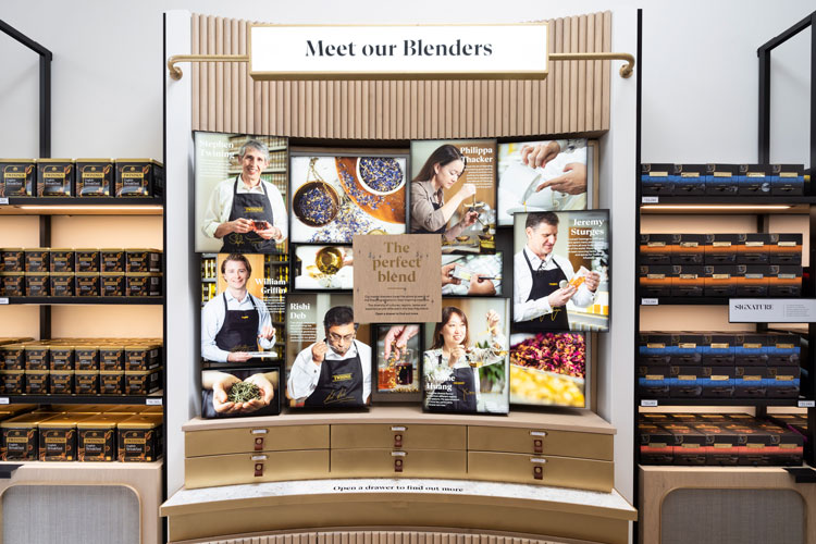
These moments include “Wellbeing” (looking at lifestyle), “Sourced with Care” (which tells the story of Twinings’ “ethical sourcing programme”), “Meet our Blenders” (which dives into the blending stories behind flavours) and “Pioneering Spirit” (which maps out the history and innovation of the brand).

The whole space is only 80m2, with a walkway at the front which now leads to a tasting bar at the back. As Berridge explains, the retail design had to lead customers from the entrance through to the heart of the building. At the back of the building, there used to be an archival-type museum which meant that the shop could be on a London tourist trail for higher footfall. Berridge says that the store wanted to retain this aspect but make it feel more “contemporary”.
On entering, there are now domes to press which have desired states of wellbeing. These include “Relax and Pause”, “Energy and Focus” and “Vibrance and Vitality”. Once a moment is chosen, a short animation plays on the digital screen above with lifestyle tips and flavours to try out.
Customers can then walk through the shop to try out the suggested blends. The tasting bar is designed to be a more reflective part of the experience, as customers are taken through the tea-making process in detail, from the leaves’ drying process to the actual brew itself. Dalziel & Pow hopes that this gives people stories to take away, playing into the social side of the drink.
All the tea is available at the store, and the design studio has worked on the “gifting experience” which aims to add to the “ceremony” of the purchase.

“Tightrope” of design details

The design for the store was a “tightrope” between classic British nods and the history of tea-making, Berridge says. It also had to match the brand’s “premium” identity. Going for a “contemporary” feel was crucial, she adds.
Softer lighting that emits a “glow” has been used to convey the calm and rejuvenation that tea can bring. On other touchpoints, materials like grasscloth, raw oak, brass and stone have been used as a way to show a “natural craft”. Brass signage has been used throughout as a way to “elevate” the space.
Berridge says that the design also aims to be adaptable. Twinings’ products are often colourful and visually-led, which meant that the store had to act as a kind of framework for the products.
Downstairs is a basement that is being launched as a VIP experience; it can be hired out for private tea tastings and events. For Twinings, which has many wholesale clients, it is also a useful place for meetings, Berridge adds.
Dalziel & Pow has also worked on the store’s branding. The tone of voice aims to be “open” and “transparent”, while the lifestyle-focused approach is brought out in the photography which features “warmer tones and more personal imagery”. All communication is now carried out in a typeface inspired by a stencilled tea chest.

The newly-designed store has opened with social distancing rules in place. Although finishing touches were being prepared in lockdown, Berridge says that COVID has not altered the design too much. Some interactive elements, such as a “smell jar”, have not yet been made available to the public yet. Other features, like the domes, are being regularly sanitised.
The shift from a more traditional food and drink retail experience to one that is more bespoke and experience-led has suited social-distancing changes, she adds, as customer journeys are easier to manage.


Bland!
Oh. Was a little joy off Fleet Street, might as well be Heathrow. Bland, ubiquitous and SOOO pretentious. Pity.