DesignStudio breaks from “cold” art world with Artfinder rebrand
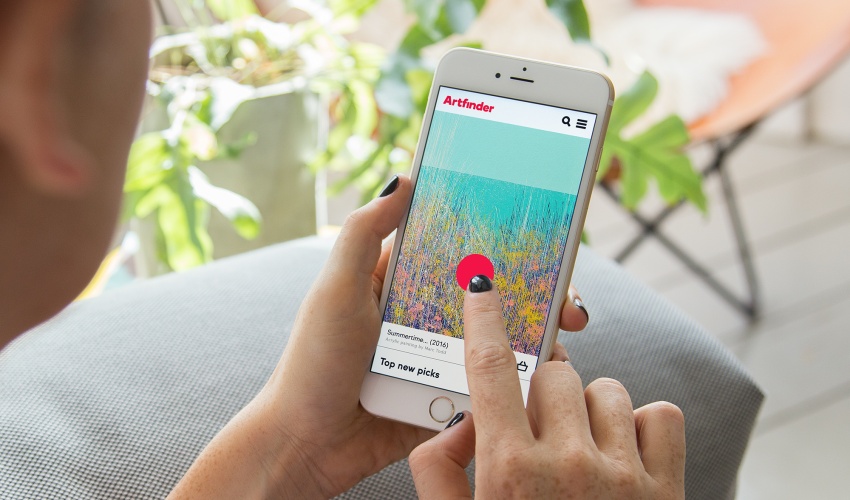
The online art marketplace’s new identity features a pink dot, based on the circular stickers which traditionally indicate when a piece of art has been sold.

DesignStudio has redesigned the visual identity for Artfinder, a London and Miami-based online marketplace which offers artworks suitable for a range of budgets.
The new identity centres on a bright red “dot” symbol which looks to “reinterpret the language of the traditional art world”.
Sticker-inspired “dot” symbol
Inspired by the classic circular stickers used at art galleries and auctions to identify pieces of art which have been bought, the colourful dot is seen in different positions across different platforms, including the website and print materials. It overlaps some imagery, colour blocks and text, while also changing in size and scale.
Executive creative director at DesignStudio, James Hurst, says: “We’ve filled this little red dot with a peskiness that grabs attention, getting in your way until you wake up to the opportunity to own something original.”
DesignStudio has opted to use A2-Type’s typeface, Boing, to go alongside the dot, with the aim of making the identity “confident and welcoming” and to break from the “stale and cold visual language of the current art world”, says the consultancy.
“Making art work”
Based on the proposition of “making art work” and accessible to everyone, the brand’s tone of voice has been updated to include a “simple and bold” copy mechanic, featuring statements such as “happy making, happy hunting”.
“A striking colour palette, bold typeface and attitudinal tone-of-voice this brand amplifies that [Artfinder] is here to make a change. It is here to make art, work,” says Hurst.
The new branding has now been rolled out across all touchpoints, including the app, website, advertising, social media and print materials.


Read this next


love it
Another formulaic brand from the Design Studio machine. I’m amazed that recent clients have not said, ‘I know we said we liked your previous work, but we didn’t;t think you’d do something absolutely identical for us’
Wow, what a beautiful transformation! I’m a big fan of Artfinder, and the art marketplace has never felt more friendly and approachable. Great job Design studio.
I disagree, I think it’s quite imaginative. The colours are fun and the dot reminds me of the ‘Sold’ sticker that you’d see in an actual art gallery.