Hat-Trick rebrands Wimbledon tennis club
Hat-Trick Design has developed a brand identity overhaul for the All England Lawn Tennis & Croquet Club, better known as Wimbledon, which this year holds its 125th championship.
The consultancy was appointed in August 2010 following a credentials-led pitch against four other groups.
It was chosen because of its experience of working for Twickenham Stadium and other quintessentially British establishments such as Kew Gardens and the Natural History Museum, says Hat-Trick creative director Gareth Howat.
He adds, ’It’s not about changing everything, it’s an evolution. [The All England Lawn Tennis Club] knew we understood this: we were a safe pair of hands and weren’t going to do something off-kilter.’
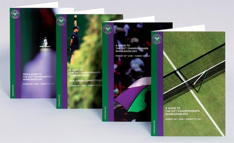
Hat-Trick was briefed to align and re-energise the club’s identity, wayfinding, print and digital communications, which were disparate and did not match Wimbledon’s world-class reputation.
Howat says, ’There was a noticeable disconnect when you looked at the state-of-the-art venue and hallowed status of the brand, and then at the communications produced on its behalf.’
The championship’s logo was tidied up to make it more legible and less dated. Howat says, ’The logo had evolved since it was first introduced, but the quality was terrible. We wanted to move it back to a classic look, as it was a bit 1970s-looking.’
The consultancy wanted to keep the club’s distinctive purple and green colourway and has introduced a double stripe device featuring the colours for Wimbledon’s website and print communications. Different tones of green, including grassy and tennis ball-inspired hues, have also been used on the site, to keep it vivid and lively, says Howat.
Hat-Trick was also keen to convey the ground’s heritage, passion and ’mystique’, says Howat. ’They have a lot of really great imagery so it was about pulling all that rich experience out,’ he adds.
Previously, the homepage did not feature any grass, a major underselling of the championship’s uniqueness as it is the only Grand Slam tournament still played on that type of court, says Howat.
Hat-Trick has created interim wayfinding for the club, and is currently working on new permanent wayfinding for the grounds, which will be introduced after the club plays host to the tennis events at the London 2012 Olympics.
As well as the website, Hat-Trick has created some 400 pieces of literature for the club, and extensive brand guidelines for corporate, retail, digital, broadcast and third-party use.
Howat says, ’Just like the tournament, every little detail has to be perfect.’
Anyone for tennis? Other groups involved
- RE Media worked with Hat-Trick Design on the digital design behind the new website
- The BBC and Red Bee Media were brought in to advise on the club’s broadcast guidelines
- IMG consulted on sponsorship and retail
Read this next


Looking at the website (as it’s too small to see the detail of the logo here) I wondered why that awful drawing of the strings on the rackets had been kept. It bugs me every time I see it. I know they are meant to be a graphic device but a tennis racket with strings strung at 45 degrees? Even a dreadful player like me knows that’s wrong. Shirley shome mishtake?