Doff the straightjacket
While both graphics purists and clients seek comfort in ordered Modernist fonts, a more decorative style is making a welcome comeback, says Jim Davies
Univers will celebrate its 50th birthday next year. Helvetica will turn 47. They may be getting long in the tooth, but these typefaces, along with other manifestations of the Modernist design tradition, remain formidably fashionable.
Recently, there have been two successful London exhibitions dedicated to disciples of Modernism: The Peter Saville Show at the Design Museum, and Wim Crouwel – Seen/Unseen at Clerkenwell’s Sea Gallery. While the work is contextually very different, it says a lot about the enduring popularity of the genre that the capital could sustain two graphics shows by designers who perch on branches of the same family tree.
But you don’t have to go to a gallery to see that. While Univers is aptly named, Helvetica should’ve been called Ubiquitous. The mannerisms of Modernism are everywhere. Clean-cut sans serif faces, rigorous grid systems, bold headlines glowering over neat columns of light-faced text, ordered white space, asymmetry and juxtapositions of scale have become the staple of corporate and consumer communication. Helvetica is the default font for a small army of design groups, who have a lot more to thank Switzerland for than penknives and cuckoo clocks.
A few designers have faithfully ploughed this furrow since the late 1950s, but its wider application has come in waves. The latest flurry is no doubt a reaction to the excesses of the post-Apple Mac era, from the ‘grunge graphics’ of David Carson, to the information overload of the Cranbrook Academy, and the vogue for furious overlaying and overprinting.
It’s a reflection of the state of the economy too – clients feel safe with a cool, clean, ordered aesthetic. It allows them to be neutral, to give little away. But ultimately, the style is contemporary without ever being challenging. It’s become the short back and sides of graphic design – always neat, never causes offence. And it appeals directly to graphic designers’ anal tendencies – carefully lining columns of text like blocks of Lego to achieve purity of idea and execution. It’s so satisfying to them because, within its own limitations, something close to perfection is possible.
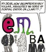
There’s an intellectual snobbishness attached to this kind of design too, as exponents try to outdo each other in their functional asceticism, constantly having to prove their hardline credentials, and their undying devotion to Josef Müller Brockmann. At its worst it’s akin to religious fundamentalism – stray from the sacred path and you’ll be damned forever.
This cultural extremism is inevitable. The Modernist card has been so overplayed, abused and watered down it’s almost become pastiche – these days, only the most skilfully executed or severe examples stand out from the crowd. Saville and Crouwel are rare exceptions, outstanding designers who have used Modernism as a starting point to develop visual agendas and signatures of their own.
So why the on-going fascination? Imagine your wardrobe consists entirely of black suits and white shirts. They’re well tailored and always look the part. Getting dressed is a doddle. There are no decisions to make. Once established, however, you can start to play with the formula. Dress it up or down. A loud tie. A sober tie. No tie at all. A breast pocket handkerchief. A lapel badge. Every small deviation from the norm is a statement. Similarly with Modernism, the parameters are a given. You have your basic shirt and suit, then you can start to toy with the conventions. It’s effective, but essentially limiting.
In many ways, the tenets of Modernism are holding graphics back. While they have raised the overall design standards of corporate and information graphics – when did you last see a badly designed train timetable or annual report? – they’ve become a security blanket. An elegant substitute for original ideas and visual expression. At the start of a project the proverbial paper is not blank, it’s pre-gridded to accommodate six different weights of Helvetica.
Design, like fashion, is cyclical, and there are signs that a new decorative baroque style is gaining influence and popularity. Hopefully we’ll see a more pluralist approach which allows the personality of designer and client to shine through. It has happened before, in psychedelia and Punk, two socio-cultural movements that spilled into the graphic design arena, rejecting the straightjacket of Modernism. And by the time Modernism comes round again, it will look fresh and dapper once more.
But in the meantime, throw out your black suits and pull on your kaftans and bondage trousers.
Please e-mail comments for publication in the Letters section to lyndark@centaur.co.uk
-
Post a comment


