Method making
Hannah Booth picks out a selection of work that employs interesting printing techniques and materials, and asks a printer how such designs are produced
Foil-blocking, embossing, debossing, plastics, metals, die-cutting, laser-cutting, lenticular lenses, heat-sensitive ink: gone are the days when a print job was an easy four-colour process. As clients demand greater stand-out, creativity and value for money for their print work, designers are responding with ever more unusual printing techniques.
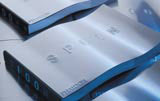
Take Spoon, one of publisher Phaidon’s recent books. Published this week, it features the work of 100 product designers selected by ten ‘critics’ and has a steel cover formed in the shape of a sinusoid curve. The cover was designed by Mark Diaper, founding partner of Berlin consultancy Eggers & Diaper, in conjunction with Corus Packaging Plus’ advisory service, Space.
‘We quickly decided to cross the basic form of a book with a spoon, as a 3D cover suited the content of the book perfectly. I was fascinated by the creative potential of metal, an unusual material in book terms,’ Diaper says.
One of Diaper’s main concerns was that the cover would be able to support the weight of the 444-page book. Metal covers are usually used with spiral binding, but he didn’t want that effect, he explains. Traditional binding beckoned, but with heavy pages it can be difficult to bind steel to paper.
To get round the problem, Diaper bound the book’s pages on to vinyl and cut the cover short to around one inch and attached the metal. ‘This method only worked because Space found a metal – actually Promica Pristine, a polymer-coated carbon steel – that would work well with glue,’ he says.
The steel itself had to be fingerprintand scratch-resistant, lightweight, retain its shape and allow for embossing. A matching invitation to Spoon’s launch this week has also been designed in metal.
Diaper believes one of the reasons he was approached by Phaidon for the project was because Eggers & Diaper works regularly with experimental formats. A recent project used foam as end papers of a book for Whitechapel Art Gallery, called Missing Voice, reflecting the fact that visitors to the exhibition put on foam-backed headphones to walk round.
Product design group Inflate is also known for its experimental plastics work with clients, and has just launched its first own-brand stationery range, Attraction. It is currently working on printed versions of the plain stationery, which will be launched in February 2003.
Flocked and embossed polyvinyl chloride stationery will form part of the range of folders, clip boards and tags all with magnetic clasps, says Inflate founder Nick Crosbie. Graphics on the stationery will include Inflate logos and artists’ work, he says, and there are plans for PVC diaries, sketch books and telephone books. Technically, the printed versions are slightly more complicated, and use screen printing over litho printing, says Crosbie.
Often, an off-the-wall print technique can e e more accurately reflect the nature of a particular project. For example, Elmwood designed a promotional book for paper group Scheufelen, which was published last month. Called Free, the book is a vibrant, funky showcase of graffiti work selected by graphic designers – former Face and Arena art director Swifty, Vince Frost and Stefan Sagmeister among them.
Each page explodes with colourful photographs of graffiti, almost all in situ on walls in cities the world over. To introduce the theme on the cover, Elmwood decided to show both states of a wall, before and after a graffiti artist has made their mark. It opted for a lenticular, ‘now you see it, now you don’t’ cover, with the switch effect achieved by moving the book up and down, rather than side to side. At one angle, the wall appears plain red. Tilted at another, graffiti with the word ‘Free’ in four different languages appears.
The technique is usually straightforward, but can throw up teething problems. ‘In the first dummy, the differences between the two were not pronounced enough,’ according to Elmwood designer Steven Shaw. ‘So we had to produce a further three images of each to enable the timings on the lenticular ‘lens’ to be controlled more tightly.’
Lenticular printing is designed to produce a variety of effects, such as switch /flip (in Elmwood’s case), 3D, animation, zoom and morphing. Free was printed using a four-colour process printed directly on to a lenticular sheet. It is then die cut with the corners shaped, as lenticular material can be very sharp.
As with Elmwood, Attik Sydney decided to reflect the nature of one of its projects in the printing technique. It designed a heat-sensitive cover for a Ministry of Sound CD (pictured above) to reflect its ‘hot’ summer launch in Australia this week (News, DW 14 November).
Apparently black with the Ministry of Sound logo rendered in gold foil, the ink on the cover turns clear when rubbed to reveal fruity messages printed underneath, such as ‘You’re getting hot now’.
‘The cover reflects the whole hot summer, beach party vibe of the album,’ says Attik Sydney designer Steve Johnson. The effect was achieved by printing the heat-sensitive ink as a special colour on top of a four-colour process.
A simple debossing technique, rather than a more complicated print job, was chosen by Love for the cover of a mini book cataloguing its first-year achievements. The slip cover is made from white expanded PVC.
‘The most important thing is for suppliers to buy into your creative idea – they must know why you’re doing what you’re doing,’ explains Love production director Matt Beardsell. ‘You’ve got to be flexible and compromise. Each job is a discussion – and there’s no point in telling a supplier their own job. You’ve got to trust them to make suggestions.’
A large part of Beardsell’s remit at Love is to source new materials. Creatives are constantly coming to him with ideas, he says. ‘Designers often don’t have the courage to try new things, as there can be a high failure rate. But clients get bored with easy, A4 paper jobs,’ Beardsell says. ‘Our booklet, for example, feels different as soon as you pick it up.’
Q: What are the most common types of non-paper materials used in printing?
A: Materials such as Plasmacoat (a plastic), leather and book cloth are common. Many printers can also print fairly easily on bulky items such as front covers of books that are already bound and, more unusually, leather jackets. We work on the principle that we will try anything that will take print or foil.
Q: Which materials are the most difficult to print on and why?
A: None are difficult once you have worked out how. It sometimes means experimenting, for which you need time and budget. The more we do the greater our library of experience. That said, there’s always something unexpected.
Q: What types of jobs use the most unusual materials?
A: Clients often commission more off-the-wall jobs for special events and the invitations for them; and more innovative designers doing self-promotion usually want something a bit different.
Q: What types of printing processes do you use to get round difficult jobs?
A: Foil-blocking, embossing and debossing (where embossing won’t work, debossing often will), litho, letterpress, thermography, silk screen, die-cutting and laser cutting. We can duplex surfaces where clients want an effect to show only on one side (for example, embossing). However, the earlier printers are involved in a project the greater chance they have of delivering a high quality product within a client’s budget.
Q: When you are faced with a tricky job, how do you work with the designer? And how often do you have to compromise?
A: We never compromise, we only redefine objectives. We achieve that by working closely with the designer, preferably face-to-face, but we will work within whatever constraints the designer has.
Paul Benwell is managing director at printer Benwell Sebard
Read this next

-
Post a comment


