New FutureBrand leaf for Air Canada
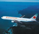
Air Canada is unveiling a major brand overhaul, Design Week can exclusively reveal. The airline is introducing a reworked livery, a corporate identity and fleet exteriors and interiors, all created by FutureBrand Worldwide.
Appointed to the work in May, FutureBrand conducted the project from its New York office, with a team led by executive creative director Claude Salzberger. The consultancy has developed a lighter colour palette for the brand, also blending art and technology for the designs.
The national flag carrier’s traditional red maple leaf marque has been reworked and a green graphic dot pattern introduced for the tail fins. The colour scheme will be applied throughout aircraft interiors and ultimately across all corporate communications.
‘The industry has moved away from a pure corporate look to one that is closer to the customer and that is what we have achieved with the new livery,’ says Salzberger, who worked on the airline’s previous FutureBrand makeover in 1994.
‘We’ve used the latest technology in paint, masks and decals to produce a kinetic effect on the tail fin that shifts in changing light. This couldn’t have been done ten years ago; the technology just wasn’t there,’ adds Salzberger.
Air Canada claims that the identity is the ‘first of its kind’, challenging the established language of aircraft livery design. The branding work also extends to staff uniforms, created by fashion designer Debbie Shuchat.
Last month, Air Canada emerged from 18 months of bankruptcy protection. The identity overhaul is part of the company’s intention to create a ‘new chapter in its history’ after the financial restructure.
Read this next

-
Post a comment


