High flyers
The wild range of invites for London Fashion Week.
It is London Fashion Week again, and once more the unwearable will meet the elegant as Bond Street jostles with Hoxton on the capital’s catwalks. With a reputation for creativity and a surprise, as always, up its sleeve, Fashion Week has become a fixture in the calendar and it now at least competes against the big shows: Paris, Milan and New York.
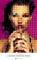
But what of its graphics? In the past, names such as Tim Lamb and Peter Saville have been responsible for the Fashion Week identity. This year, Fashion Week’s iconic image is of Kate Moss sucking a straw, divided into squares as if pixellated. This is no mere photograph, however, but a work by Sarah Morris, an American artist in the White Cube gallery stable of Jay Jopling: a major figure of the Young Brit Artist generation. Indeed, since Moss was the subject of a Gary Hume daub in the late 1990s, the belle of Croydon has become quite the muse.
Inside the catalogue, much is made of the “synergy” of creative London, and an essay both high-minded and breathless draws a cast of characters that swirl around London – from Tracey Emin and Sam Taylor-Wood to Sam Mendes and Guy Ritchie – in a haze of creativity. Not since the great days of Coco Chanel rubbing shoulders with Diaghilev and Picasso have the worlds of art and fashion been so entwined: the former providing ballast for the latter, and taking glamour in return.
But London Fashion Week still has to promote itself with scant means, and although renowned for its energy, it is not a rich event. “The problem with Fashion Week is that it hasn’t got any money to generate an image itself and has to resort to using material that is already available, or relying on the goodwill of models and photographers,” says Alan Page, chief executive officer of media agency New Media Industries, which generates the promotional material for the event. “We have to devise ways to get the best out of it, and also tell people across the world a bit about London.”
In order to attract foreign buyers to London, the city itself has to be talked up in the catalogue, and its unique profile as a city of grass-roots creativity enhanced. “New York is commercial and practical, Paris is over the top couture glamour and Milan is sassy Euro-glamour,” says Page. “But London Fashion Week is the whole city: it’s about what happens on the streets, in the art schools, the cultural mix here and the talent.”
It has also had a reputation for “difficult” clothing, but Page thinks it would be foolish to concentrate on the avant garde, and to that end the graphic finish of the catalogue is restrained, simple and elegant. “Remember, Fashion Week has to encompass Jasper Conran and Betty Jackson – neither of which could be called ‘avant garde’ – as well as Alexander McQueen and Julien MacDonald,” says Page. “We want to project the idea that there is good, simple, commercial work in London as well as cutting edge.”
Since 1996, when New Media Industries began working for Fashion Week, the company has taken a number of different approaches. The first took a monochrome Arthur Elgort image of massing fashion photographers, used in a portrait format. Then, in 1997, came Naomi Campbell in a Union Jack dress, the flag being very of-the-time and associated with the optimism of that year. “That was taken from a shot for Elle magazine, and re-cropped,” says Page. In the interim years, there has been a model in a dress covered in the London A to Z map (indeed, AOL’s “Connie” mascot looks suspiciously similar to this image) and later, models that emphasise the look of the time.
The Morris image came from a Vogue piece about Moss as an icon, and it suggested the art-meets-fashion theme for the catalogue. “Kate Moss is an icon for the whole London scene,” says Page. “She personifies London, which is fashionable, but also of the street.” The resulting publicity literature pulls off the balancing act admirably.
But there is also a graphic underground in Fashion Week, in the form of the invitations that the designers send out. These employ the same kind of ingenuity as nightclub flyers once did, using grabby graphics, gimmicky paper and mixed media, from cotton to steel. Or they go the purist route, letting the punters know about the show by way of a simple graphic statement.
“Designers usually go one of two ways,” says fashion writer Juliet Warkentin, who has been to thousands of shows over the past 15 years. “They either create a simple, elegant invitation, or they go the whole hog and and do something that relates to the collection, to give you an idea of what to expect.”
Warkentin says that the “invitation is often considered part of the event. When they’re working on the concept, the invitation is considered alongside the rest.” Therefore, some can be really inventive. A few years ago, Clements Ribeiro made a cashmere cushion which it sent around to the invitees. “Galliano always makes something spectacular,” says Warkentin. “Once he made a charm bracelet with an invite dangling from one of the charms.”
Others play it straight. Despite their humour and inventiveness as designers, a spokesman says that Antoni and Allison usually make a postcard format invitation. Yet their catwalk shows feature the video work of designer Anthony Burril. Many do a quick job at the local print shop – it is customary to do it as late as possible as the shows are liable to change. It is therefore difficult to say what we will be able to see this year. A spokeswoman for Alexander McQueen – arguably the buzziest event in Fashion Week – says that even she doesn’t know. “We work really close to the show and nothing has been finalised yet. In any case, it’s kept top secret until the actual event. All I can say is that it’s usually relevant to the show,” she says.
This is all good fun. But Martin Raymond, senior lecturer in lifestyle studies at the London College of Fashion Рhe also edits a cultural magazine called Viewpoint Рsays that the Fashion Week promo material is full of clich̩s.
“If it is a season about glamour – which it apparently is this year – then sequins spin out of envelopes and bright feathers from haberdashery shops are attached,” he says. “There is also a tendency to use quotes from philosophers, and a trend to use wallpaper, transparent paper and edible rice paper. Some use obscure download pictures from the Internet in a kind of scratch-punk style.” Many are done not by graphic designers, but by the fashion designers themselves, perhaps with help from friends, so should perhaps be forgiven for their lack of graphic sophistication.
But, adds Raymond, we must remember a basic irony: that fashion designers are not leaders in design. “Their graphic work tends to be second-generation,” he says. “Fashion designers are not that creative. They cobble together a graphic package in-house: it is usually done on the hoof. But fashion takes from other fashion: that’s its problem. Designers tend to be retroactive.” Indeed, Raymond believes there are great opportunities awaiting design consultancies that pitch at fashion designers.
“If you get your work into their Prada handbags, it’s a good way of getting it into the right people’s hands.” There are some designers whose graphic content Raymond admires: Hussain Chalayan, Boudicca, Andrew Groves and Vexed Generation among them.
Designer Paul Smith, however, is in no doubt as to the importance of the invitations. “Perhaps if your image and reputation are strong then the invites aren’t as important,” he says. “But you could argue that it is a chance for a bit of image enhancement, and some of us really go for it.” At Paul Smith, the invitations are always designed in-house, and this year the scarves have been printed at Lake Como in Italy, where printing on silk is a local speciality.
This year, Smith has departed from his usual print format to make a silk scarf, with the event details and an image of a carnation on it. It’s expensive, but worth it, he feels. “The show is about luxury and a summery, high lifestyle and we wanted the invitation to get that feeling over,” he says. “It’s something I wanted to do, and they’ll be used on the catwalk as well as put through letterboxes.” That’s synergy for you. Most invitations for this year’s shows will only be available just before the events are staged, and they will only be seen by those who are lucky enough to be invited. But here we preview a few, to give some idea of how the designers wish to be seen.
-
Post a comment


