Homepride is boosted by JKR package
Homepride Flour has been redesigned by brand packaging consultancy Jones Knowles Ritchie. The project was commissioned as part of a bid to grow sales in the increasingly competitive home-cookery market.
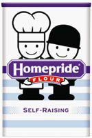
The brand’s familiar lozenge identity has been strengthened to reinforce the range’s position.
Fred, the brand’s cartoon icon since 1965, has been retained, but modernised. He now appears in a more lighthearted manner to attract amateur cooks, and is reduced in size on the soft packs to appeal to more serious bakers.
The brand’s red and blue stripes, used traditionally to distinguish the different lines of self-raising and plain flour have been made more subtle, appearing in pastel shades, to lend the product a fresher look.
“The redesign gives the Homepride brand name a stronger presence [on shelf] and should achieve greater stand-out from own-label rivals,” says JKR managing director Andy Knowles.
Read this next

-
Post a comment


