Seymour Powell and Roundel
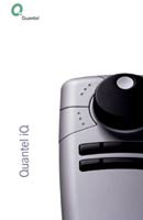
Product design consultancy Seymour Powell and brand identity consultancy Roundel worked together on iQ, Quantel’s latest ‘platform for a partnership in post-production’. Seymour Powell designed the interface for the workstation, while Roundel designed its new identity, based on the letter Q and a thought bubble, symbolising innovative thinking and attention to detail. The product was launched last week at IBC, the broadcast fair in Amsterdam.
Seymour Powell and Roundel were appointed independently and only came together towards the end of the process. Johnson Banks had previously worked on identity concepts for Quantel that were not adopted. ‘The client commissioned us separately, so we were already quite a way down the line with the completion of the products when we talked to Roundel,’ says Adrian Caroen, director at Seymour Powell. ‘However, the branding on the object is a key feature of the product, so we always knew that we would use the symbol on it, whatever that was.’ John Bateson, director at Roundel, adds: ‘We knew that the identity had to work powerfully on Quantel products, like a car branding exercise.’
The two teams worked together, meeting up and discussing options. The result is the iQ symbol illuminated by a blue light, a soft tone that glows in the editing suite and can be regulated. ‘The difficult part is that the symbol had to be designed to become a mechanical part. In order to get that to work, there had to be a lot of work between us and Roundel,’ says Caroen.
This is the first time the two teams have worked together. ‘But we have worked in the past with product design groups such as Priestman Goode and Jones Garrard,’ says Bateson. They had never met before and both give positive feedback about the experience. They won’t mention fees, but it is understood that each had a separate contract. Says Bateson, ‘Our contract is ongoing since we are currently acting as brand guardians.’
Read this next

-
Post a comment


