JKR’s WKD redesign aims for “gender inclusive” look and feel
WKD has overhauled its brand to help close the gap between “consumer interests and demands” and introduced a bold new look inspired by oil painting.
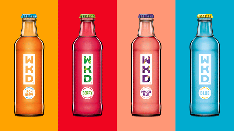
JKR has designed new branding for alcopop brand WKD, featuring an entirely redrawn logo and showing a marked departure since the most recent redesign unveiled in May 2015.
The new identity is centred around an exclamation concept to represent the brand’s “sense of fun and excitement,” according to JKR, and is launching to coincide with the vodka-based drink’s 20th birthday.
WKD parent company SHS Drinks brought in several consultancies to pitch for the project, aiming for a new look that better reflects the attitudes of the brand’s 18 to 24-year-old target audience. JKR was appointed in April this year, and reinvented the brand across all visual touchpoints and packaging.
“Big gap in consumer interests and demands”
JKR says, “Research revealed a big gap in consumer interests and demands since the brand launched in 1996, so a revitalised brand design and visual identity was required in order to engage this audience.”
The exclamation mark concept was chosen as a subtle reference to the previous WKD branding’s rectangular device, which now appears elongated down the bottle above a circle. This new dot shape is used across the identity, acting as a holding divide for flavour information or as a flexible icon across other channels.
Adam Swan, design director at JKR, says, “Vibrancy and bright colours have always been part of the WKD story but this reinvented design unlocks that vibrancy and takes it one step further, bringing the passion, fun and excitement of the brand to life.”
“Inspired by oil-painting”
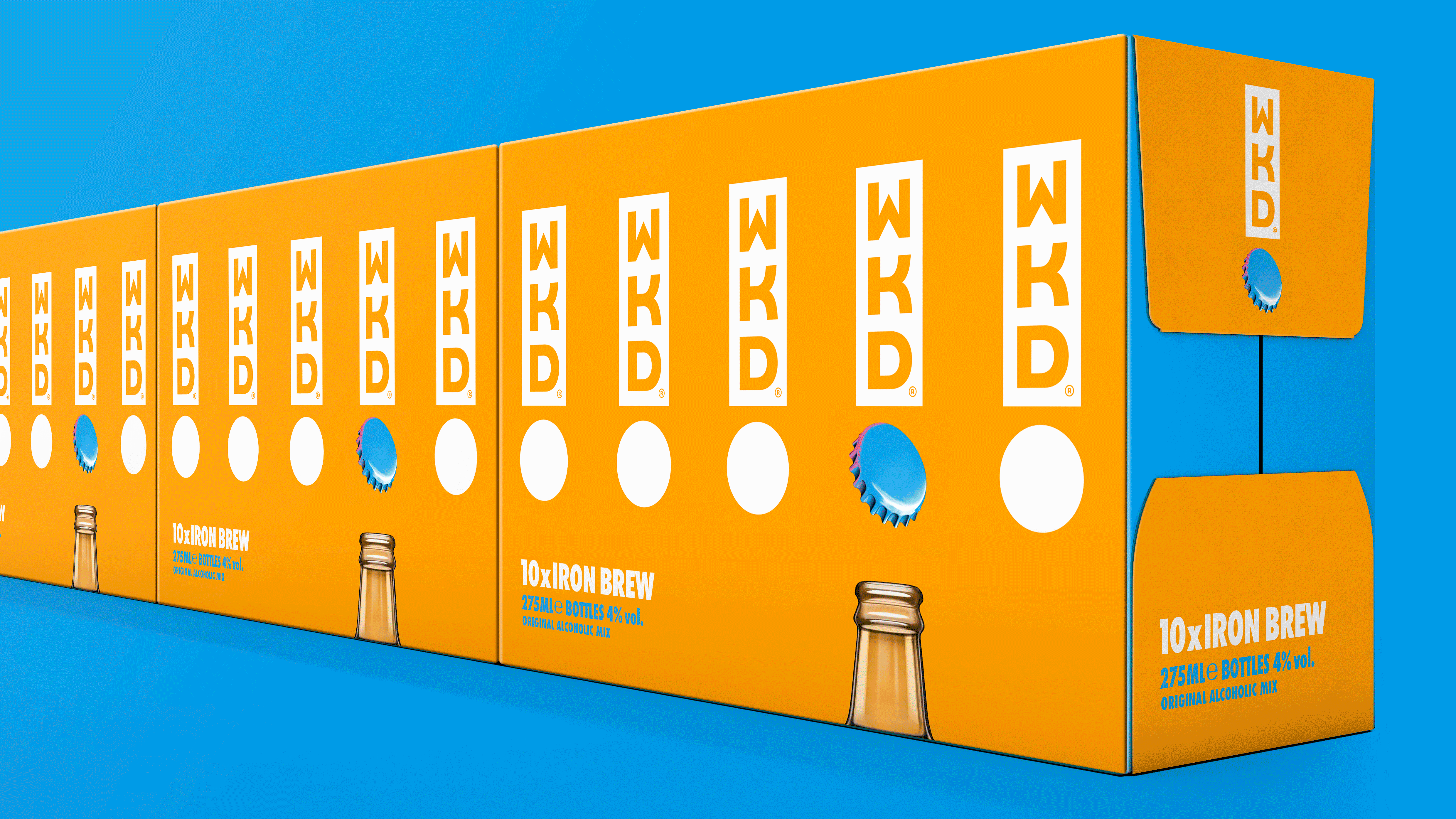
New bolder typography is used, appearing as transparent to show the drink colour on Blue and Iron Brew variants, and acts as a holding device for a brushstroke pattern “inspired by oil-painting,” according to JKR, on the Berry and Passion Fruit flavours.
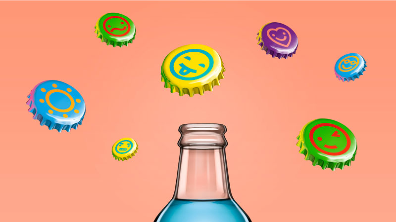
Bottle caps in bright contrasting colours feature simple icons and designs such as smiley faces, winking faces and hearts, aiming to “further emphasise the element of fun,” says JKR.
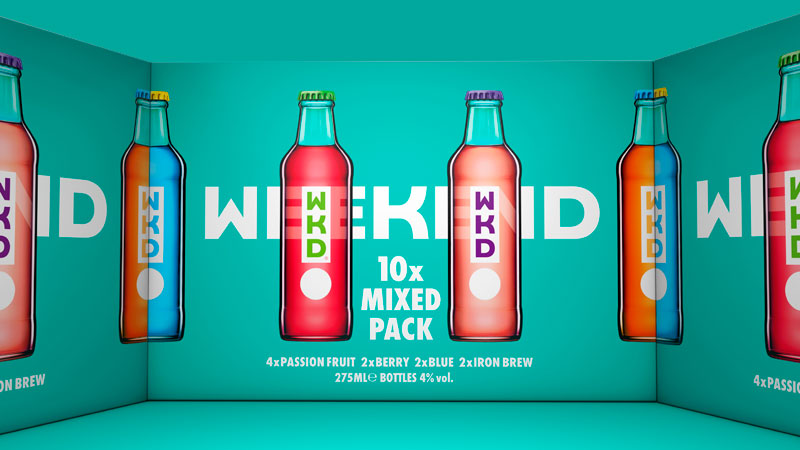
The redesigned bottles will roll out in October this year with a range of four flavours – Blue, Iron Brew, Berry and Passion Fruit, renamed from Blush. The brand is also set to launch two new low-calorie variants at the end of this year.


Really bold and well crafted design that should hopefully help to reconnect the brand to a new audience.
However, I think the biggest challenge lies in challenging the preconceptions from the previous (lad culture) brand, as well as seriously considering dropping the ‘blue’ sku – no one wants to drink synthetic coloured drinks anymore. Positioning will be key.