
Moving interface aims to provide hygienic solution for supermarket touchscreens
Special Projects has designed the Moving Buttons concept, which could allow 50 people to use a screen every hour without touching the same spot.
London design studio Special Projects has created a moving interface concept which aims to make touchscreens more hygienic in the age of Covid.
The studio says it was inspired by the widespread use of touchscreens – at supermarket check-outs, for example – where up to 30 customers can touch a screen every hour, often pressing similar areas. Research showed that viruses can remain active on surfaces for up to 28 days.
“The pandemic has changed how we interact with our physical environment in so many ways, and we are all used to paying attention to the things we touch,” Special Projects co-founder Adrian Westaway says.
“The digital kiosk space in particular sees hundreds of people every day touching the same spots when purchasing products, which can be a risk in itself,” he adds.
“A very simple but potentially very impactful solution”
“We wanted to visualise how this transaction could be made safer through innovative interface design, and put customers at lower risk of coming into contact with other customers,” Westaway says. “The Moving Buttons interface provides a very simple but potentially very impactful solution to this.”
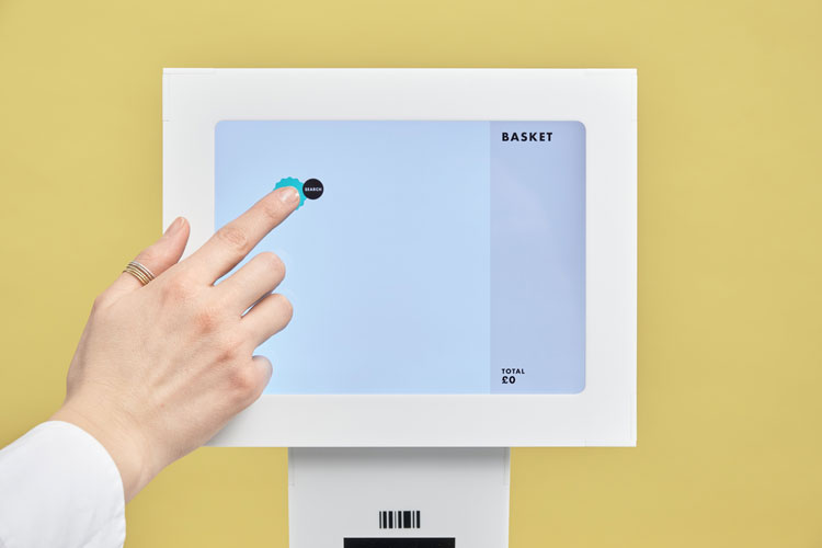
Moving Buttons provides an algorithm for these screens, which changes the positions of buttons between transactions so that customers do not touch the same area twice.
The design goes against many accessibility rules, Westaway says, as people tend to “feel more comfortable using familiar interfaces” and to know where buttons are.
Westaway explains that an “uncluttered” interface aims to make the process simple. The initial pay button resembles a sticker to remind customer that it is “essentially repositionable to anywhere on the screen”, the designer adds.
On the initial screen, a bright green button will appear and then supplementary buttons – ones that allow customers to input numbers for loose items, for example – will be “anchored closely” to the original button, Westaway says.

Design development
The design team looked at many supermarket interfaces throughout the development process. Westaway highlights interfaces at food chains at McDonald’s and Leon as more user-friendly high street examples.
Though the project aims to solve an ongoing and modern-day problem, it was inspired by the early days of plasma televisions, Westaway explains. If static images remained on a screen for too long in one position, they could leave an image behind.
This problem – known as plasma-burn – was the reason for shifting television logos, which usually appear in high-contrast at the bottom corner of a screen. It was also the reason for screensavers – so-called because the moving images prevent phosphor burn-in on plasma computer monitors.
Special Projects says that up to 50 people could use a touch screen without touching the same spot. After this period, the screen alerts a member of staff to clean the surface.
While it is only a concept at the moment, Special Projects hopes that it will inspire touchscreen manufacturers to update their interfaces.
The system could be used at other self-service touchpoints, according to the studio, such as train ticket machines, exhibition spaces and ATMs.
“We want to share this idea as widely as possible in the hope that companies making human-facing touchscreen interfaces can implement and evolve the idea,” he adds.
Throughout the pandemic, designers have explored ways to make regular interactions more hygienic. Design Week has looked at innovations in surface materials, the aviation sector and wayfinding systems.


I once tested something like this in an airport terminal on a self service check-in kiosk. The purpose was to increase the lifespan of the touch screens by changing the area in which the button appeared.
It was a total disaster. In the lab, it worked great. Clean interface, obvious buttons, no problem. But in the stressful, distracting environment of the terminal, people had to work harder to find the button, and when they couldn’t immediately see it, the panic set in and they then found it even harder to find it. Sometimes people had to give up and ask us.
The button in question was a ‘Submit’ button – which was how you finalised the check in process once you had added all the passengers (so, equivalent to a pay button). We even had it light up and start flashing when it was ready to use, it was super over-sized, and directly colour contrasted to the rest of the UI.
It was also not fair on those who had a sight or cognitive difficulty. In an environment that might get daily use, this makes that a daily game of ‘hunt the button’.