
Lock maker Yale rebrands for “warmth” and a digital future
Yale, which sells a range of digital security products as well as traditional locks, needed a coherent global brand that balanced heritage and modernity.
GW+Co has rebranded security company Yale in an attempt for coherence and a more future-focused brand positioning.
The new identity includes a refreshed logo, colour palette and bespoke typeface. As well as the graphic identity, London-based consultancy GW+Co has developed the brand’s tone of voice, a UX system and an avatar based on Yale’s founder.
Yale was founded in 1840 in Connecticut, U.S. by Linus Yale Jr. The company now sells a range of security products in 125 countries across the world.
“This cosy world of locks has been disrupted quite a bit”
GW+Co principal Gilmar Wendt tells Design Week that part of the challenge was to co-ordinate Yale’s image across all these territories. GW+Co found that while it did not previously matter as much if there was not a unified identity across countries, now that Yale was entering the digital playing field, it was important to be cohesive. “You used to have almost a different brand in the US, to Europe, to Asia Pacific,” Wendt adds.
The new brand also had to tie in with the company’s “legacy” and show it was a viable competitor to digital security systems, such as camera-based platform Ring (owned by Amazon) and smaller technology start-ups. Yale now works on digital platforms too, so the identity had to work on apps. “This cosy world of locks has been disrupted quite a bit,” Wendt says.
“Even when it rains, you know the sun is always there”
The graphic system has been based around the sun, a symbol of warmth and positivity, according to Wendt. GW+Co hopes that this sets Yale apart from its competitors, which they say focus on fear and negative feelings around security. The refreshed logo retains the brand’s signature yellow, but has a higher contrast around the edge, to emphasise the shape of a sun.
The sun is also universally recognised, which is useful for a brand that needs to work across 125 countries. It’s also always present. “Even when it rains, you know the sun is always there,” Wendt adds, which ties into ideas of reliability around the brand. The identity also launches on 22 June – two days after the summer solstice and longest day of the year, which was intentional according to Wendt.
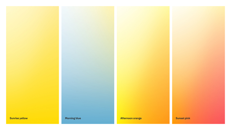
The graphic identity is built around the image of the sun. The colour palette, for example, is inspired by times of the day. Four shades – ‘sunrise yellow’, ‘morning blue’, ‘afternoon sun’, ‘sunset pink’ – can be used flexibly across the identity.
Light and shadow
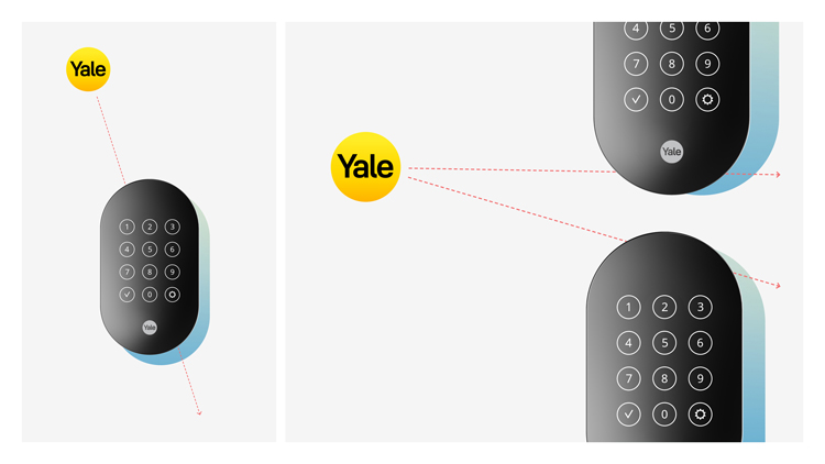
The image of the sun also adds some depth to the identity. As Wendt points out, “where you have light, you have shadow”. Where the logo appears on material, it acts like the sun, casting shadow on other images. In the example above, the shadows on the remotes are cast in accordance to the position of the logo, using colours from the palette.
An avatar based on the company’s founder, Linus Yale Jr (who also invented the cylinder lock), has been created as a way of adding some personality to the identity. It’s so far being used on internal communications, but could in the future be used as a kind of guide on digital products. The avatar’s distinctive image has the potential to add a “cheeky” tone to the identity, says Wendt.

A sonic identity has been designed, though it is still in development; Wendt says it will be used in future applications. A “positive” tone of voice has also been implemented.
Designing a typeface for Yale
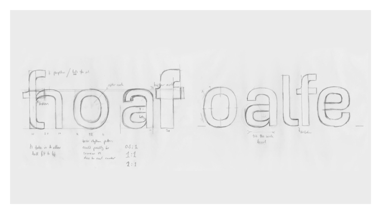
Typeface designer Jeremy Tankard was brought in to develop a bespoke typeface for Yale. His approach took into consideration the logo’s lettering, which has a “general roundness and softness” to it. Tankard explains that he also wanted to incorporate the new “fresh and light” branding, and design a typeface that was “simple, pure, constructed and engineered”.
The resulting Yale Solis typeface was inspired by research into different typefaces such as the 1931 Din 1451 typeface with its ethos of “regularity”. “Inspiration was found in how the regularity could be controlled and altered in order to maintain beautiful word shape and rhythm,” Tankard says. He also took note of typefaces from the 1960s, created for computers to read, which had “personality” – each letter had to be different enough so that a computer could read it easily.
These ideas came together in a typeface which has a “softness” in appearance, according to Tankard. “The proportions create an even rhythm that elegant and effortlessly conveys Yale’s voice.”
Read this next

-
Post a comment


