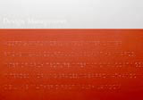
Folder for Design Management Consultancy by Design Narrative
Metallic inks and deep embossing have been combined for their tactile qualities in a marketing folder for Design Management Consultancy. ‘The client’s concept was a portfolio containing project postcards, news and issue reports to reflect the emotional values of its services creating high-quality workplace environments. The choice of colours and materials incorporate the ideas of restraint and light reflection,’ explains Design Narrative designer Alison Hunt. ‘The pack has the feel of a treasure chest which opens to reveal its colourful contents.’
The folder uses 300gsm Chromomatt board printed in standard Pantone silver and bronze metallic inks on the cover and a darker graphite silver on the inside. ‘Tests were carried out on a number of coated and uncoated materials because metallic inks have a tendency to soak in and dry with patchy results,’ explains Hunt. ‘Chromomatt’s coating proved to be the best, giving an even metallic finish that retains its sheen.’
Embossing on the front cover adds impact to the design. It too required several tests. Hunt continues: ‘For the list of client names on the folder’s cover, the Frutiger Bold typeface was chosen because of its chunky texture which I thought would emboss successfully.’
The reverse of the embossing makes a subtle pattern on the dark silver inside of the pack where the project postcards are stored. These cards use a 250gsm Chromomatt and four-colour printing with the addition of a gloss varnish over the colour image. Printing was by Good News Press and Tymeprint.
-
Post a comment


