Brand prix
When the A1 Grand Prix kicks off this Sunday, it’s a chance for all nations to show their true colours. But who will shine and who will flop in the livery stakes? Clare Dowdy speaks to the designers behind the branding to find out.
When the A1 Grand Prix kicks off this Sunday, it’s a chance for all nations to show their true colours. But who will shine and who will flop in the livery stakes? Clare Dowdy speaks to the designers behind the branding to find out
Could this become the World Cup of motorsport? That is certainly the dream of Maktoum H Al Maktoum, the president and chairman of A1 Grand Prix.
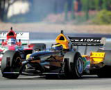
The first race is scheduled for Brands Hatch on Sunday, when 25 national motor racing teams will compete. And it’s the national nature of this new fixture on the sporting calendar that makes A1 Grand Prix a fascinating exercise in branding.
Unlike Formula One racing, spectators won’t see teams racing their own bespoke cars, à la McLaren or Ferrari – Al Maktoum’s model is more egalitarian than that. Instead, a team can be bought as a franchise by any interested individual, but every team must race in the same kind of car, and the driver must be of the appropriate nationality. The line-up for Saturday includes Russia, India, China, Germany, Turkey, France, Spain, the UK, the US and Brazil. The only difference between the cars – apart from the skills of the driver – lies in the livery and graphics they sport.
The overall branding for the A1 Grand Prix was designed by specialist consultancy Interstate in London, which has created a colourful visual concept. ‘It’s about nations and the pageantry of the World Cup,’ says creative director Nigel Gray. ‘So the stripes of colour we’ve created represent a grand stand full of flags, seen at speed.’
The consultancy, which has a history of working with Formula One, has also turned its attention to some of the liveries, designing five of the cars to compete at Brands Hatch: Russia, Switzerland, Pakistan, France and the graphic elements for the Chinese team.
This is where the issues of sport, nation and branding come together. There are very few frequent sporting events where countries worldwide compete against one another. The Olympics and World Cup are only every four years, but A1 Grand Prix plans to run every winter – traditionally international sport’s quiet season. That means that these cars – and their designs – could get considerable exposure.
So how do you customise a racing car to represent a nation? For Gray, the starting point is always the flag. The designers considered creating an image which would look as though the flag was literally draped over the car, with appropriate creases and shadows. However, that would demand an extremely skilled paint job, and there are morbid connotations of a car being draped in a flag, coffin-like, which could seem highly insensitive in the case of a serious accident.
Instead, Interstate used the flag and its symbol or device as graphic inspiration. Hence the French red, white and blue design, which incorporates the country’s heritage of art and painting, says Gray.
However, as Rod Petrie, performance and development coach at Design Bridge, which has worked on many high profile sporting projects, says, ‘Bringing together a nation’s identity isn’t always about sticking a flag on it.’ He adds, ‘As they have remained unchanged for years, flags do not necessarily reflect the mood, vision, new status and national identities that some countries now aspire to.’
And what happens when colours are shared by a number of countries? Red, white and blue has to do for the UK, France, the Czech Republic, the US and others. Then, says Gray, you have to draw on other national characteristics or symbols within the flag. To interpret the stars and stripes of the US flag, the team enlisted artist Steve Kaufman.
What works best, is when a nation ‘owns’ a colour. For example, on team shirts, such as the Dutch footballers in their orange and, in rugby, the New Zealand All Blacks in black and white. The A1 Grand Prix cars, for these two nations, take advantage of this, as Robert Jones, head of consultancy at Wolff Olins, points out. ‘New Zealand is an unexpectedly chic black, though with some quite unnecessary go-faster stripes. The winner, though, is the Dutch with their cool orange – and no unnecessary extras – the car design is just right, as you’d expect from a design-conscious country,’ he says.
In fact, this is how Formula One used to be. In the middle of the last century, each nation raced under a specific colour – red for the Alfa Romeos and, later, Ferraris for the Italians, blue for the Bugattis of the French, silver for Adolf Hitler’s Auto Unions and Mercedes and, of course, the British Racing Green liveries sported by Bentley.
With all this symbolism and national heraldry about, there is a danger of falling into cliché mode, something that Gray was very aware of, especially with the dragon graphic for China. ‘We considered that risk, so we consulted a Chinese professor at the Victoria & Albert Museum and received clearance from China.’ At the same time, Gray ‘tried to get away from a style that was overtly pastiched and draw in more of an F1 manner’.
Wolff Olins’ Jones sees A1 Grand Prix as an international design competition waiting to happen, as much as a sporting event. As it is, he appears under-whelmed by a few cars. ‘Mexico has swirls of colour like breath-freshening toothpaste. The US car is vaguely reminiscent of an Apollo spacecraft, and Great Britain is an embarrassing rehash of the BA post-Thatcher tailfins,’ he says.
But to get a real sense of these liveries, spectators must wait until Sunday, when all 25 will be travelling at considerable speed, complete, no doubt, with a plethora of sponsors’ logos. That is when the designs will really get a chance to sing, roar or whimper. •
Read this next

-
Post a comment


