Downsize to stay competitive
Does the redesign of The Guardian keep the paper’s character intact and is it bold enough to halt a sales slump? Scott Billings asks the experts
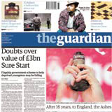
Does the redesign of The Guardian keep the paper’s character intact and is it bold enough to halt a sales slump? Scott Billings asks the experts
Something of a domino effect has rattled through the national newspaper market since The Independent boldly trashed the serious, authoritative broadsheet format in favour of a handy little tabloid.
That was in April 2004, although Guardian editor Alan Rusbridger allegedly told an internal staff meeting two months prior, ‘we have to shrink this paper’. If so, he was presciently calling a change in the market, a slow shift in consumer tastes and reading habits. Either way, The Independent’s decisive move undeniably set all the broadsheet editors thinking; the paper’s circulation – which had long been in the doldrums – immediately jumped at the expense of its rivals.
The Times followed suit in November last year and The Daily Telegraph is understood to have tinkered with its own scaled-down incarnation, although a trade campaign earlier this year trumpeted ‘Impact, not compact’, lampooning The Times’ descriptor of its new size.
Despite Rusbridger’s apparent acumen in sensing the wind of change, The Guardian sat tight for a while, carefully trialling a number of possible formats, under the in-house design team led by creative editor Mark Porter. The favoured approach always appeared to be the Berliner, a format used more widely in continental Europe that falls between broadsheet and tabloid.
But it was never going to be easy for The Guardian – often considered a trailblazer for newspaper design – when it unveiled the results of this process last week. A wholesale ditching of Pentagram partner David Hillman’s design of the 1980s has arguably shaken The Guardian personality out of The Guardian.
According to CDT Design founder Mike Dempsey (who created the original design of The Independent in 1986), the Berliner Guardian has lost, in design terms, much of what had been nurtured since the introduction of Hillman’s layout.
Gone is the iconic masthead, its new white-out-of-blue, lower-case replacement somewhat adrift from the top of the page. The combination of Helvetica, Garamond and Miller typefaces has been dropped to make way for Guardian Egyptian, a type designed exclusively for the paper by Paul Barnes and Christian Schwartz.
Dempsey is not convinced this is a wise move. ‘They could have changed the format – I don’t think there’s a problem with that – but still kept the look. It was so beautiful and well-honed [after years of fine tuning]. The design was really about nurturing a good piece of work done years ago, but its unique selling point has been thrown away and the paper now has to fight all over again on a design front,’ he says.
Garcia Media founder Mario Garcia’s work with over 450 news organisations includes redesigns for The Wall Street Journal, Die Zeit and The Philadelphia Inquirer, and he is also currently working with Guardian sister paper The Observer, which is moving to the Berliner format early next year. He believes that the relaunch of The Guardian has been successful.
‘The Guardian guards a special place in every designer’s heart. It was daring – that ‘The’ in italics in the logo. It was fun – front pages that surprised at a time when visual surprises were not chic. It had passion, through those bold Helvetica heads that you were used to seeing in less prestigious publications.
‘I saw an earlier prototype of The Guardian as a Berliner that was disappointingly grey, funereal even, and not one bit like the Guardian we know and love. I said so at the time. I am very happy to see this new, vibrant, contemporary Guardian. Again, it sets the pace, again, it is fun,’ he says.
Most importantly, Garcia believes that the paper has not simply shrunk the broadsheet, like The Times and The Independent. ‘It has reinvented itself, moved to a smaller place, and thrown out enough of the unnecessary furniture,’ he claims.
But Dempsey believes the new typeface lacks colour. ‘I see a greyness of typography because there’s no light and shade,’ he explains. ‘It is all very flat in the headline text, which looks the same as the body text, but larger,’ he says.
Porter claims the Guardian Egyptian face is a mid-ground between the higher contrast serifs, with their defined thick and thin elements, and the more modern-looking sans serifs. ‘The Egyptian is more authoritative than the sans serifs, but not too high contrast and so not as old-fashioned,’ he says.
The Guardian has adopted a five-column grid for its news pages, opening the space out in comparison with The Independent’s denser seven-column grids. Porter says that this system is the standard used in the tabloid sector and believes it was selected by The Independent primarily to ease the buying of advertising space by media agencies.
Porter and Rusbridger are still bedding in the new design and tinkering is likely over the coming weeks. The bottom line, of course, is the effect on circulation and advertising revenue. The paper will be looking to reverse a trend that has seen a decline in circulation of almost 12 per cent since August 2000, the steepest rate of decline of all the quality newspapers over this period.
QUALITY NEWSPAPERS CIRCULATION GROWTH AUG 2000 – AUG 2005
Daily Telegraph-11.7%
Financial Times-7.4%
The Guardian-11.9%
The Independent14.4%
The Times-4.3%
Source: Audit Bureau of Circulations
Read this next

-
Post a comment


