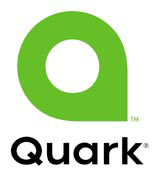
Quark identity clash with marque for SAC

The issue of accidental logo replication has arisen once again, as the rebranding of media software publisher Quark has seen it reborn with a logo that unerringly resembles that of the Scottish Arts Council.
The new Quark logo, created by SicolaMartin, a division of Young & Rubicam Brands, was launched on 9 September with the promise that it would ‘help Quark break out of the visual “sea of sameness” that lumps together so many corporate software companies’, according to SicolaMartin creative director Chris Wood.
But the on-line community, and in particular bloggers from the design industry, have been quick to pick up on the logo’s resemblance to that of the SAC, designed by Graven Images and launched in 2002.
A spokesperson for Quark says the company carried out domestic and international trademark searches before registering the design and that any similarities are unintentional – although the SAC design is also trademarked.
A spokesman for Graven Images takes a philosophical view and points out that, because Quark and the SAC operate in different business sectors, the similarity causes no legal problems. ‘It is one of those things,’ he says. ‘It is a pretty basic shape, it’s almost a primary.’
The curious incident is another example of two coincidentally similar logos emerging into the marketplace, following the recent wrangle between the Foreign Office and Eurosceptic think-tank The Bruges Group, over the flying swan logo of the UK’s EU Presidency (DW 7 July).
-
Post a comment


